HOME | DD
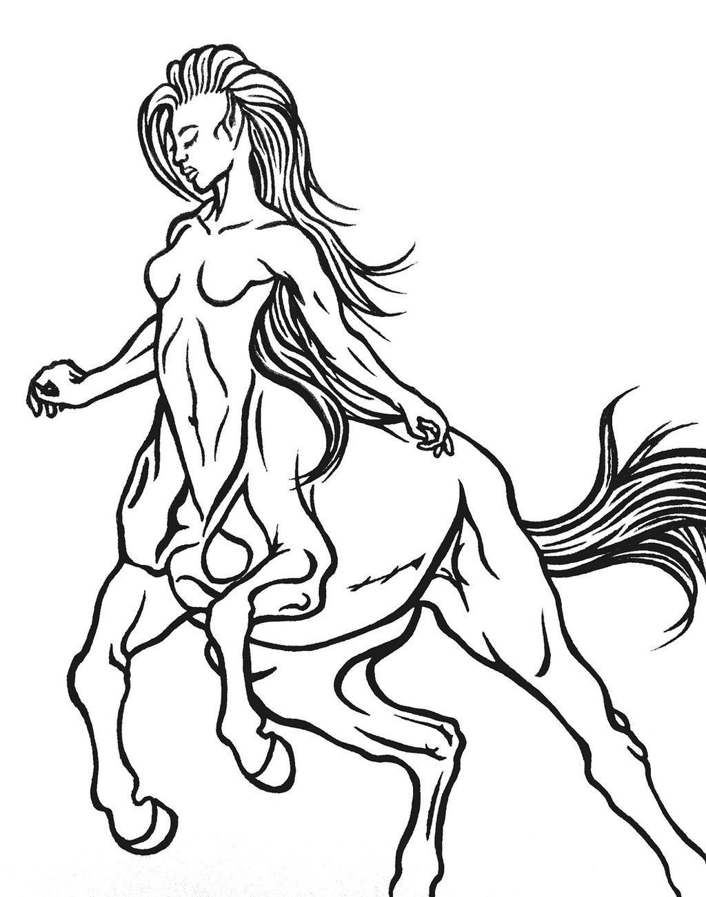
 Christa-S-Nelson — Centaur Lineart (please read)
Published: 2015-05-12 23:18:41 +0000 UTC; Views: 999; Favourites: 19; Downloads: 12
Redirect to original
Description
Please do not use.I wasn't going to share this with you mainly because the chest of the horse part is so wrong anatomy wise, but then I decided that I should show you. Because I feel like you guys should see my failures as much as you should see my accomplishments. It is important for artists, for anyone actually, to fail forward. It's like riding a horse. You never become a true rider until you have fallen a million times with your face in the dirt. I encourage you all to accept your failures, learn from them and move on!
Love you all!
 Christa
References:
christa-s-nelson.deviantart.co…
christa-s-nelson.deviantart.co…
Related content


Comments: 5

Horses are hard with their mix of soft curves and hard bone. Many pro fantasy artists just plain suck at them but won't acknowledge that fact. I do see all the errors in the horse body, in the back half as well as the chest, and I find it admirable of you to publicly face up to it.
I really like the inking job, too. That is really nice and smooth - what did you use?
👍: 0 ⏩: 1

thank you! i have a lot of terrible drawings, i could fill a room up with them, but i'm failing forward! I used a regular sharpie pen
 (Smile)")
👍: 0 ⏩: 1
You're welcome!
👍: 0 ⏩: 0

Nicely done, I don't really see where there are big failures here. The body of the horse looks great, and so does the torso of the woman
👍: 0 ⏩: 1
thank you! i'm glad some people don't see the mistakes haha!
👍: 0 ⏩: 0