HOME | DD
 ChristopherStevens — Repairs

Published: 2009-11-17 11:15:41 +0000 UTC; Views: 12561; Favourites: 404; Downloads: 671
Redirect to original
Description
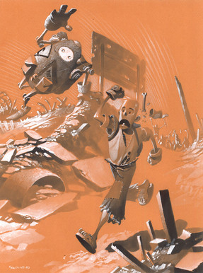
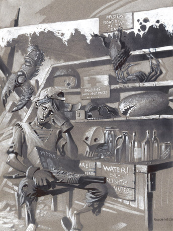
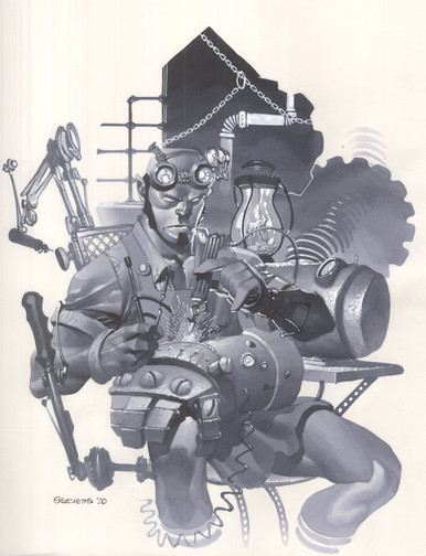
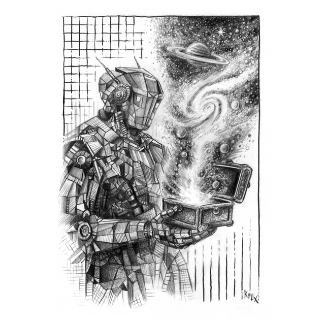
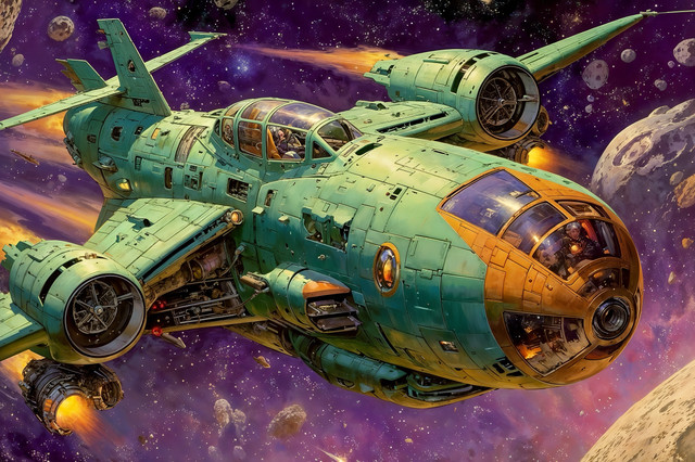
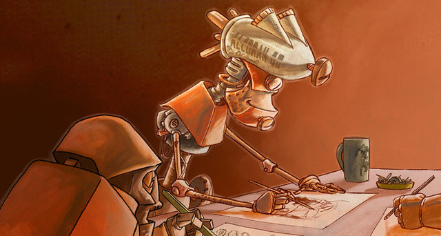
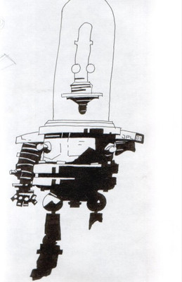
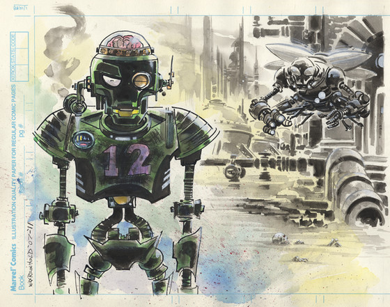
Some more art for Bot and Lenny. Not crazy about the red. A bit much hehe. It does give a bad of a scorched earth vibe though...just a tad stronger than I'd prefer.Marker white paint and color pencil
Bot and Lenny © Chris Stevens
Related content
Comments: 37

This artwork has been suggested for a feature:
Keep up the good work!
~Kaana
👍: 0 ⏩: 0

I totally love this series! It's got a strong Iron Giant meets Fallout vib going for it that I totally love! 
👍: 0 ⏩: 1

Thanks. Yeah, Fallout's a big influence. On a lesser level, so is Wall-E, Road Warrior and few other things. I'm just a big fan of this setting.
👍: 0 ⏩: 0

Delightful rendering, you really nailed those textures.
👍: 0 ⏩: 0

Man, you're doing amazing jobs with those pieces!
👍: 0 ⏩: 1

Wow! The red worked perfect for this piece! So awesome!
👍: 0 ⏩: 0

This bot series is too cool 
👍: 0 ⏩: 1

Thanks. That's exactly what I'm going for.
👍: 0 ⏩: 0

I think the red works really well on this.. makes it look like a dusty haze that contributes to the post apocalyptic type setting.
awesome work as always
👍: 0 ⏩: 1

Yeah I thought the same thing once it was finished. Looks like Mars or something, but it still kinda works.
👍: 0 ⏩: 0

Damn dude, this is so sick.
Your marker pieces are my favorite things in your gallery. What kind of markers do you use? You blend them flawlessly.
👍: 0 ⏩: 1

Thanks, man. Mostly using Prismacolor cool greys, but I use the cool grey Copics for some things..like background elements.
👍: 0 ⏩: 0

I agree on the red, but you may have sumthin here, at least from a storytelling perspective.Colors emulate mood, so it can be used to help tell your story.
Lookin forward to more.
👍: 0 ⏩: 1

Thanks. That's been my thought process too. I can see a comic even with different color papers for certain panels. Blue for night time..red for intense scenes etc...Could be very cool.
👍: 0 ⏩: 0

This is great, just like all your other stuff.
Magneto might work good on red like this.
👍: 0 ⏩: 0

What's nice about the red is that it contrasts the shadow areas perfectly, making the image look more menacing!
👍: 0 ⏩: 1

Thanks. It's definitely giving the scene a sense of dread...not that was intentional really, but it's kinda there.
👍: 0 ⏩: 0

really nice!
have you planed working on a self made colored paper? (dyed with watercolor, ink, acrylic...)
(I'm not sure this sentence is understandable ^^)
👍: 0 ⏩: 1

I hadn't considered that. Sounds like it's be tough. Have you tried it?
👍: 0 ⏩: 1

Yes I made it before with acrylics, and it gave really nice "risky" rhythms to the paper.
Last time, it tried a new approach with the paper, mixing blue ink (the kind you can erase with an eraser), acrylic and bleach.
first, I paint the background with acrylic, and when it's dry, I make a new layer upon it with the ink, dried it and erase "accidentally" the ink with the bleach diluted in water, by a kind of dripping.
the bleach mixed with water change the color of the ink and sometimes erase it. finally, you've got on paper many shades depending on dilution.
If you want an example, in [link] , the headband is made like this, and "cut out" with drawing gum and scrape off with scalpels.
👍: 0 ⏩: 0
