HOME | DD
 Chuckdee — MegaMan...steps and stuff
Published: 2012-02-20 23:21:08 +0000 UTC; Views: 19326; Favourites: 448; Downloads: 435
Redirect to original
Description
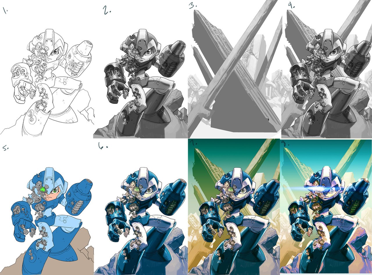
here's the steps for the Megaman piece... really not all that diferent than the Koala piece I posted before.1. I forgot to save the roughs for this one, so I'm gonna start off with the line-art... I knew I wanted to do something a bit more 'painterly' with the debris he's standing on, and also with the background, so I left that stuff pretty open at the line-art stage.
2. Since I approached this one I little more 'painterly' rendering-wise (the Koala was almost strictly two-tone)... I could have removed the line-art and it could have been a 'digital-painting' with a bit more work, but I can't help but like seeing line-art... my comic-book roots won't leave me alone!!!
 (Smile)")
3. I wasn't sure exactly what I wanted for the background, except that I wanted a 'Y' or 'X' type of composition that leads the eye straight to MegaMan's head area... in this case, you can't go wrong with destroyed cities (mainly because it's fast and easy to b.s. details hehehe) ... I also knew that the bottom half was gonna get covered with MegaMan, so no rendering there.
4. I put the figure and background together... move it around a bit 'till things sink-in right.
5. flats
6. mix my flats with the rendered greys (I colorize the grays to siennas or warm-ish blues.... depending on the scene (this technique goes back to the Renaissance...uhhhh... sans the Photoshop layers and 'undo' command).
7. I drop in my background, colorize the grays as well, in this case a warm color, since MegaMan is kinda' cold and in the foreground.
8. this is the fun part (although sometimes a MAJOR headache) where I get to play around and 'push and pull' things until they feel right (the beauty of digital art!!!) ... I wasn't quite sure of this one at one point, so I had to bother Dave Wilkins at two in the morning to look at it and get some advice hehehe... WAKE UP WILKINS!!!
I wanted the color-saturation from old school Capcom pieces, so I really cranked the warms in the shadows of the foreground and also pushed the blue-greens of the back to create more distance between 'em..... a lot of little decisions happen at this time... I usually like to step away from a piece for a few hours (if deadlines allow) and come back and look at it again with a bit of detachment to see what needs to be clearer etc.
I wanted to add more smoke and sparks coming out of MegaMan's exposed mechanics, but it might have looked to busy at that point and I didn't wanna over-work it... so here it is, DONE and DONE!!!
")
Related content


Comments: 55

just make sure you colorize-it when mixing it with your flats... otherwise everything gets 'muddy'.... old Renaissance masters usually used sienna as their 'underpainting color'(they were working with either sunlight or candlelight, so it makes sense all their pieces always had warmth to them), and one or two centuries ago, artist started to also use purple-ish and blue colors as underpaintings as our understanding of color and light 'deepened'(first time I saw this was with Maxfield Parish)..... I personally like it because it works with the way I'm used to working, but that changes from artist to artist!
👍: 0 ⏩: 1

Just made me a richer man ... I didn't know this.
👍: 0 ⏩: 1

<= Prev |