HOME | DD
 Chuckdee — MegaMan...steps and stuff
Published: 2012-02-20 23:21:08 +0000 UTC; Views: 19413; Favourites: 449; Downloads: 435
Redirect to original
Description
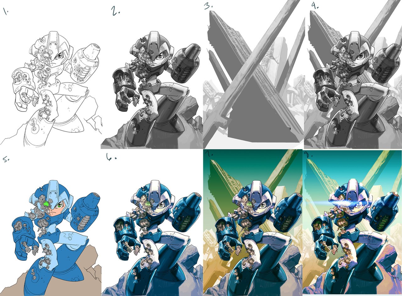
here's the steps for the Megaman piece... really not all that diferent than the Koala piece I posted before.1. I forgot to save the roughs for this one, so I'm gonna start off with the line-art... I knew I wanted to do something a bit more 'painterly' with the debris he's standing on, and also with the background, so I left that stuff pretty open at the line-art stage.
2. Since I approached this one I little more 'painterly' rendering-wise (the Koala was almost strictly two-tone)... I could have removed the line-art and it could have been a 'digital-painting' with a bit more work, but I can't help but like seeing line-art... my comic-book roots won't leave me alone!!!
 (Smile)")
3. I wasn't sure exactly what I wanted for the background, except that I wanted a 'Y' or 'X' type of composition that leads the eye straight to MegaMan's head area... in this case, you can't go wrong with destroyed cities (mainly because it's fast and easy to b.s. details hehehe) ... I also knew that the bottom half was gonna get covered with MegaMan, so no rendering there.
4. I put the figure and background together... move it around a bit 'till things sink-in right.
5. flats
6. mix my flats with the rendered greys (I colorize the grays to siennas or warm-ish blues.... depending on the scene (this technique goes back to the Renaissance...uhhhh... sans the Photoshop layers and 'undo' command).
7. I drop in my background, colorize the grays as well, in this case a warm color, since MegaMan is kinda' cold and in the foreground.
8. this is the fun part (although sometimes a MAJOR headache) where I get to play around and 'push and pull' things until they feel right (the beauty of digital art!!!) ... I wasn't quite sure of this one at one point, so I had to bother Dave Wilkins at two in the morning to look at it and get some advice hehehe... WAKE UP WILKINS!!!
I wanted the color-saturation from old school Capcom pieces, so I really cranked the warms in the shadows of the foreground and also pushed the blue-greens of the back to create more distance between 'em..... a lot of little decisions happen at this time... I usually like to step away from a piece for a few hours (if deadlines allow) and come back and look at it again with a bit of detachment to see what needs to be clearer etc.
I wanted to add more smoke and sparks coming out of MegaMan's exposed mechanics, but it might have looked to busy at that point and I didn't wanna over-work it... so here it is, DONE and DONE!!!
")
Related content


Comments: 55

I love the piece of art but I also like the step by steps. I'm still grasping digital drawing and this was really helpful.
👍: 0 ⏩: 0

very cool,awesome,pelase check out my character 'SNIPER',thanks
👍: 0 ⏩: 0


Awesome, thanks for sharing! Do you have any more information or a starting point to learn more about the Renaissance technique of shading with blues (or a different color)? I'd be interested to learn more about the history of that.
👍: 0 ⏩: 1

because I'm a lazy bastard, I shall copy-paste the explanation I gave to someone below!
the color of your shadow is typically the complimentary color of the light source (on a color-wheel), so if you have a bright-yellow mid-day lightsource, then the shadow will be a blue-ish purple, or if it's at night, and you have a blueish lightsource from the moon, then the shadows will be a warm color.... sienna works really well because it's a neutral color, and it warms the tones you apply on top of it.... mind you, this is not an exact science, it's based on 'general methods', and the rest is based on your own taste... just remember that shadows are NEVER black or grey, and light is NEVER white!
👍: 0 ⏩: 1
Thanks for the reply. Awfully nice of you to share.
👍: 0 ⏩: 0


great work! 
NEW COMMISSION OPEN: [link] 

👍: 0 ⏩: 0


can i ask sir??Do you colorize your grays always to siennas or warm-ish blues,or just this time tha megaman flats are also blue???
👍: 0 ⏩: 1
I always colorize them, if you leave them gray they will suck the life out of your colors!
👍: 0 ⏩: 1
understood..but always sienna or blue?how do you choose witch color colorize them?
P.s:sorry for language errors,i'm italian
👍: 0 ⏩: 1
the color of your shadow is typically the complimentary color of the light source (on a color-wheel), so if you have a bright-yellow mid-day lightsource, then the shadow will be a blue-ish purple, or if it's at night, and you have a blueish lightsource from the moon, then the shadows will be a warm color.... sienna works really well because it's a neutral color, and it warms the tones you apply on top of it.... mind you, this is not an exact science, it's based on 'general methods', and the rest is based on your own taste... just remember that shadows are NEVER black or grey, and light is NEVER white!
👍: 0 ⏩: 1
Thanks so much!Even fan-artist don't explain too much about theyr works!You are a special person,sir!
👍: 0 ⏩: 1
hehehe... my pleasure Man!
👍: 0 ⏩: 0


looks like you had fun with the J.J. Lens Flare on Panel 8
Great stuff man!
👍: 0 ⏩: 0

I've never understood how to do this. I still don't, but that doesn't change the fact that this is amazing.
👍: 0 ⏩: 0
Sorry mister,if i can ask......how do you MIX the flats with greys?????
👍: 0 ⏩: 0

wow, thanks for this steps, i have one question
👍: 0 ⏩: 1
I usually lay the graytones set to multiply on-top of the flat layers.... and then if I have to, I play with levels on the grayscale layer to make sure the colors mixing aren't burning... it also helps if your flat colors aren't too saturated, otherwise, stuff can get garish and 'burnt' looking really fast.... it's a matter of experimenting and making mistakes so you can find the 'sweet spot' in your own method!
👍: 0 ⏩: 1
ohh, i never thought play with the levels to adjust..jejeje XD, i'm gonna put that in practice the next time,and experiment a lot
👍: 0 ⏩: 1
yeah, I love learning new techniques of doing things, even if it's something I am comfortable with, there is always something new to learn, BUT equally important, is just pure experimentation... everybody develops their own system of doing things based on trial and error. Sometimes we tend to look for a 'magic bullet' when there is really none, it's all just practice, practice and then more practice!
👍: 0 ⏩: 1
yeah, you right, a lot of practice and experimentation...great words
👍: 0 ⏩: 0


The destroyed city has a Fortress of Solitude vibe going on in the stand-alone grays.
👍: 0 ⏩: 0


I absolutely love seeing these process pieces. Keep 'em coming!
👍: 0 ⏩: 0


Really informative and interesting, to say the least.
Just a suggestion: ever tryed to, instead of colorizing the grays, applying the grays over the flats? "Hard Light" blend tends to do this nicely, specially if you were going for something more saturated.
Anyway, just a thought. A great walkthrough to a great piece of work. Major respect for it, man!
👍: 0 ⏩: 1
thank you for the suggestion... that's the beauty of Photoshop, there's a gazillion different ways of doing similar processes!
👍: 0 ⏩: 1
Or pretty much any graphics editor, so long as it has the basics for this kinda thing. ^^
👍: 0 ⏩: 1
yup yup! ... I think many modern 'art-schools' focus waaaaaaay too much on teaching the software, but neglect teaching the basic rules of composition, anatomy, color theory etc.... so regardless of how you do things, whether you do work digitally or 'analog', all the same guidelines still apply!
👍: 0 ⏩: 1
Not only that, they also teach as if photoshop is the only software capable of doing this sort of thing, when there are other programs that do exactly the same, and sometimes even better. PS IS good, and a powerful all-rounder for any kind of graphical work. But the market's a TAD bigger than that.
Inversally proportional to most artists' pockets, if ye catch my drift. XD
👍: 0 ⏩: 0

Chuck... I want you to know- Your art makes me happy.
But seriously this is just frigg'n awesome man
👍: 0 ⏩: 1
hehehe... well thank YOU very much!!!
👍: 0 ⏩: 1
Of COURSE! (speaking in M Bison voice)
keep pumping out art how you do man ^^
👍: 0 ⏩: 0

You really shade in Grayscale?... do a lot of people do it this way?
👍: 0 ⏩: 2
Actually yeah, I know several "pros" that do this but no clue how it works honestly
👍: 0 ⏩: 0
some do... I like greyscale 'cause I don't get distracted by color and I am focusing purely on values... color is still not-quite second-nature to me, so I like to make sure my values are working correctly first before I start adding color!
👍: 0 ⏩: 2

Thanks for the walkthrough. I am currently struggling with color and have been trying all sorts of different techniques. I am going to try yours.
👍: 0 ⏩: 0
You know what?... I should try that at some point, see how it'd work for me
👍: 0 ⏩: 1
| Next =>