HOME | DD
 Ciril — Nejc

Published: 2006-05-20 10:20:25 +0000 UTC; Views: 1011; Favourites: 3; Downloads: 248
Redirect to original
Description
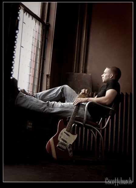
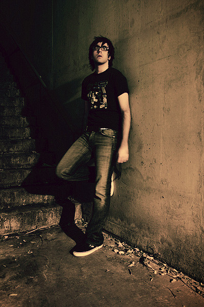
part of my commision for Mercedes magazine. (Smile)")
i would really like to hear opinions on this one.
and please also CHECK these: [link]
which one is your favourite??
model: Nejc Gazvoda (young successful writer)
assistant: Jan
canon 20D, 2 flashes, reflector, 18-50mm sigma 2.8
Related content


Comments: 42


I like the one with the tree too, you should definatly choose that one.
👍: 0 ⏩: 0

sorry..for some reason i can't look at the other pictures...this seems great,i love the lighting but the tones could be a bit warmer...and the eyes...they're not right..thats what pops out at me...that because of the lighting difference it seems that one eye is half-closed and the other is open...so that's not so great..but still a good portrait!
👍: 0 ⏩: 0


the one under the tree and the last one.
the one you uploaded here suffers from the background...
👍: 0 ⏩: 0

I like the one totaly on the right. It gives amore open idea. to him.
👍: 0 ⏩: 0

the third (last one) and the last are my favourites. they show him intimitely.
👍: 0 ⏩: 0


These are all great shots, man. I would give low res samples of all of them to the magazine, and let them choose. That way they can see what you are capable of (of course they already know, but it doesn't hurt to remind them!) Whenever I'm commisioned for work I try to give them a little more then they expect and as a result, I get call backs. Seriously all great shots!
👍: 0 ⏩: 0
 (Wink)")

haha lahk bi me vsaj omenil. ")
👍: 0 ⏩: 0

I don't like how the feet are closer to me than his face; I find it distracting and slightly disportionate. If he'd been squatting, leaning forward with the same expression he has in the last image in that panel, it would be money.
The black bar is fine. The location is sorta futuristic, sorta sleek and modern.
First shot is a nog go. Nothing remarkable about it, and the angle is way too distracting and the color unnecessary.
The second is something I'd expect to see in a tech magazine, about a inventor or a product designer or a computer engineer or something. Just not a writer. Unless he writes science fiction, having your subject in a location that doesn't relate to what they do or who they are is merely inutile.
Third is good.
Fourth is good too, but for editorial portraits, maybe having him in a different shirt instead of a pullover will change your following images a lot.
Fifth is a good follow up shot. Nothing that should go on the lead page, but it'll work for a follow-through.
Sixth isn't bad, but it could've been combined with 1 or 3 to make a truly great portrait.
Cheers.
👍: 0 ⏩: 1
thanks for your opinion mate! yeah i am aware of these mistakes...but such photo sessions are always very difficult...you have to think about so many things... you have to be in a contact with the model... and so on... and i am often suprised by some mistakes when i upload images.
btw i am so behind with your work... sorry.
👍: 0 ⏩: 1
All portrait sessions have their difficulty, no matter who the photographer is. But the thing about you is that you have the talent and you're resiliant. You make good images that people will like. I'm a portrait photographer so I notice the small nuisances that browsers overlook.
I hoped the critique helped. I'm a fan of the location.
And don't sweat it. I'm wicked busy with my new staff position at this newspaper and I'm waiting on Jeff Lipsky's final review.
Hope all is well, mate!
👍: 0 ⏩: 0

Ta 3. in ta 4. sta meni najboljši. Če hočš popolnoma ravne črte uporab foto velkega formata
👍: 0 ⏩: 0


great work... but in this one i don't like very much how shadows from his lenses are projected over his face... they dont give a clean look.
from the strip, my favorite, no doubt, is the rightmost one. lovely colours. narrow dof. great expression. lights are perfectly balanced.
👍: 0 ⏩: 0
hm nism registriran pa ne morem pogledat...jao... registrirat se pa ne da...
👍: 0 ⏩: 0

From your link, my top 3 are, in order of best first - the 2nd pic, then the 6th pic, then the 4th pic.
All very nice though!
👍: 0 ⏩: 0

Also, as to the best of the collection, I like the one on the far right.
👍: 0 ⏩: 0
Very nice shot. I'm not sure if you'd want to do something about the black bar above his head. It really pulls my attention away. But the lighting is great.
👍: 0 ⏩: 0

I think I like this one the best out of the selection. It has the most dynamic lighting and stands out the most, to me.
👍: 0 ⏩: 0

opa, sem opazil da je nejc objavil eno izmed fotk na jokerjevem forumu - nisem si mislil da je tvoja.
good job!

👍: 0 ⏩: 1

čudovita fotografija
Lp
👍: 0 ⏩: 0

i find the low perspectives a bit distracting, to be honest. 3rd and 5th one are my favorites, though 4 would be good if you had been on the same level as him.
👍: 0 ⏩: 0

i like the third one and the last one. really nice shots.
👍: 0 ⏩: 0

I looked at this one, as well as the other ones. This one is great, but I like the close-up one the most!
Really great series, I tell you. I would be thrilled to be in one
")
👍: 0 ⏩: 0

Composition needs improvement, having a horizon running through someone’s neck doesn’t give your subject or yourself credit.
👍: 0 ⏩: 1
i dont agree. yes it would be a problem when it would run through the head...but neck is fine.... i mean it was impossible to change that. his head is also very much in thirds or golden cut...
👍: 0 ⏩: 1
The neck isn’t a substitute for the head, if anything, below the neck is reasonable and that’s standard industry practice both in photography and in motion mediums as you should know. But as you are at a very low angle, plus you had the stairs, so as you said it would have been impossible to change that from that setup therefore you can justify your means.
Unfortunately by no means does it do justice in helping make it a powerful compelling photograph, and thats something that can not be ignored.
I don’t mean to come over as a troll; I was just trying to give you an honest critique of your work specially since its for a commision.
Favourite ones are the tree and the last close-up picture you had submitted in that extra link. I have also sent you a private message with a few questions properly best if I asked there. Check your messagers please. I do not want to continue this here.
👍: 0 ⏩: 0

i think the pics there in that link are all great, but i like the last pic the most
👍: 0 ⏩: 0

Wow, incredible detail and focus. A bit too overexposed on the face but I guess you needed that for the background. Nice tones.
From the link, the second, fifth and sixth are best

👍: 0 ⏩: 0

you never care about parallel lines in this series, allthough it is for mercedes. i think for this company, i'd always take my time for composition and perfect framing. your angles are always looking up, so that you have falling lines everywhere, you have cruves instead of lines. i prefer the photos that are closer to the person, like the last one and the tree one. i also don't see why you don't leave them in b/w, this duotone with green shadows doesn't appeal to me very much, which is my opinion but photos with human subject shouldn't have such tones except you go for necrophilia.
👍: 0 ⏩: 1
third one is also my favourite yes...and i indeed have a problem with parallel lines! what do you suggest? well i can fix that in photoshop right...but they wanted only one picture anyway. what about shift lens?
thanks for your opinion mate. i am aware of this problem very much.
as regards tones... i love it. what do you mean by necrophilia?
👍: 0 ⏩: 1
you have straight lines when you are paralell to the subject and it also help to use focal lengths above 50mm. wide angle needs more accuracy with the parallel lines to the fame, it still works of course. you can always straighten lines in ps afterwards but with human subject in it, it can look strange.
the tones look kind of dirty, i meant you'll please people that like photos of dead people
👍: 0 ⏩: 1
i see. hm well i know that you have straight lines when you are paralell....and that the best thing for portrais is between 70-130mm....
hm maybe i need 85mm fix.
👍: 0 ⏩: 1
on a 20d your 50 is a 85 on a fullframe... so use this one i'd say
👍: 0 ⏩: 0

You know, you never cease to amaze me Ciril. I've had you on watch for quite some time now, I always get amazed by your picture. You make even the most regular portrait look so good!
👍: 0 ⏩: 0