HOME | DD
 ClaireLyxa — Tiguesse

Published: 2012-09-15 12:05:34 +0000 UTC; Views: 2268; Favourites: 145; Downloads: 8
Redirect to original
Description
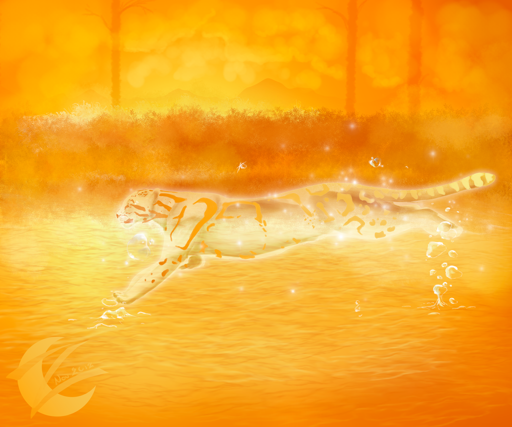
 Seeing the different drawings of tiguis for my contest, I wanted to draw agin my animal. But this time I drew the female of Tigui : a Tiguesse.
 En voyant les différents dessins de tiguis pour mon concours, j'ai eu envie d'en redessiner un. Mais cette fois, j'ai dessiné la femelle du tigui : une tiguesse.
 Info for the contest : [link]
Ref: [link] and [link]
--------------------------------------------------
--------------------------------------------------
tigui © Lyxa
Artwork © Lyxa
--------------------------------------------------
Website
Blog
Related content


Comments: 30


Technique
This image really popped for me in the preview made. That's a hard thing o accomplish. One way is to step away from the work (not backing away) and when you get about twenty feet away, turn and notice what you see. The critique was spot on, and very fair. The solution might be to run some lighter colors back along the top edge where the white stops. That would imply more shape to the flatness mentioned. Good luck, I like it. The rest of this critique is to fill in the need for one hundred words. just ignore this part. LOL
NewYorkRod
👍: 0 ⏩: 1

Thank you very much for you comment.
I will try your advice the next time or if I have the motivation I would correct this drawing.
Thank you
 (Smile)")
👍: 0 ⏩: 0

Overall
Originality
Technique
Impact
I looked at the two photos that you used for references and I can see them easily in this image. Your color choice is pretty good, and the shapes are incredibly accurate. I do notice a few things that maybe need some improvement. The shading makes it a little difficult to see some of the edges of the cheetah and the trees. I know this may have been intentional but the picture looses some of its 'pop'. Specifically the hind end of the cheetah is a little flat. The pattern of the spot work is realistic which I really like to see. You didn't just throw on spots. Overall I would say it is pretty good.
👍: 0 ⏩: 1
Thank you very much for your critique.
Yes you'right, to the rear of the tiguesse the shading is to flat, and it is difficult to differentiate the animal with the tree. But I didn't find really a solution for that, because this part is dark...
Or else I am touched that you like my work. Thank you.
👍: 0 ⏩: 0


")

 (Wink)")


My god cest trop beau ")
👍: 0 ⏩: 1
Merci beaucoup. Ça me fait plaisir que tu apprécies mes fonds
👍: 0 ⏩: 0


I am glad that you like her spot
Thank you
👍: 0 ⏩: 0