HOME | DD
 clindhartsen — Focus - Text Editor
by-nc-nd
clindhartsen — Focus - Text Editor
by-nc-nd
Published: 2010-08-21 21:47:00 +0000 UTC; Views: 7274; Favourites: 20; Downloads: 480
Redirect to original
Description
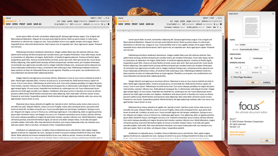
Continuing down "Metro Across Windows," this one is a try at a WordPad/TextEdit style program for basic text editing.More advanced than Notepad, 'Focus' would provide you a crystal clear UI, excessively basic at that, which would let you focus on the work you're set to get done. Change font sizes and types, your basic modifications, alignment, plus lists and insertable images and such, it covers everything you'd need for most text editing, plain and simple.
It's called focus because the UI is supposed to be out of the way, something which you can simply ignore when you don't need it and quickly understand when you need it.
Anyone have any suggestions for improvements on this?
Related content


Comments: 15

It's fun to create Metro interfaces but you can't make all the tools text based buttons. It needs some graphical metro buttons.
Still it looks better then notepad ")
Great work!
👍: 0 ⏩: 0

There was Metro inspired text editor on codeplex called Bend, site is down or something currently. But there are reviews of it at many places (incl. lifehacker)
What's the possibility of Focus being available to general public, i wanted to know?
Its a pity that one can count all available Metro UI application on 1 hand. Such potential. I wish you all the best.
👍: 0 ⏩: 1

It's purely a concept in Photoshop at this point, but I'm going to do some research and see what it would take to make this an actual program, unless I can get assistance by a programmer elsewhere.
Blend was an interesting project, though I'm not sure why they took it down.
Metro should be in more instances, but sadly it isn't, or it isn't being seen widely. Still, if you haven't tried it and am a Twitter user, check out MetroTwit
👍: 0 ⏩: 0

I think "NEW | OPEN | PRINT | SAVE | SAVE AS" should be in a top left menu like the firefox 4 betas and get the options down to 2 lines. The options should be spaced a bit so it doesn't look cluttered and confusing.
👍: 0 ⏩: 1
The only thing I'd worried about in moving actions to a menu under the program name would be discovery being more difficult.
👍: 0 ⏩: 0


The top-right area seems cluttered, particularly in the second window, when ALL of the options are text.
I think that would be a subject/area safe to go with stylized buttons, yeah? The traditional faded buttons when left alone, and only the one hovered over would darken to focus.
👍: 0 ⏩: 2
[link]
One idea on changing it, but buttons like you see in the MetroTwit app, or the WinPho7
👍: 0 ⏩: 1
My thinking was something like the round buttons of MetroTwit, yeah. If the circled buttons still feel too busy (this might be the case if the circles are too close together), the Zune software uses some stylized buttons without circles on them.
👍: 0 ⏩: 1
I hope the link works, didn't realize a direct one out die out. It's also available here: [link]
I'll try the other as well. I'm just debating what would look more distracting.
👍: 0 ⏩: 1
The first link broke; the second link worked, but I was getting a broken JPG.
Your style at [link] is looking good, though. Clean and not-busy.
👍: 0 ⏩: 0