HOME | DD
 cluedog — Which Massacre?
Published: 2011-03-17 00:30:53 +0000 UTC; Views: 2797; Favourites: 23; Downloads: 218
Redirect to original
Description
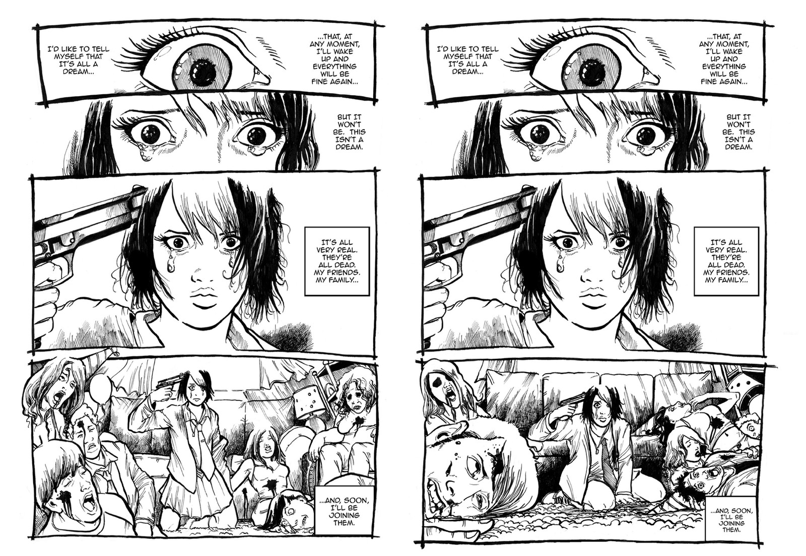
Howdy folks,I've been busy working on the new version of the sixth page of "Miss Doomsday", but I went back and re-drew the bottom panel of page one. I'd like to solicit your opinion. I've placed two versions of Page One side by side. The first one has the old version of the bottom panel, while the second one has the new bottom panel. Which one (if any) do you like?
Any thoughts would be greatly appreciated.
Related content


Comments: 56

I'd choose the left one, since the dead mom helps a lot to the drama around this page.... but I really love the dead guy in the front of the panel in the right one!
👍: 0 ⏩: 0

I vote for the left one.
Really it depends on the feeling you're looking for. The posture and facial expression on the left makes it seem like she's more composed and resolute. More accepting of the situation and more likely to go through with suicide. On the right there's more a sense of helplessness than anything else. Like she can't bring herself to actually fire the gun and is about to break down into tears of helpless frustration.
👍: 0 ⏩: 0


I'm going to be difficult and say that i like the background/foreground of the right version but "Miss Doomsday"'s position in the left. So a combination of the two would be best, IMO.
👍: 0 ⏩: 0

I like the better the right one.
Reasons:
the woman with the funny hat and the guy below at left pic don't seem so (dead) natural as the guy at the right pic, with his mouth slightly open and eyes, that's dramatic. Also all the view point looks better.
Also. These pics are among the best comic stuff i have seen on deviant. it is hard to find good artists with good sense of design and style in comic strip.
👍: 0 ⏩: 0


I like the mix of the pose in the left panel and the layout and contrast in the right one. And I like the view of the window and curtains in the left one too.
👍: 0 ⏩: 0


I like the girl from the left one, but I like the bodies on the right one...
👍: 0 ⏩: 0

The right is better. The closeups look grimmer and her pose looks more desperate.
👍: 0 ⏩: 0

I think both work well for what you want to tell in this page, Zac.
I think the one at the left, for some reason, looks nicer on the page, while the one at the right, seems to have more impact.
I think it is because the close-up of the head in the foreground, and also because of her pose, where she looks defeated. And the fact that she is placed in the center of the panel, more isolated from the rest of characters that in the previous version, makes the scene more desperate. In conclusion, I guess the 2nd one is more effective, at least in my opinion.
👍: 0 ⏩: 0

Can I be awkward and say I like the girl and the curtains from the left and the bodies from the right?
👍: 0 ⏩: 0

I'd go with the right one, the reader can take in the panel much easier because there's a bubble of sorts around her where there's no carnage and she's more centered in the panel. It makes the reader focus on her quicker, she seems slightly more desperate and I just like the way her collar and necklace line up, kind of makes it less cluttered
👍: 0 ⏩: 0

Actually, I would suggest to you to take the best elements from these two and apply them to the third version:
kneeling from the left is better cos it is also symbolical. Dead people on the right of the right version are better. Dead people on the left of the left version are better (tho, I would tilt the head of the guy up front more to the left).
All in all - not bad mate, not bad at all!
Cheers!


👍: 0 ⏩: 0

What I like best is the male head in the left corner of the right panel. The close-up and the expression are great. But for the rest I'm not sure.
👍: 0 ⏩: 0

To be honest I can't decide which version I like better. I'd know if it would help any but I will say about I like about each.
Her pose in the first version is more aetetically appealing, and yet the new pose fits her emotions at this point better.
With the dead bodies the closest man's face in the new version looks spectacular! I think the bodies look generall better in that panel. Though in the old version I do like the dead mother because I recognize her, foreshadowing I do enjoy.
The like the background more in the old panel, the curtains and the carpet looks better.
👍: 0 ⏩: 0

")

I liked the one on the left because her pose makes her seem extremely stunned and and overwhelmed and the characters seem less goofy, but there's some good arguments for the right one.
👍: 0 ⏩: 0

I like the one on the right. I like the perspective you created.
👍: 0 ⏩: 0

The second one, I prefer the people and the dead body on the left gives it a gruesome. I also prefer her pose because it's more alive and bleak. Though I like the mother there on the left so maybe if you could include her, but otherwise I really prefer two.
👍: 0 ⏩: 0


The second one. I like the new panel...the pose is just more...alive.
👍: 0 ⏩: 0

I like the second. seems more real, less comedic. More likely she would try and shoot herself over something that looked like THAT
👍: 0 ⏩: 0


I like the one on the right more. there's a greater sense of hopelessness in her expression and pose.
👍: 0 ⏩: 0

The one on the right, Anne's expression is much more powerful, and the dead guy in the forground on left really hits it home that it's the big bad.
👍: 0 ⏩: 0

Second is more gruesome, but I also like the wider angle of the first page's final panel.
👍: 0 ⏩: 0

First one, I guess, since it's more coherent with the posture from panel 2.
👍: 0 ⏩: 0


I have to agree with ~jeffcee as M.D.'s pose in the left side looks better than the right, but the group on the right side looks better than the left. So sort of a combination of the two?

👍: 0 ⏩: 0


Tough call. In general, I like the left better.
The left side girl on the right example with the black eyes kinda creeps me out in a bad way. Although having the mother that way is fine. (Maybe it's the smaller black splotches.)
However the guy in the lower right corner (of the left example) is pretty cartoon-ish compared to the one on the right example. So, if you could replace the one with the other, it would be better.
Also, the right one seems busier on the right. (i.e. more bodies)
There is less emphasis on the carpet on the left which is good. The carpet isn't that big a deal unless it is the killer.
And lastly, I agree with whoever else mentioned her being vertical. The bodies all point/lead back to her on the left example.
👍: 0 ⏩: 0


I will try to say it the most constructive as possible.
All is about panel 4 as I see, at 1st glance I said myself that I prefered the right side of the Second Version (V2) and left side of Version One (V1) with Anne of (V1)
Then I took the time to observe the details so I concluded this: On V1 we clearly see it happen on her birthday AND it was at HER house, why? Well, we see her dead mother on right (a restricted woman on medics rarely go out) and a girl with at birthday hat on the left, plus the posture of Anne holding the gun on her head is far more dynamicaly dramatic and convincing. On V2, even Einstein would say she doesn't look like she is going to shoot and we don't see her mother on the panel wich make it not that dramatic even with a mega dead face close up, so It's what I say from what I saw
 (Smile)")
👍: 0 ⏩: 1

a wonderful observation, i too, see more of a coherent story on the left.
👍: 0 ⏩: 0

 (Wink)")


Hmm...I like the expression of the character in the first one...but I like the surrounding dead people in the second...but which is better? There's only one way to find out...FIIIIGHT!!
...Er, but in all seriousness, I would go with the left, one as my preferred page
👍: 0 ⏩: 0

The right one. The poses of the corpses look more natural to me.
👍: 0 ⏩: 0

I like the left one, with her head above the rest it becomes the focal point, my eye is drawn to it. The right version is also excellent, but my eye bounces around a lot more. I think the white space around her head also gives a halo effect. just my .02
👍: 0 ⏩: 0

On the right, definitely.
It drives her desperation, and the whole macabre situation home better
👍: 0 ⏩: 0


The one on the right is more visceral I think because of the closeups.
👍: 0 ⏩: 0
| Next =>