HOME | DD
 cluedog — Which Anne?

Published: 2011-01-26 20:50:50 +0000 UTC; Views: 2349; Favourites: 24; Downloads: 217
Redirect to original
Description
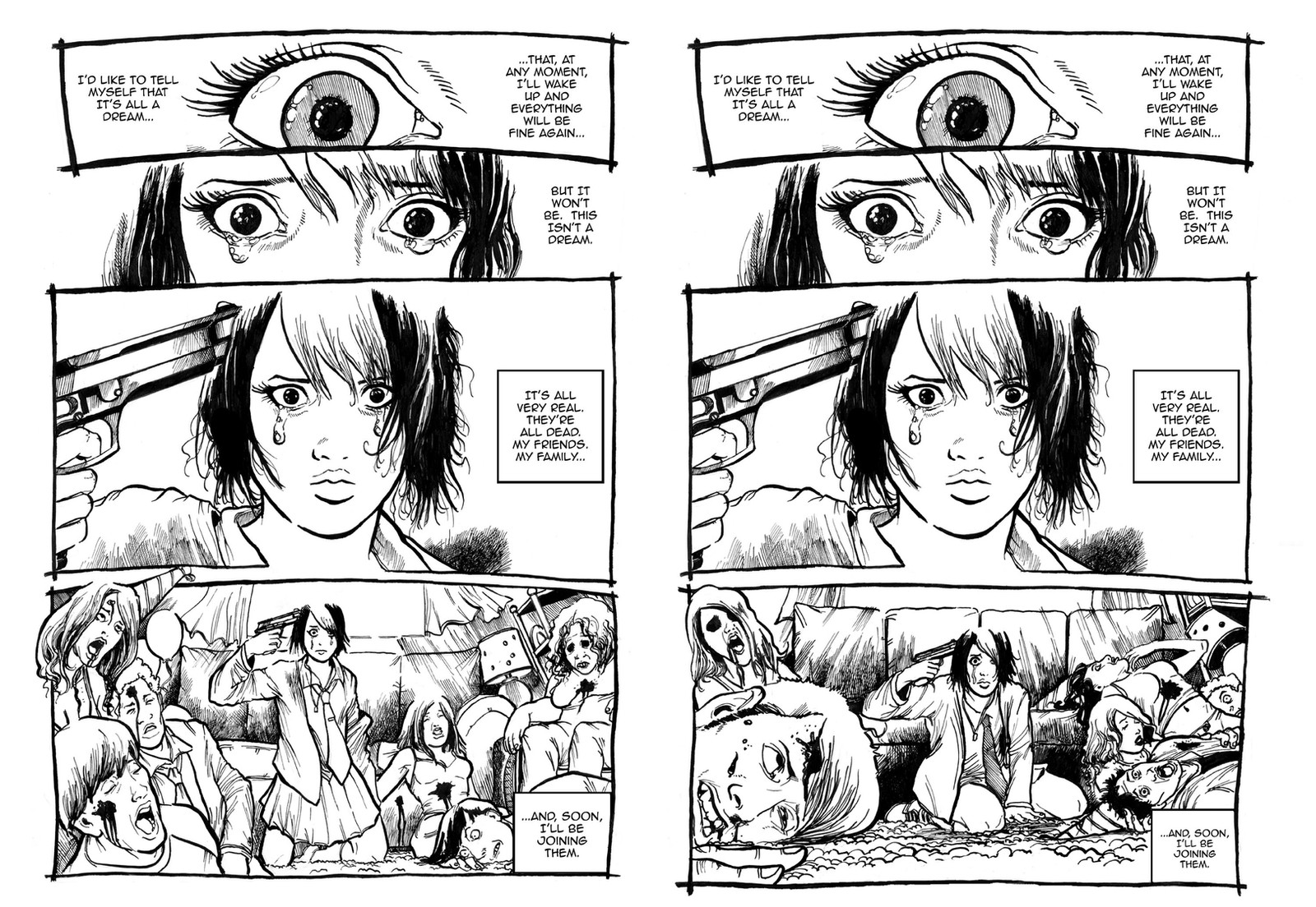
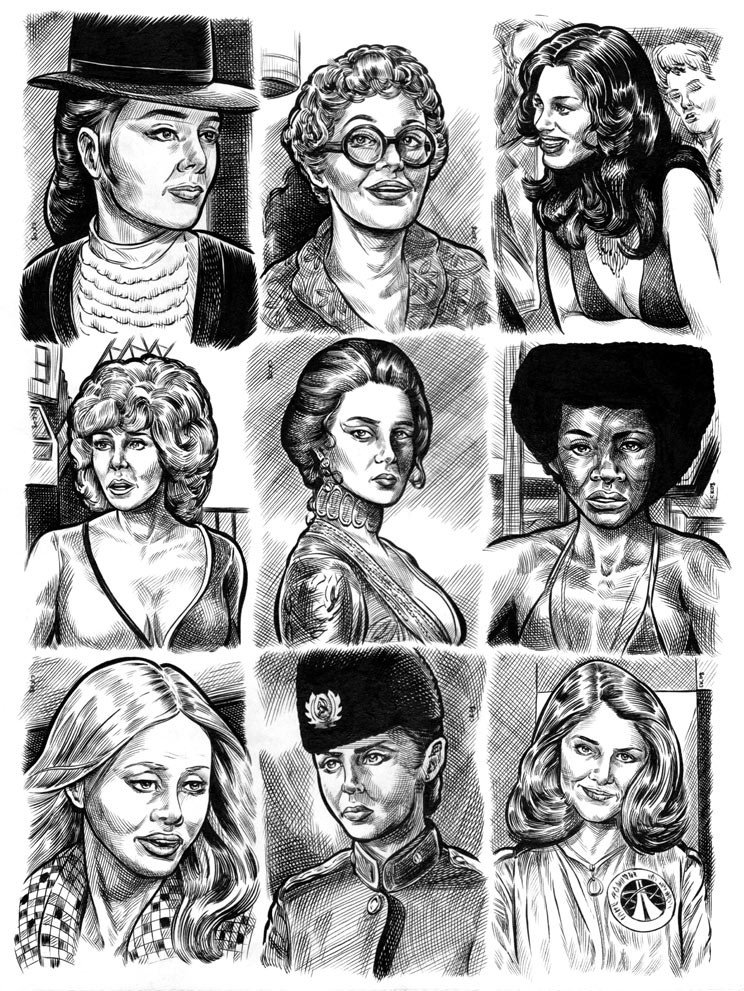
Howdy folks,I'm revving up production on my comic "Miss Doomsday" and I wanted to ask you fine people out there in DA land an opinion. One of the things that has tormented me for quite some time is the overall design of Anne Hedonia. I've gyrated between cartoony versus realistic Anne, blond versus black haired Anne, and I've gone through a multitude of designs for the girl. That's because, like "Opey the Warhead", the comic means a great deal to me, and I want to get things to look as perfect as I can.
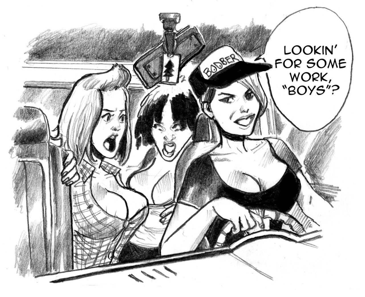
So, the question I'd like to ask is: in the drawing above, which design for Anne do you prefer? The two images above are two renditions of the middle of page 1, seen here: [link]
I think Anne looks cuter and more scared in the top version, more psychotic and disheveled in the bottom one. I know I've redrawn page 1 a hundred times but, if I used the design for Anne from the top, I'd probably have to redraw most of the seven pages I've already posted here on DA. But it would be the LAST time.
Any help in the decision making process would be of great help.
Which Anne do you think I should go for?
 (Smile)")
Related content


Comments: 48

I prefer a mix... she'll be like the cuter version most of the time, but suddenly there will be a big shadow on her face and she will look like the bottom one. depends on her mood and the situation I guess.
👍: 0 ⏩: 0

Don't know; the first is sympathetic and can connect to the audience.
The second looks deranged and can show horrid torment. Go with what you're trying to CREATE more than what simply looks better.
👍: 0 ⏩: 0


Actually, I think the top one is definitely the best one. Not because that one's a lot cuter than the bottom one (emphasis on "a lot") but because she has a pretty much blank expression on her face and yet she's crying. Well, she does look a little bit sad and shocked, but knowing that she's surrounded by her friends' dead bodies, her expression is really an understatement, and to me that implies she's accepted the fate that's come over her.
The bottom one invokes "anger" rather than "acceptance". She also looks a bit more crazy on that one. Then again, maybe that's what you're aiming for.
👍: 0 ⏩: 0

I think it depends on what do you want with her in the story, both draws show a different person, you can see that the first one kinds of looks like she wants to be saved, more innocent if you like and the second one like she has nothing to lose. Main difference is the shape of her jaw, the bottom one makes her look older and sharper than the first one, the thing brows add to the effect too.
So the question is, what do you want to go with her personality? To me they look like these shots were taken in a different moment of the story.
Now for tastes, I'd prefer the first one, mostly cause I don't like her bottom lip in the second one.
👍: 0 ⏩: 1

@JadeGL: Exactly what I was thinking.
@cluedog: On artistic merit only, I think both are good. Of course I like the "cuter" top one, but on the other hand I've always admired your ability to be unafraid to draw people as they would really look. The second one and her like may be less attractive, but real people are not perfect. And because of this, I'm able to think of the characters in your stories as real people, and empathise with them more. It greatly adds to the depth, in my opinion.
That said, it is just an opinion. Go with whichever you think best suits the mood and theme of the story.
👍: 0 ⏩: 1


I choose the one on top. It's more cartoony, and I like it!
👍: 0 ⏩: 0

I agree with ~danmtzp. Where are we in the storyline, and where do you want it to go from here?
Is this scene the ultimate beginning of her story? Or is she supposed to be a hardened killer at this point?
👍: 0 ⏩: 0


i say it depens on what you want for the story, (I hadn't got the pleasure of reading your comic) i belive that in the first pic she is sader but in the second she will kill... maybe not herself but some on is going to die so i would use the second look but just for this pic for the main thing the first but that is just a sujestion
PS your art is increadible
👍: 0 ⏩: 0

Hrm, a tough choice... i personally gravitate towards the lower one, but maybe some form of middle ground?
👍: 0 ⏩: 0

I honestly prefer the first, but the second has it's points too. Go with your gut, it's your baby!
👍: 0 ⏩: 0


Top one, but I like the eyes in the bottom one, they convey more emotion
👍: 0 ⏩: 0

I like the bottom version. She looks like a person who has nothing left to lose and very jaded. The top version is nice but she just looks like a very frightened person and not some one who has lost a lot and is very jaded about it.
👍: 0 ⏩: 0


for me in the top versio she look in total despair, she can't run away... on the bottom version she lost concious and act like a crazy person who can't really think about what she is doing...
but it still personal! for me both of them have a strong impact but it's depend after what you really want make the reader thought!
👍: 0 ⏩: 0


With the text you have on the bottom one, the top one seems to fit the writing more.
👍: 0 ⏩: 0

I love them both but I will keep it short and say that the top image wins for me. There's something about seeing the whole of the eyes that makes it look madder!
👍: 0 ⏩: 0

I agree with Demontales - Both are lovely to look at. The 1st image is striking, but the 2nd image has a great expression.
At the end, she is a wonderfully dishy and nuts character, and your choice is whatever pleases the inner art demons!
If pushed, I would go for the 2nd image, as I love her wicked eyes!
👍: 0 ⏩: 0

I prefer the style of the first one, but the expression of the second. But for the expression, it depends of her personnality. The first one grabs more of my attention.
👍: 0 ⏩: 0

I'd personally go with the bottom one mainly because there's an empty "I just want to die" kind of look to her eyes that really captures the moment best. The top one is cute, but I don't think the look is portraying the emotion you want the audience to experience.
👍: 0 ⏩: 0

There's so many things to think about, really. The top one is definitely more of a demographic pleaser, but the integrity of Anne's character is somewhat diminished in that light. Yes, she's more appealing - girly, wide-eyed, pouting; you can easily see her being played by the waif-like hollywood hottie du jour (but let's not get too far of ourselves, eh? 
For me, it's Bottom Anne. I think Top Anne is definitely going to score some points, but I wonder if there's any chance of bringing the two together. I can't imagine you haven't wondered that or redrawn Anne over again to see for yourself already. Whatever you choose, I'm eager to see more.
👍: 0 ⏩: 0

Well here is my two cents, for a comic about the apocalypse you will probably want something the may balance out such a dark tone, and the top image does this. But not only that, but it's much more bold than the more realstic version below.
👍: 0 ⏩: 0


I think the one on the bottom better fits the reaction to the text on the side
👍: 0 ⏩: 0

I'm all for psychotic Annie. She's been through a lot, I imagine - no point in being scared, rather defeated with that fascinating glimpse of ... defiance? Is that it? In the bottom picture, she just looks way more interesting, like a strong, active protagonist, whereas the top one, being a "scared cutie", makes her look more passive and reactional.
Perhaps I'm reading way too much into these two choices, but that's just the first impression I have when looking at it.
👍: 0 ⏩: 0

I like the bottom one...except that I like the top one's hair more stylistically but that's about it...
I love all the feelings the bottom one emits...She seems more angry and beaten down, while the top one just looks innocent and confused.
👍: 0 ⏩: 0

I like 'em both, the alpha male in me likes the top one but the woo kickass side of me likes the bottom one.
Top one cuter, bottom one "more awesomer"
👍: 0 ⏩: 0

I prefer the cute version but maybe a compromise can work. Like when she the victim and innocent use the top, the times where she's more psychotic can be the bottom. I like the hair in the top one by the way. So just sort of do both and use them where they work.
👍: 0 ⏩: 0

I think she's meant to be both. You can put a gun to the same woman's head and get a different reaction each time
Broads is nuts, mang.
👍: 0 ⏩: 0

I like the bottom one.
The first one is undeniably cute and would probably be the popular choice, but having read the other pages I think the bottom one still gives off the demented and yes, psychotic vibe, and I think it's just fitting for the whole direction of the series. I dunno what demographics you're targeting, but if you really think this is more of a 'seinen' (to be short P; ) than a fan service type of thing, then my vote goes for the 2nd.
I think if you're gonna use the first one as Anne's design, you wouldn't just have to redraw the pages, but probably must tweak something in the story as well. Like how she interacts with other characters and how she handles every situation... and that would mean A LOT. In the existing pages you've uploaded, she has that badass-ery thing going on, so yeah...
BUT.
I'm throwing you another option here.
I think you could still compromise them both. :] Like.... since the first page is the beginning of the end... Anne could have become softer and more mellow throughout the series? And thus her appearance could slowly change over time. Of course this option entirely depends on the entire story itself, and it's all up to you. ")
The tricky part here is that since you decided to start with the end, it's entirely dependent on the situation that happens in between... and I think it's more apt to call the first page as the climax, and so the least you could do for now is know what's Anne's current condition on the Rising part of the story, then decide from there.
I hope I didn't confuse you even further. XD
 (Wink)")
👍: 0 ⏩: 0

The bottom one shows more weary derangement. Like that's it, it's come to that point. I have to do this now
👍: 0 ⏩: 0

It's kind of hard to pick because both give off different feelings towards the character and different inturpritations on how we think her personalities like.
We feel more sympathetic towards the first one cause she looks sweet and innocent (though I think her face in this version should look more terrified).
The second version she appears more like a badass/goth-like/given up on life already kinda girl. Not sure how to feel about this character and whats happening to her, pity for her is not as strong.
👍: 0 ⏩: 0

depend on if she is the cause (bothom) or another victim (top)
👍: 0 ⏩: 0


It might be because her face is a little skewed in the bottom picture, but I'd say top. Or it might be the otaku in me talking.
👍: 0 ⏩: 0

The bottom one is thicker and stockier whereas the top one is more feminine. Personally I enjoy the top.
👍: 0 ⏩: 0

Okay. Here's a question for you.
When in the scheme of things does this take place? (Obviously, it is the "first day" the readers see, but are there more days before the one we see?)
Is she just responding to the events of the first day? Or is she responding to a week of days?
👍: 0 ⏩: 0


i love the top one i just love how you can see the sorrow in her eye's its really becoming
👍: 0 ⏩: 0

well that would depend on which one fits her personality more and we've seen too little of her to judge. will she be more cute and normal or more psychotic? I'd have to know that before I could say.
👍: 0 ⏩: 0

I think I prefer the "cuter" version. It fits better with the tears in my opinion.
")
👍: 0 ⏩: 0
