HOME | DD
 code2 — CODE2 V2.4

Published: 2011-12-27 18:56:55 +0000 UTC; Views: 4648; Favourites: 24; Downloads: 49
Redirect to original
Description
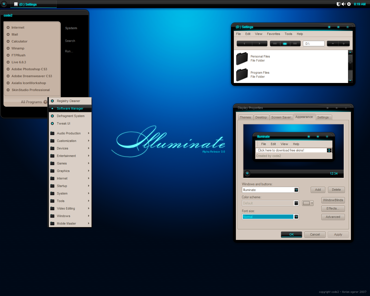
Updated to version 2.4+ New "Language & Network Band"
~ Small tweaks here and there
Would be great to receive some input on the changes,
thanks for the comments on the older version so far!
Updated to version 2.3
+ Agency Area
+ Work Method Area
+ "Counter" for the image slideshow
+ First part of footer
~ Tweaked sidebar headers
~ Main Header spacing
~ Desaturated some colors
~ Optimized spacing between elements
~ Less Ribbon Height
~ Other changes i couldn't think of
Updated to version 2.2
+ New BG
+ New header and tabs
~ Some text changes
~ Small tweaks
Old versions (for comparison):
2.3 - Minor differences to 2.4
2.2 - [link]
2.1 - [link]
-------------------------------------------------------------------------
~ = Updated/Changed
+ = New/Added
-------------------------------------------------------------------------
This is a work in progress, so i will update on a regular basis.
I am redesigning the landing/front- page of my website,
as its extremely outdated and need input from you guys.
Let me know what you think of this new concept.
Every input is welcome.
Note: The text and heading are just placeholders and the wording
sounds like crap, please ignore that for now!
You can find the very empty old version here: [link]
Related content


Comments: 35


Nothing to say about footer now ofc ")

👍: 0 ⏩: 0

Hmm. Maybe for the bottom (where the reflection is) add a small line of opaque black to no fill to enhance the reflection. Otherwise, it's looking nice and clean! Aweshum.
👍: 0 ⏩: 0

Thanks mike!
Its getting where i want it to be,
but its not at all there yet.
 (Smile)")
👍: 0 ⏩: 1

I know how that feels, finally found a logo that I'm happy with.
👍: 0 ⏩: 0
From here on comments are related to version 2.3
-------------------------------------------------------------
Thanks ladies and gentleman for all your input so far!
👍: 0 ⏩: 0

")
Thanks man, i wouldn't say its perfect, but its certainly improving
👍: 0 ⏩: 1

No it´s even better, the new background gives another style to the site, more closer to yours. Well done
👍: 0 ⏩: 1

Looks a lot better with the new background
Frohes neues übrigens, hoffe du bist gut rein gekommen
👍: 0 ⏩: 1
Danke Mann ^^
Ja war ein heftiger Anfang (Freunde, Party, Alkohol usw)!
Aber ich würde sagen doch erfolgreich und nicht zu übertrieben.
👍: 0 ⏩: 1
So lang du es überlebt hast ist alles okay
👍: 0 ⏩: 0
Looks better. Maybe using smaller spacing between objects so it wouldnt look that empty and youre done I think
👍: 0 ⏩: 1
Thanks mate, spacing is horrible between some elements.
Should be fixed with 2.3 though, take a look!
👍: 0 ⏩: 0

this is so much better, and my name is Nigel lol .. not bbt
")
👍: 0 ⏩: 1
Thanks Nigel, i keep up the pace and try to turn the old lady into smthn awesome.
Let me know your honest opinion about some details and things though.
Your critique, and of course from everyone else also, is valuable to me.
👍: 0 ⏩: 1
From here on comments are related to version 2.2
-------------------------------------------------------------
Thanks ladies and gentleman for all your input so far!
👍: 0 ⏩: 0

I think it's great, especially compared to the old one.
Along with some of what others have said, I think ribbon titles aren't totally working, specifically, the terminals. They appear to be arrows, in the body it appears to be be pointing towards the sidebar, and in the sidebar appear to be pointing toward the body. I think I good solution might simply be to reverse the ends, so it looks like a more classic ribbon - with the arrows pointing inward, toward the titles. Or, just a plain diagonal cut, which would keep the overall "forward-moving" feel of the design.
👍: 0 ⏩: 1
Thanks man, just been fighting with that
👍: 0 ⏩: 0
I think you should either stay with much gradients and more dark look like in the header or make it whole minimal and clean. Right now it is something between and I am not sure which way you wanna go. But I am sure you will find the way out of it.
👍: 0 ⏩: 1
Yeah same stuff like BBT pointed out. Its kind of a mix right now.
I guess i will get rid of the "glossy" look on the header and also redesign it.
👍: 0 ⏩: 0
Don't like the use of the web 2.0 style gradient highlight ( used in the main header ) .. other than that looks insane
👍: 0 ⏩: 1
Hey thanks man. Do you think i should take out the gloss totally ?
I guess it would look better to stick with a flat style like you pointed out.
Will try how i can redesign the header to look more unique.
👍: 0 ⏩: 1
Sehr farbenfroh und trotzdem klare Linien, gefällt mir sehr gut
👍: 0 ⏩: 0
Good, I like the whole style of it, however, I don´t see that the brown background you choose fits very well with the theme... Otherwise, the full site looks very clear without missing any detail, like a personal webpage should look if you want to tell future clients that you are a pro.

👍: 0 ⏩: 1
Thanks man, there have been quite a few people "hating" that BG and they are right about it ^^
One of the things that's going to be changed for sure once i get to redesign of the "nocontent" area.
Great to hear some valuable constructive criticism. Exactly what i need.
Take care and have a great year 2012!

👍: 0 ⏩: 0

Great work! Love the different colours on the "banners" and Hire me button!
👍: 0 ⏩: 1
Hey thanks man, btw please ignore the crappy text... its just a placeholder ^^
👍: 0 ⏩: 1
Yeah no worries, I'm used to placeholders XD
👍: 0 ⏩: 0