HOME | DD
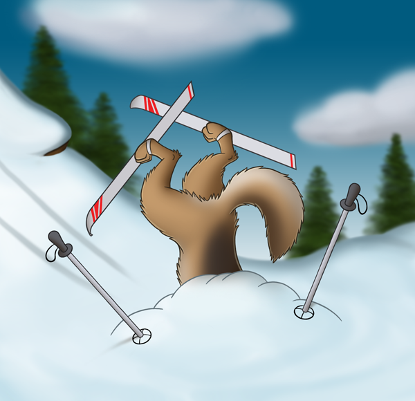
 CodeFly — Bad Skier
Published: 2013-01-16 02:44:11 +0000 UTC; Views: 1152; Favourites: 6; Downloads: 43
Redirect to original
Description
Looks like somebody should have stuck to the beginner slopes...(I'm currently trying to make one small colored picture each week for practice... they will usually be posted on Tuesday)
Related content


Comments: 7

👍: 0 ⏩: 0

I'm excited to see more new stuff from you! It seems you've been drawing so much more lately, and that's a good thing! I'm excited to see what you put out next. Once again, good job on the anatomy and shading. I like the depth of field you used putting the trees out of focus in the background, too.
You know what? I have a challenge for you. I've seen that a lot of your drawings are based off of the same colors as real animals. You should try - maybe not for the next picture you draw, but just sometime - to draw an animal that you're not used to drawing with a completely wacky color scheme. A red and orange polar bear. A black and grey peacock. A rainbow colored zebra. It would be cool to see you experiment with that kinda stuff!!
👍: 0 ⏩: 1

Thanks! ")
 (Smile)")
Honestly, you're actually as much an inspiration to me as anything... trying to inspire you to draw is actually helping inspire me.
I'm not sure about unrealistic colors... it feels to me like a good way to make a nice picture look bad (especially if you poorly mix warm & cold colors) Have you ever heard of the term "sparklefox"? Yeah, that's what I'm trying to avoid. 
For this picture, I had accidentally created a very realistic fir tree-brush, but had to make it extremely blurry so that it didn't interfere with the cartooney foreground.
")
👍: 0 ⏩: 1
I think the unrealistic colors will benefit you because it will really stretch your mind and get you out of your comfort zone. Whatever you'd like to do.
For me, I definitely want to majorly commit to drawing but I've found that my mind doesn't like to run on schedules. They're a great thing to use if you like deadlines and precision, but it seems that I make more art when I tell myself that I have all the freedom and time in the world to draw ( which obviously I don't )! It makes me feel less pressured to draw and more inspired to draw.
👍: 0 ⏩: 0

"If you go off the beginner slopes....you're gonna have a bad time!"
👍: 0 ⏩: 1
