HOME | DD
 CodeMonkeyArts — A Small Bit of Happiness

#couples #heart #landscape #love #nature #pretty #romance #iradante #tristandante #birthofasin #toogoodtolast #opencanvas6 #medibangpaintpro
Published: 2017-06-09 06:28:01 +0000 UTC; Views: 832; Favourites: 68; Downloads: 0
Redirect to original
Description
For added effect (and music I will repost with Chapter 6 after I edit that a bit), I suggest listening to Small Happiness by Chino Yoshio. And prepare to have your heart ripped out if you know what's gonna happen between Ira and Tristan.Or if you're a sadist, laugh with glee. I'm torn between the two.
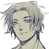
So I have no idea where in a city would be such a beautiful empty space of nature. Maybe some outskirts, maybe they took a train, I have no idea, I just ended up painting this background landscape. And I love it. The background I am very proud of. Ira is okay; her head seems a tad large. But Tristan ain't looking too bad so hurray? Overall this was fun and I think it'll go well with Ch 6.
Enjoy!
Update 06/09/2017: Still not perfect but I fixed most of what bothered me about Ira's face. She looks a little better now? At least I think so. Also updated Tristan a bit; He's pretty as hell, but also still a dude. So gave him more chin. Helps? I dunno.
Related content


Comments: 68

Thank you so much for the critique! I still need to work on Tristans' face and...*sigh* hands will always be a challenge. I do think his thumb his a bit small. Something I shall work on!
Thanks again!
👍: 0 ⏩: 1

Okay, you're welcome!
👍: 0 ⏩: 0

Overall

Vision
Originality

Impact
This is, for the most part, a very decent piece.
The most striking part of the this piece is the background. The background is stunning because of your use of color, and value along with a sense of unity. To elaborate, the grass is a beautiful shade of green along with great use of shading and highlighting. The use of detail on the foremost part of the grass actually adds to the suggestive detail of the back most part of the plain. The bushes are a great addition to contrast, and the sky ties it all together. What I really like is that the fuzzy parts of the background are much more impactful than hard lines because it gives the sky and background a sense of realism. The lighting gives a nice sense of romaticism to the piece.
The characters are decent with their overall design and color schemes being very well done. However the one in lavender has shoulders are bit too contracted for the situation. Even if they both are muscular, this situation calls for certain muscles to be relaxed because the trapezius muscle's apex reaches the top of the neck indicating contraction or tenseness. The one in lavender's shirt has a part that could be confusing to viewers. Is it a collar or is it a tear? Other than that, the characters have good shading, design, and decent proportions.
Even if the characters are the main focus of this piece, you really outdid them with the background.
👍: 0 ⏩: 1
Haha this piece is kinda all over the board. I like it! I love how the same piece can bring different reactions though everyone loves the background which is awesome! I really need to work on environments and landscapes, so I am happy to see that in this piece it really pops.
Thank you for your comments on the characters and you are correct; in trying to make the characters both quite fit, Imay have missed the mark a bit on body language. I know there were tweaks to be made. Ah well.
At least the overall image is giving the effect I want. Thank you so much!
👍: 0 ⏩: 0

Overall
Vision
Originality
Technique
Impact
Hello! As a member of Project Comment, I'll take up the job of critiquing your piece! Starting off with positive critique, the shading and background are stunning! Highlights are well executed, and placed in very appropriate areas. A very clear image of what's going on is mildly present. Although it's obviously an act of passion, there isn't much context given at first glance. But, that isn't much to worry about, as there isn't much else you could've done that wouldn't upset the serene theme of the image. Onto negative critique though. The hair on the girl who's sitting up seems kind of weird. The bangs seem to be defying gravity and bending forward, although a very thick strand size is established. Along with that, the face on the bottom girl seems long and the eyes too large. There's something slightly off with it, and although I can't quite see what, I feel it might be because of how thin the head is compared to real-world size. But, in total, I'd give this a slightly steady 5/10! Thank you, good job!
👍: 0 ⏩: 1
Thank you for the critique! Hehe the one sitting up is a guy (though I have him lashes, go figure) and I do agree with his bangs. I need to work on profiles with the woman laying down, so I can understand that there is a lot I need to work on. Thank you for your thoughts!
👍: 0 ⏩: 1
Ah, okay! Thank you, as well!
👍: 0 ⏩: 0

Overall
Vision
Originality
Technique
If you think I was too harsh, please tell me.
Anyways, everything about this piece, is absolutely gorgeous. The colors are soft and background is well very done. The blur on the background gives the setting a out focus affect. But in my opinion, I feel like you put too much effort into Ira's hair (or that's just me). And I think that Tristan's hand is a little too small. Then again that could be me. Other than that, everything about this piece is amazing, and simply represents love and peace.
I'm apart of ProjectComment, I just choose to critique here.
👍: 0 ⏩: 1
I will admit from the words you chose, I would not imagine technique being 2.5. You have been very complimentary except for a few off things here and there (I agree with her hair and his hand being small)
Was there something else off that would make technique 2.5? I personally see where I should've been more cautious of Ira's profile (even with the fixes I did) and Tristan's forehead. I hope to improve on this since I'll be drawing these two...oof a lot.
Thank you for your thoughts!
👍: 0 ⏩: 1
Your very welcome! I didn't mean to give you a 2.5, I meant a 4.5, I'm sorry.
👍: 0 ⏩: 1
Oh! I was wondering if there was something else I needed to work on here. Don't apologize; I still very much appreciate the feedback
👍: 0 ⏩: 0

XD Now it's my turn to stalk you from out
I think this one is really lovely. ")
👍: 0 ⏩: 1
Hehe this is one of their earlier dates out, before..things happened and I'm really happy you like this one! This took a lot of time and I really wanted to show the joy between them. Thank you so much!
👍: 0 ⏩: 1
Works you put effort into are always the best.
👍: 0 ⏩: 1
XD Glad I could make you happy
👍: 0 ⏩: 1

dude, be prepared for a ton of one liners because I've been away for 11 days but I REALLY want to comment all this and so:
I really freaking like the atmpshere in this, Coda!! You nailed the background, and it looks really classy, idk how to put it, but looks like a picture that deserves to be in a crime mansion HAHAHAH
👍: 0 ⏩: 1
LOL I log on and see all of these messages and I am so excited you came back so no problem!
You like this one?! Awww thank you! This one took a while but I'm glad you like the atmosphere and background. This belongs in a mansion?! AWWWW YOU ARE SO SWEET! Thank you!
👍: 0 ⏩: 1
I mean, dude, idk if Ira is a portrait or photo person, but this is definitely one worth hanging. It looks amazing. Of course, Coda!

👍: 0 ⏩: 1
Hehe awww. She is not a big photo person, but she does have pictures of them together in her room and on her phone. Including pictures of just him that she may have gotten from Sybil's surveillance drones.
👍: 0 ⏩: 1
LOL It's her city and she has made specific requests. Granted the one time she didn't have her phones happens in CH 7. and oh boy. Lol contrived coincidences...
👍: 0 ⏩: 1
I really have to read that oh my oh my
👍: 0 ⏩: 1
I can't wait to hear what you think!
👍: 0 ⏩: 1


Oooooh. OOOOH it is where he still is without the heart! I just realised that.
It's like; HEART times lie ahead.
Just ignore it, hopefully helpful feedback lies ahead ^w^
If it's not, just tell me and I shall go and hide in the corner XD
Well first of all I really like this old anime style vibe I get from tristan again. You use a lot of
very nice clean lines and, yeah sure, the chin helps! But you don't need to worry
too much about him looking to feminine, it is really common in old style anime
that the pretty boys look really feminine and just as big-eyed as the girls.
I mean just LOOK at Yukito from CCS.
You nailed the shadows on both tristan and ira, and it is very well placed at the left
leg and shirt of tristan, and on Ira's body in general. Although I'd say it's missing some underneath
the LEFT collar from our perspective of tristans shirt, but I'm nitpicking again ^.^
The ambient lighting is really soft and nice and gives a nice kind aura to the piece.
Although I believe your hair highlighting can be a little harsher if you want to
completely go for the Old-style look
Now let's talk ira; Her color scheme is really pretty, the soft orange really suits her and she
has very warm dark skin that contribute nicely to her hair.
Also it must be SO much work doing curly hair, so respects for having a character with these curls XD
I honestly REALLY love the coloring and shading of her lips.
And her nose is really adorable too.
What I BELIEVE is a little weird about her face that she, by anime standarts, might need to have a little
more forehead. I'd also say the left upper arm might need to be a tad longer,
but again that's me nitpicking. What is really great are the clothes and it's movement.
You did a great job on her body, being slightly turned around and having the clothing
follow that movement without it looking too forced. Really nice!
And last but not least, the background.
The background adds a lot to the calm feeling, and I'd say you did a good job of
blurring it farther in the background and having it more detailed closer to the character.
The choice of green is vibrant enough to support the "happy" scenery,
but soft enough to complement iras red color scheme instead of having the colors bite.
That one dark color in the tree stands out oddly though, it has a really
weird effect. I believe you could have done darker shadowing on the tree and more
details, don't be afraid to use the same kind of shadowing as on the characters
I believe you could even give the tree some kind of outline like the couple as well,
since it's very close and directly in touch with tristan as opposed to the rest
of the backgrouns.
I hope I didn't offend you with anything ^.^
And wish you a great day!
👍: 0 ⏩: 1
You didn't say anything to offend me at all! In fact thank you so much for the feedback! I like the nitpicks you pointed out cause they bug me too! Things I need to work on are important to point out so thank you!
Glad that you like this one!
👍: 0 ⏩: 1
XD Glad you were fine with it! In that case, you are very welcome ^w^
👍: 0 ⏩: 1
I will link this to project comment, hope you are fine with that ^.^
👍: 0 ⏩: 1

ooh the background's very peaceful! XD
i like the scene a lot~
but lol i almost confused Tristan for a girl.

👍: 0 ⏩: 1
Haha oh I need to keep him consistent. He is very pretty, but I'll have to work a little on him. Glad the background is so pretty though!
👍: 0 ⏩: 0

This looks great. The sunset, the skin colors, the background. I wish I had the ability to do the background like you do  (Smile)")
👍: 0 ⏩: 1
Aww Thank you! Honestly I am not that great at backgrounds and I had to look at a few references to figure this out. Even now it's not exactly what I was aiming for but it ended up looking so pretty anyways.
👍: 0 ⏩: 0

wowowoowowow
In my opinion backgroud is really well done, the grass looks really realistic and blur makes it only better
What can I say about sky, hm - I think that color is good, but clouds looks more like cotton candy, not like cloud
If you use Sai i can give you special brush for clouds 8D
Try a little harder about tree, i know that it's hard to imitate tree bark, but it's possible 8D Make lines stronger, when something is close to us we see it without any kind of blur, so it must be severity? sharpness? I hope that you know what i mean XD
But at all,the only think to which i can for real hitch on is the profile of girl face, it's bad to be honest - mouth is too big, nose is too long and you probably didn't thought about forehead, didn't you? I see it because the nose is long and like ski jump, nose looks ok, but if you forget about forehead it's not anatomical correct ")
And what i like the most are colors, idk did you use any palete or not ,but you have really good sense of colors, you use it pretty well! i like how you cooperate with colors - brown-yellow-red, it's nothing new but makes girl more exotic (if i can say like that
And boy's colors are calm and quiet which makes a big difference,but also make them as a couple like whole thing , like Ying and yang, I really like this concept
Good job at all, keep going! Really amazing and calming picture
Sorry for my english, hopes it's not that bad XD
👍: 0 ⏩: 2
Btw: I took some of your comments and updated Ira's face. Not great by a long shot, but she looks better
👍: 0 ⏩: 1
Yea! She looks better! I'm happy that you get my instructions to heart ^^
👍: 0 ⏩: 1
Hey I like feedback and good suggestions!
Also starting to keep images with layers and stuff so I can go back and fix things
👍: 0 ⏩: 1
I always when i see that something is wrong with drawing i send to my friends and they tell me what's wrong 
👍: 0 ⏩: 1
Hehe I could always try that too, but I'm always just posting first, fix later
👍: 0 ⏩: 1
Thank you so much for the feedback! I added some filter on the overall image to tie the colors together so it did end up flattening out the clouds a bit as well as blurred the lines so that was an experiment that may have lost some impact of the background.
Awww yikes yeah, I had issues with my girl Ira here. Profiles are VERY weak for me, so when I finally started color this is when I went "Aw shit Ira, no...". I should've stopped and taken more time to try and fix it, but it was getting a little late last night and a lot of time when into the background. Ooof. I will definitely take all of this into account for next time I draw her profile (maybe never? Hopefully never). I actually like how lips came out but I do agree that they are quite big. She is African in origin but because everything else is lacking that does end up being an issue. So things to work on there.
In comparison Tristan looks good, but yeah he needs some forehead there too
I'm glad you like the colors and I'm glad that despite the many misses, the whole overall is nice! Thank you so much and I hope to keep improving!
Your English is fine don't worry
👍: 0 ⏩: 1
No problem! I always make a repay if someone send me a good critique or say something nice with good explanatio- ah you know what i mean XD
It was interesting experiment and did a lot of good for your drawing!
Oh i understand your point. I also do things for fast when it's late but i want to finish it and don't have more energy. Sometimes we see mistakes when we already ended drawing and we cannot change it
She is african! That's new! I don't know a lot of people which makes their OCs africans, i like it! Africans people are so beautiful *-* I like african looks to be honest, they are natural in every part not like white people whicha always need to change something
hahahha yea, forehead is important xD
I hope that you will remember about my pointers when you will make new drawing ^^
That's good, when i write something long sometimes i forgot about what i'm writing and didn't focus too much ;^;
👍: 0 ⏩: 1
Hehe thank you! Glad you liked it!
I like making OCs of different ethnicities
I will never forget a forehead again and thank you for all of your helpful points!
👍: 0 ⏩: 0

| Next =>