HOME | DD
 Coldone —
Crownless04

Published: 2004-01-21 18:08:58 +0000 UTC; Views: 14005; Favourites: 288; Downloads: 6455
Redirect to original
Description
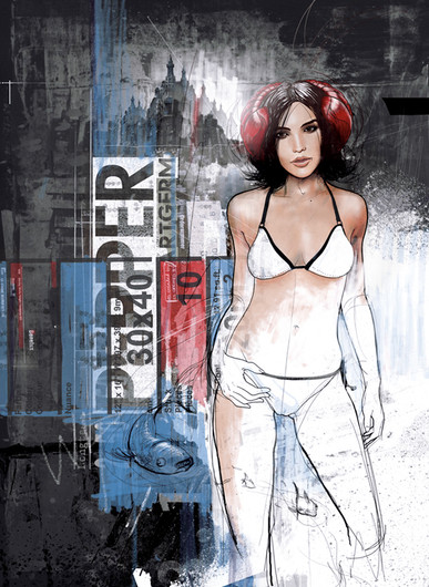
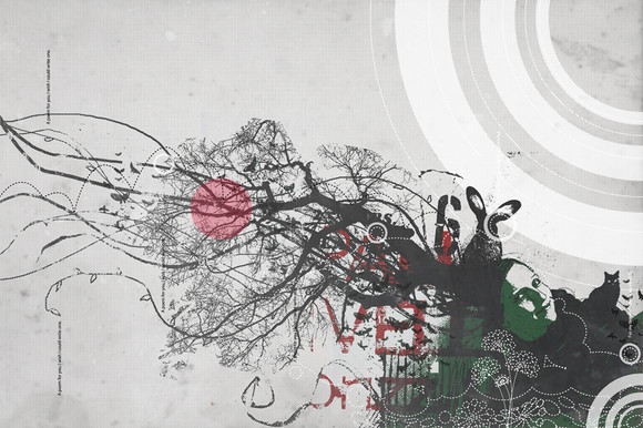
Here we go, until now the last variation on the theme of the vectorised girl.Related content
Comments: 157

Cool. Nice color theme and shadow use... love the freckles on the girl
👍: 0 ⏩: 0

really cool picture! i love the whole design
👍: 0 ⏩: 1

wow, i adore the way you've approached the hair! Definitely a
👍: 0 ⏩: 1

great vector! i like the way u did the girl's face.
cheers
-JEZ-
👍: 0 ⏩: 1

aaaaaaaaaawesome, i love it 
btw: what's the txt on the left side ? (im curious)
cheers
👍: 0 ⏩: 1

Thank you. I can't remember what I put there for text, I'll have to look that up..
👍: 0 ⏩: 0

hey
fantastic work, i love your style.
What programs did you use?
martini
👍: 0 ⏩: 1

Hi, thanks a lot, this one is Illustrator, there are some paths exported from Photoshop, and a few preliminary sketches but the main work is done in Illustrator.
👍: 0 ⏩: 1

I just looked through your gallery, and I am in complete awe of your skill and style.
I am just starting to learn illustrator, so I've got a long way to go before i get any good using vector, but seeing what you and a lot of other vector-artists can do, certainly will keep me motivated...
Mind, a question, when you trace photos, and draw in illustrator, do you use paths only or also freehand? which is more effective, best result, pros and cons etc? (if you please)
👍: 0 ⏩: 1

It depends on what you are searching for, tracing freehand will give you a more sketchy, lively result whith less smoother curves etc, while tracing paths with the pen tool will give greater exactitude and a cleaner look. Both are paths though..
👍: 0 ⏩: 0

woow the girl looks awesome and the whole piece is great !!! fav
👍: 0 ⏩: 0

Im sorry this looks extremely familiar ([link] ), but it was purely un-intentional, if you do not believe me ask ~HAMMER-TIME .
I will try to work something out, change the colours possibly, or maybe some of the style.
Regards.
👍: 0 ⏩: 1

It's hard to believe that it was unintentional, it looks almost the same in the great lines, but I guess you know the truth. However, you can only progress in your own art if what you do comes from your inside, so I don't care if you did see this before, or did not...keep following your own way. Regards.
👍: 0 ⏩: 0

Hmm, never did anything for them, and I couldn't find it on their website, although I looked through their entire ads. I guess you must have taken it for something else...
👍: 0 ⏩: 0

Im not really sure.I just saw it in a page of TOKION MAG. op.com/joel.U should check it out.
👍: 0 ⏩: 0

excellent use of typo and white/black space. and the vector is equally awesome!
👍: 0 ⏩: 0

great composition and tones. wicked style as well, this is a stellar series...
👍: 0 ⏩: 0

FLAWLESS!! Everything from the design to the implementation of it...beautiful work! Great high contrast piece, nice choice of a muted and subtle color too. Deffinitely a
👍: 0 ⏩: 0

love the colors and the design of this one! really nice
👍: 0 ⏩: 0

I love the colour. It's my favourite
In fact the colours you have chosen on there are all fantastic!
+fav
👍: 0 ⏩: 0

whoa..love the comp, and ur line usage rocks 

take it easy
sam
👍: 0 ⏩: 0

I am using this as my myspace.com background as of now. Just letting you know. I like this one a lot.
👍: 0 ⏩: 0

Simplistic, yet beautiful.
The minimal use of colours is great, and the girl floored me.
👍: 0 ⏩: 0

that girl is the best piece of work i've seen in i don't know how long. i'm just a beginner in vector stuff myself, so i can't really say anything constructive, but in this picture, everything seems so _right_. +fav.
👍: 0 ⏩: 0

holy moly it's awesome... damn.
what can i say?
that's it, you've left me speechless. it's awesome. everything. it's so clean & fresh. must put it in my favorites. thanks for making something so beautiful.
👍: 0 ⏩: 0

One word....Beuty work
👍: 0 ⏩: 0

Just adore this style!
The white line on the right side, beautifful! I mean... where do you get the idea of doing that? 

👍: 0 ⏩: 1

Hey, thanks 
👍: 0 ⏩: 0

man i had this as my backgroudn for the longest time.. when i came across it again i figured i would give the respect it deserves and fav it..
👍: 0 ⏩: 1

Good choice of colors. Really like the contrast between the line drawing of the face and the flat surface face drawing. The textures are well chosen. The typography comes well in the context, and the overall compositions is grand with the different focus points you give it great depth.
Would look lovely in print...
congrats..
👍: 0 ⏩: 1

Thanks for all these lovely compliments, I appreciate that a lot!!
👍: 0 ⏩: 0

this is so awesome. you deserve more than a daily deviation for this.
👍: 0 ⏩: 1
| Next =>
