HOME | DD
 Coldone — Sophus

Published: 2005-03-11 12:39:40 +0000 UTC; Views: 4352; Favourites: 82; Downloads: 873
Redirect to original
Description
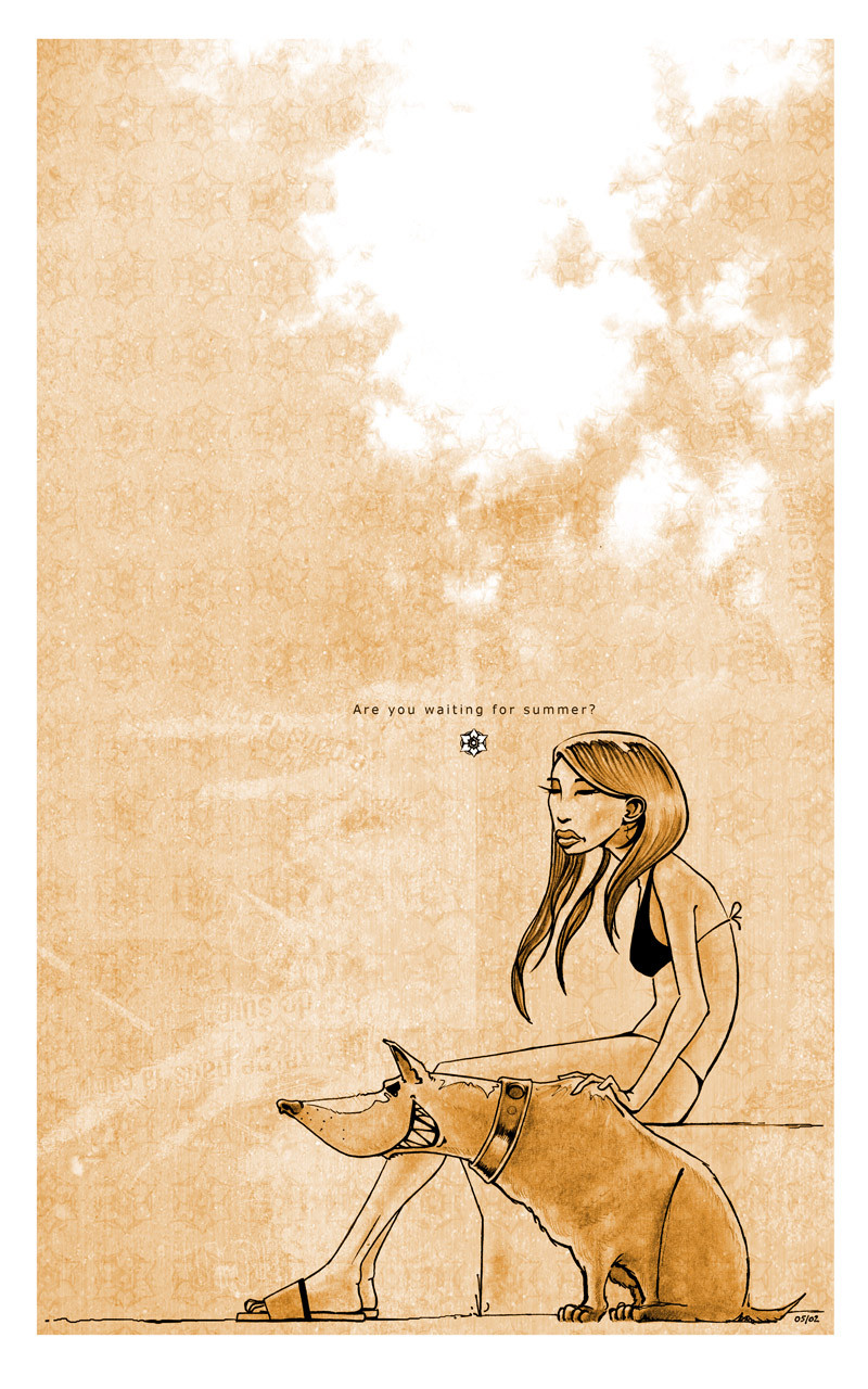
A piece of wonderland, no sorrows, no bad thoughts, all gentle and rounded.I wanted it to look pretty fashion like, a bit of popart with vector bubbles and pink. Then I would add a subtle undertone to it, a subversive note, asking: what have we become, what have I become?
Initially, I wanted to keep it very minimal, but I failed miserably. Couldn't help but add forms until I thought it was time to stop before overloading it.
The grey minimal Version: [link]
The blue minimal Version: [link]
Made for ~daGroove artpack 'vibe'.
Related content


Comments: 32


 (Wink)")


How do you mean that?
I pasted it together out of "sophisticated lust", I liked that strange association!
👍: 0 ⏩: 1

it's just a silly little word telling how i feel
👍: 0 ⏩: 0

I'm blown away by the background here - I've always found this style of work pretty interesting, but this is something I can really get my teeth into and enjoy.
👍: 0 ⏩: 0


love the colors. I didn't think of combining the two shades together..it looks amazing!
👍: 0 ⏩: 0


That's definitely the best one. Great shapes, nice color combination and good composition as well. Keep the good vector bubbles work up!
👍: 0 ⏩: 0


omg fricking amazing. i dunno what to say. i jsut love the big bold pop art! and hte vector is so smooth and great. the outline really makes it stand out!
👍: 0 ⏩: 0

You did fail miserably at making it minimal, but i'm sure glad you overdid it. Composition is fantastic, color mix is fresh, and the messenger bag r0x0rs! ")
👍: 0 ⏩: 0


that's nice... i think this is the best of that series
👍: 0 ⏩: 0

I think this is the strongest of the three. It's got attitude and self confidence eminating from it. It more of a sense of that in this piece over the others.
Nicely done.
👍: 0 ⏩: 0

What is this? It's AWESOME! LOVE IT! My fav! No questions about it!  (Smile)")
👍: 0 ⏩: 0


definately my fav one!
you created a very integrer atmosphere from the background to the font!
👍: 0 ⏩: 0


Wooha Kale! I love this one so much! Your other two Sophus' were great, but this is awsome!!
I like all of your vector/typo magic! 
👍: 0 ⏩: 0

some nize extras, but i like the normal grey version the most
this one is like to busy for me
cheers
👍: 0 ⏩: 0