HOME | DD
 ComfortLove — The Uniques issue 3 re-release example: 1

#directorscut #funny #theuniques #awesome #educational #superheroine #indycomic #makecomics #comfortandadam
Published: 2015-10-20 17:39:19 +0000 UTC; Views: 1412; Favourites: 18; Downloads: 18
Redirect to original
Description
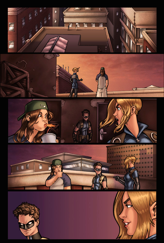
This is page 3 from the upcoming issue #3 of The Uniques: Expanded Director's Cut. (my partner in crime) and I wanted to put this up as an example of a page that's getting edits...but not a HUGE amount of them.If you zoom in on the page you'll mostly notice that the things that are changed are things like Telepath's expression and body (we were initially drawing her too skinny), background elements which includes putting things on the proper perspective, and overall lightening the image. It may look good dark in digital, but it always printed muddy.
Overall, this is a great example of the things that will be changing moving forward with The Uniques as we move past issue #3 (once issue #2) and move into #4. It'll be smattering of new panels and scenes, but nothing like the overhaul that issue #1 got!
...and for those who've never read The Uniques, you're in luck! You can read the first issue for free on our website here: www.uniquescomic.com/
Related content


Comments: 8

The touch ups are better. The skewed nightstand still looks odd to me though. Any reason it isn't parallel to the wall?
👍: 0 ⏩: 2

Damn, was hoping people wouldn't notice that. May have to take the time to fix it now. Good eye sir!
👍: 0 ⏩: 1
It might be quicker to skew the poster and headboard to match the dresser.
👍: 0 ⏩: 1
Possibly - we shall see what I do!
👍: 0 ⏩: 0

I think it's the poster rather than the night stand. But other than that presentation is Much better than the original. I love the saturation hierarchy foreground figures pop a lot better.
👍: 0 ⏩: 0
