HOME | DD
 AdamWithers — Uniques issue 2 pg 5
Published: 2008-04-23 16:09:06 +0000 UTC; Views: 2758; Favourites: 21; Downloads: 88
Redirect to original
Description
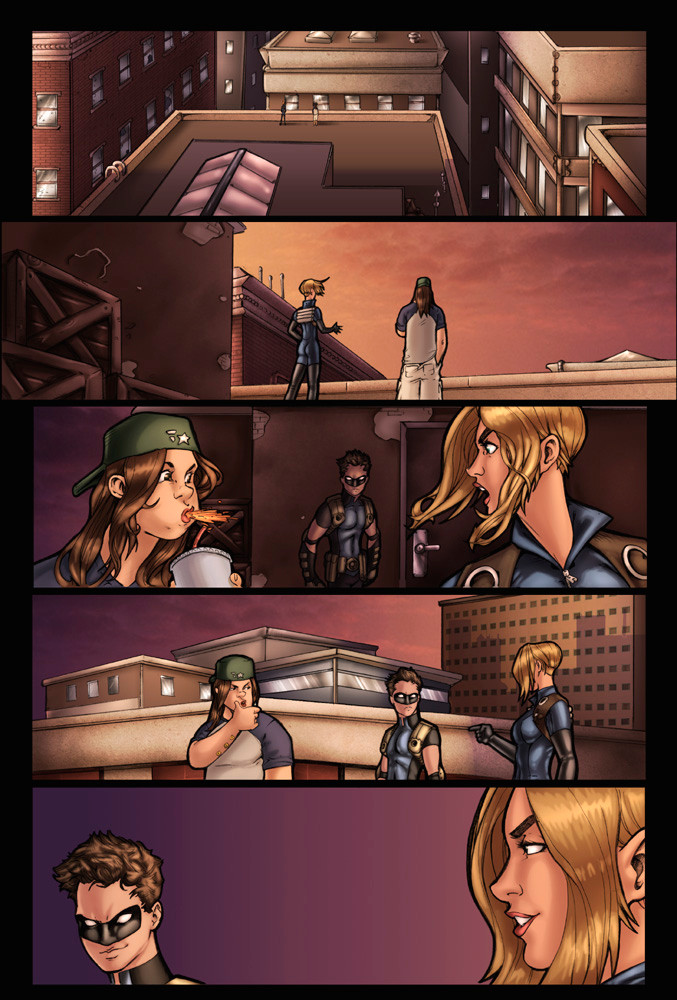
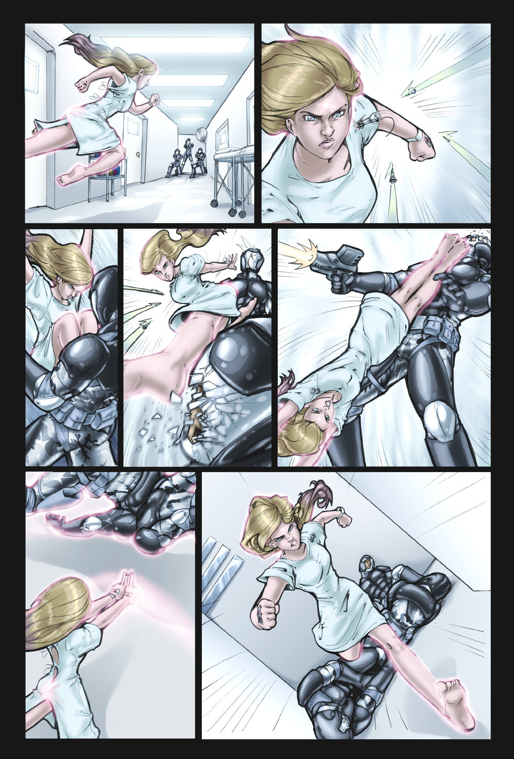
Here's a sample page from the second issue of The Uniques, the creator-owned superhero comic written, drawn and colored by me and my wifeThis page is the first meeting between Telepath and Motherboard (who are putting this new super-team together) and Scout (doing his stealthy 'out of the shadows' thing).
Besides sharing pencilling with Comfort, The background colors and textures are my job on this book, and this page was a real workout. The challenge was to set a light-source that could create shadows deep enough that Scout could hide in and dissappear.
Since we don't ink, we don't use absolute blacks. Instead, we use chromatic shadows. We personally like the effect more for our book, but it does make some stuff difficult. If we were doing this the traditional way, it would have just been a black shadow with Scout's white eyes peering out. Instead, I had to find a way to use light and shade in our color to make the same sort of effect. I like it, but I'm biased
 (Wink)")
Related content


Comments: 19

The building and overall color choices really look great. Keen beans.
👍: 0 ⏩: 1

It took some doing, but I'm really happy with it yeah. Backgrounds can be deceptively tricky.
👍: 0 ⏩: 0

Nice expression having Motherboard spewing her soda from surprise. 
👍: 0 ⏩: 1
Any excuse for a spit-take. I LOVE me a good spit-take.
👍: 0 ⏩: 0

The shots have a nice pace of change from panel to panel (angle, figure size). Colors are great and consistant with colors of the time frame. It would have been nice to see the same sky texture in the last panel as the others though.
You have the values...just not the cool texture. This panel depends on the bit of negative space to hold the two head shots together in the same scene/setting. This makes it look flattened after all the great depth shown through the others with BG as well as texure and variation in colors within the other panels. Overall this is a great laid out page from drawing to color!
")
👍: 0 ⏩: 1
It's something that reads better with the dialogue, because with the text there you really don't notice the background in those panels at all. And I was the one who vetoed the sky texture there, because if you look at the way the buildings are laid out, it wouldn't make sense to see sky from that angle-- you'd see the side of another building. But since it wouldn't have been worth detailing another building since it would be covered with talk bubbles, we left the gradiant.
👍: 0 ⏩: 1
Sometimes patient, sometimes going crazy. We go back and forth.
👍: 0 ⏩: 1

oh well, it pays at the end....I hope.
👍: 0 ⏩: 0

Great storytelling on all the recent pages, Adam! You and Comfort rock!
👍: 0 ⏩: 1
Thanks a lot, P4S. Much, much appreciated
 (Smile)")
👍: 0 ⏩: 0

Great page again! Especially the detailed background in panel one! 
👍: 0 ⏩: 0

these pages are awesome. I like you composition and layouts, they keep things from becoming bland. And yet they are not so over the top that they are hard to follow.
Oh and I finally got my Green Lantern print from my friend and it is AWESOME! framed in my room and everything now.
👍: 0 ⏩: 1

I love Motherboard's spit take. I like watching her personality, even without any text. Very neat page.
👍: 0 ⏩: 1
She is fun, isn't she? I'm really pleased both with how well her character is coming along and with how well she's being received.
👍: 0 ⏩: 0


you're not biased. the evidence's there - neat, clean shadows. I'm impressed!
👍: 0 ⏩: 0