HOME | DD
 CommodoreMJFire — ST Discovery: Constitution Class and poss. Refit

Published: 2018-03-09 20:31:59 +0000 UTC; Views: 6593; Favourites: 35; Downloads: 0
Redirect to original
Description
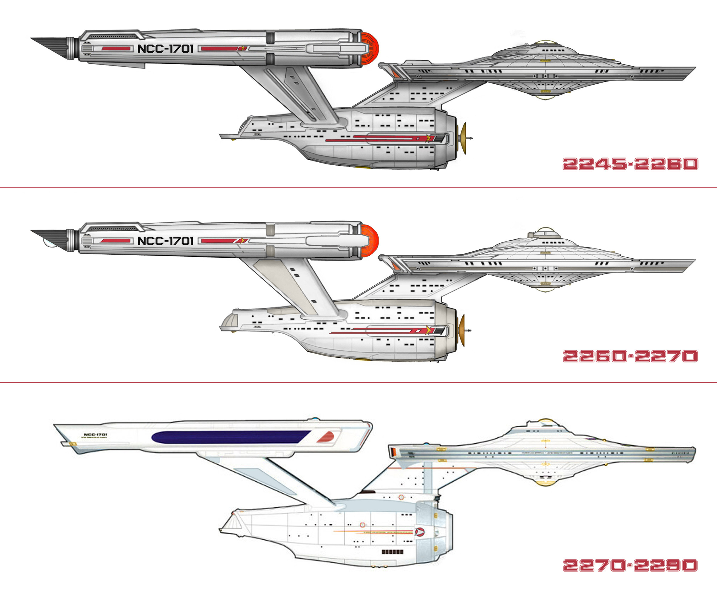
After the many Shots in Season 2, I updated the Version- and realised, that if you set the length (seriously STOP THAT STUPID, MEANINGLESS AND DISTURBING SUPERSIZING!) to that of the classic one (289m), the parts are fitting well- exept for the shorter neck and secondary hull. The refit/upgrade set for 2260 has 3 reasons: first, the upscaling of Pikes 250 to Kirks 400 men, second, to enlarging and power-up of the engine (that's because the secondary hull is longer), third, to transfer the less threatening, shiny look inside to the outside. The refit, going through the whole fleet, is all about starfleet removing their dirty image from the war, getting to an image of "knights on white horses". They take that literally! (Must be because the vulcan admirals didn't really understand... (Wink)") )
)
Related content


Comments: 9

This is a great image The Enterprise always looks amazing, and I really like you Poss. Refit! Yeah I also hate the supersizing that started with the Kelvin Timeline movies and since a lot of the producers/influences from those are working on the new Trek shows I get a lot of Kelvin vibe in Discovery and Picard.....especially Discovery!! An easy win for Discovery would have been the Enterprise looking like The Cage version just more detailed than they could back in the original pilot episode. But now in her history it seems as if The Enterprise went through two major refits, The Cage version then her Discovery Version(which is a refit too many changes), TOS Era and then The Refit(ST-The Motion Picture).
👍: 0 ⏩: 0

I have to admit - this design is far more attractive that that ...thing... JJ is trying to sell...
👍: 0 ⏩: 1

Actually, your refit could have been a refit leading up to the Motion Picture.
 (Smile)")
👍: 0 ⏩: 0

Updated. For anything else we have to wait till Season 2...
👍: 0 ⏩: 0
After the release of a pre-work with the already finished gondolas by John Eaves/Scott Schneider and finally the release of Eaglemoss with the top- and sideview of the CGI model, I can rework the shematics to fit with the series! Final version in coming... Also, the ships of the line calendar showed, why they chose for the pylons to be tipped: it actually covers the flattened look from the shorter neck!
Interesting thing: if the large Eaglemoss "federation vessels" poster shows the right proportions, the Enterprise is indeed a lot smaller than the Discovery- as calculated by different fans, using the TOS size of the Enterprise. This would at least stop the silly supersizing of former known ships from the movies!
👍: 0 ⏩: 0

By the way- of course, the registry is not the right font- in Discovery, it seems to be "Microgramma Bold" -does anyone know the font they used in the 2009 movie for the registry depicted right under the hangar bay? this would be a very interesting font to be used in a reworked TOS Enterprise...
👍: 0 ⏩: 1

👍: 0 ⏩: 0

Excellent work mate! Love the comparison and very close to the production design.
👍: 0 ⏩: 0