HOME | DD
 computerologist — adamant enlemency

Published: 2002-06-13 00:26:30 +0000 UTC; Views: 29635; Favourites: 124; Downloads: 6468
Redirect to original
Description
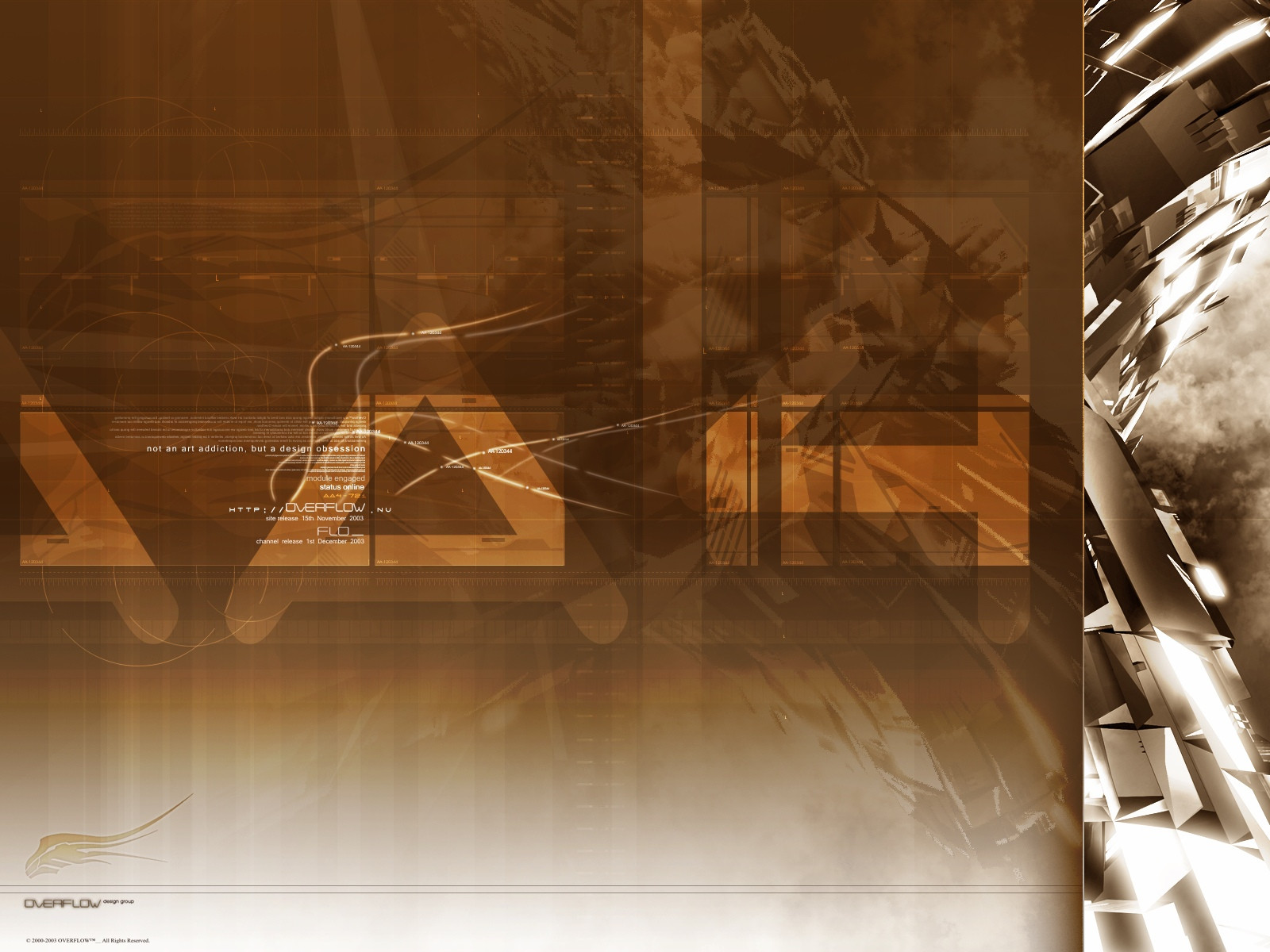
made this one mostly for my brother...he wanted one that matched his ugly ass layouti like it... he was thrilled...so its a success
thought i'd share it with the people here that enjoy the stuff i make
if you don't like it....oh well...lost the .psd which means no changes not that i would have anyway...lol..but it also means i guess its done
thanks for looking
oh and btw....you don't have to comment...unless you really just want too
hehe...damn...i typo'ed the title
ooops...1600x1200 version for cybergenics
Related content


Comments: 199

EVERY DAY YOU SUBMIT NEW ARTWORK IS A GREAT DAY
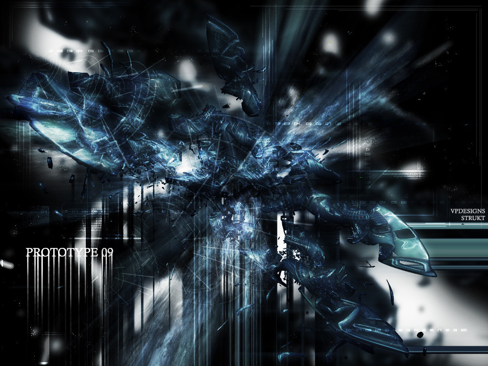
wooow ... i think i don't need to say that this is good - that's regular for your art but the "ring" or what it is ... it's awesome
the atmosphere is great and i love the concept
and the most important reason why i love your art is : every piece is unique
and in a different style -
i hope u'll never stop creating art
cya
errrr , yes , i forgot +fav.
👍: 0 ⏩: 0

not bad thats a strange title too deep for me :runs away:
👍: 0 ⏩: 0


Me Like:
Blue, White, Tredy stuff, reflections and barcodes...
I'll add this one to my weekly rotation (to quote poetess), and I wil not hear any complaints okay?!..
Congrats on getting this one in the top favorites..
👍: 0 ⏩: 0

i loved the reflactions. also very smooth. i just dont have anything more to say than... amazing!
keep sending more and more stuff
👍: 0 ⏩: 0


The grid has to go..and the orange doesn't read well, but thats coool anyway
👍: 0 ⏩: 0

Very slick... I kinda like that top heavy design. Kinda shocks the eye at first. Nice work man!
👍: 0 ⏩: 0

lol my finger hurts again!
well, i this just like all your other work
👍: 0 ⏩: 0

This graphic being one of my most favorite of this kind, due to colors, and textures (ie. smooth, mirror). At first I was going to be critical, and say something to the line of "You have center-itous", which is the "artistical disease of drawing in the middle, instead on one of the emphesis points (such as if you drew a tic-tac-toe sign in the across all your art, the intersections, are emphesis points, to place the most important part of your graphic.) I noticed after taking a look at the graphic, that you do have emphesis up there, including the area from which the main "disease" is origniated. To make a long story short, I love it. Good job, and keep up the good work.
👍: 0 ⏩: 0


Nice work, computer. It's been too long since your last submission.
👍: 0 ⏩: 0

wow, thats so sweet, I really like that tube ting in the front, its so slick and the design is top notch!
👍: 0 ⏩: 0


mmmm...very nice! love the render! different! nice work!
👍: 0 ⏩: 0


too awsome!! Somehow it gives me a feeling of a subway.. +fav and I allready have it as BG. What program did you use? 3dsmax?
👍: 0 ⏩: 0


Yeh, great work. Instantly on my desktop. I almost cried when I seen the resolution Thanks for the bigger res matey
👍: 0 ⏩: 0


Damn that is sweet. Totally dig the squaresystem over it
👍: 0 ⏩: 0


Very moving and intricate! I like that thought it's abstract, I really do have a sence of a sort of marine creature..
👍: 0 ⏩: 0


the typo is really cool man, glad to see you submitting stuff again!
👍: 0 ⏩: 0

absolutely stunning!!
the mix of opacity on the grid is so amazing. you are the man!
/ganks
👍: 0 ⏩: 0

YES!
IT'S BLUE!
Finally!
Fantastic image man, I love it. Smoothness Mr. Cooney; smoothness is the key in light-coloured images, and you've got it down pat.
👍: 0 ⏩: 0


wow awesome..the big flowing reflective tube in the front twoards the middle is my favorite part. love the colors, design, and concept. everything rocks.
...oh and it matches your icon so perfectly
great work !
👍: 0 ⏩: 0


wow....geez olo, your talent makes me wish you submit daily!
👍: 0 ⏩: 0


pretty nice.. i like the smooth curves. great work!
👍: 0 ⏩: 0

<= Prev | | Next =>