HOME | DD
 computerologist — syntax validation

Published: 2004-05-28 19:56:19 +0000 UTC; Views: 2849; Favourites: 41; Downloads: 856
Redirect to original
Description
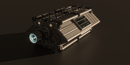
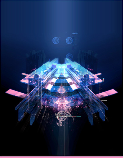
i decided to make myself a new print for my wall, dark and fun


technical abstract
Related content
Comments: 62

Good palette, and interesting to see you jumping on the wagon with the vector guys with less gradients and more solids. Just like the rastafarian though it lacks a certain sense of purpose, although I do find the composition more original, and the entire scene remensices of an underwater or deep space sense. I'm not sure if the little plusses and the gradient on the right really add much to the whole. And the green crappies...
👍: 0 ⏩: 0

I really like the dark color scheme with the vibrant bits of color, it seems different that what you usually do color wise, but then, I haven't been around for a long time, so i could be wrong! 
👍: 0 ⏩: 0

nice design, love the colours used, has a very unique feel. not sure about the typeface, but a great piece anyway.
👍: 0 ⏩: 0

it's like dopler-on-lithium!!!
wow... ok, i have an idea... why don't you stand still for a moment... nod your head yes... and reply to my EMailZ!! LOL....
NO, seriously... it's magnificent, and only as olo-could-imagine-beautiful!!!
i might need to bribe you into doing something for me.... .....please stand by....
👍: 0 ⏩: 0

nice combination of grunge and tech, nice work man
👍: 0 ⏩: 0

"complex beauty".. I love it! Allthough it seems chaotic at first, it also has a certain calm to it.. oh and where's the san-serif?! 
👍: 0 ⏩: 0

Lovely work. The colors are really great. The font is just right IMO, it fits with the overall chaos of the image. Just an overall great image.
👍: 0 ⏩: 0

really dark, but all the colors fit together really well, even if I don't like the typo
👍: 0 ⏩: 0

this IS incredibly dark and fun
your art is awsome. what program do you use to create it?
👍: 0 ⏩: 0

.....STOP IT!!!! lol
I'm too envious of how you effortlessly (not saying it took no effort- i mean the piece effortlessly blahblah) create a harmony of colour and shapes- i love your use of reds and yellows with other colours- looks stunning.
I'm trying to spot what the objects originally were, but i can only spot the gun there so far.
Good Job.
👍: 0 ⏩: 0

Technical abstract!? Very cool idea, I like it!
👍: 0 ⏩: 0

I love the distorted shadow effect. Kind of like there's something moving underneath. I think those features distract just enough from the busy grunge and balance it.
👍: 0 ⏩: 0

whoa, it's wekkid 
👍: 0 ⏩: 0

Oooh, slowly getting more into the grunge-new age art, I like it... though it still reeks pretty heavily of old skool kickass Computerologist that we all love 
But anyways, wonderful work, both my 
👍: 0 ⏩: 0

ok... this is cool and the first time i saw it in the little view i thought it was a pic from a jet coming down on an aircraft carrier. lol... then i saw it as an abstrct and im like... eh... ok? so it's kool, i dont know anything about abstract stuff but i like it
PiEcEs
👍: 0 ⏩: 0

I love it
👍: 0 ⏩: 0

the color is basic, but nice, its an interesting abstract study. I see alot of work in this vein on Deviant and its interesting in a way, but at the same time utterly banal. They're great as color and form studies as well as good practice, they just seem to await some sort of application. I've seen similar things used for website interfaces and such, but I think theres a possibility for this look to be used in something emotive. You got skills so use em, even if you look at the comments b4 me "nice color, cool style", so do it up make your style sya something.
👍: 0 ⏩: 0

I still see elements of the classic color scheme in this. I like the dark theme, and the abstract work is great as always.
Your work just keeps getting better.
👍: 0 ⏩: 0

Awesome work man! I loved the colors, this vector stuff is amazing! Your skills are great!
👍: 0 ⏩: 0

Interesting the way you used that gradient in the background. It gives me this sort of "deep ocean" feel where, the deeper you go, the darker it is, you know? I believe that it works well here to accompodate that, err .. weird techy structure as the focal point of the whole thang.
The middle looks very gritty .. but, at the same time, concrete with those solid lines behind the gritty mass.
Like it!
👍: 0 ⏩: 0

I've tried to do something like this before.. but cames out like shit 
anyway, I always love your work

👍: 0 ⏩: 0

Doesn't do much for me personally but yeah it looks cool, it's technically great and it has a pretty unique style, nice job 
👍: 0 ⏩: 0

How do you come up with these names? Lol. I love the little out of place gradient at the right of the image. It's about the little things
👍: 0 ⏩: 0

i'm sorry?...this was not inspired by bccb
👍: 0 ⏩: 0

Ahh man amazing. Really diggin the sharp white "in your face" grunge style going on thats very nice. The whole concept of "messy" is good, the way every thing seems so unorganised yet fits in so well.
The nice sharp yet suttle yellow and reds go nicely agasint the darkgreen, nice touch there. Not to mention the 2d. You know how i feel, brilliant
👍: 0 ⏩: 0
| Next =>

