HOME | DD
 computerologist — rayon technicolour

Published: 2004-07-30 12:05:16 +0000 UTC; Views: 4148; Favourites: 91; Downloads: 1153
Redirect to original
Description
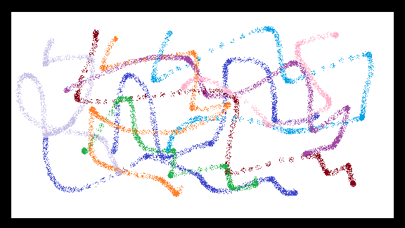
one of the pieces done for the latest release of depthcore .more technical grungy style.
tahnks for looking and go look at the release
 (Smile)")
Related content


Comments: 71


wicked cool looking piece. really liking the colour choice and those circlular shapes. really enjoyable piece.
👍: 0 ⏩: 0


Very nice looking! I would love to see a wallpaper version of this one!
Im currently using your ReVolve wallpaper (as seen here... ) which is great! But some change is allways good
👍: 0 ⏩: 0

It looks like a glad show, lovely colours, keep it up
👍: 0 ⏩: 0


i really like the colors you went with here !
awesome work !
👍: 0 ⏩: 0

I love the layers, are those trees!?
Lol they look either like torn fabric or tree tops, but either way those edges look slick as hell. I love the color scheme, great job olo it should be decorating my dorm soon
(I like the color prism ")
")
👍: 0 ⏩: 0

You know, if this is the best you've got....where else is there to go?
👍: 0 ⏩: 0

MY EYES! MY EYES!
Blinded once again by that masters work. Outstanding as always my friend. Always a pleasure to see your pieces.
👍: 0 ⏩: 0

color madness! lovely bro! You def. got the hang of getting wacky odd looking colours together.. or something like that
gj
 (Wink)")
👍: 0 ⏩: 0


Still ment to comment on this. The colors are great, the remind me of autumn, altough I prefer the summer right now. ")
BTW Kristoff, I've sent you an email.
👍: 0 ⏩: 0

Very pretty olo, although i'd like it better if it was green.....muahahahaha!!!
👍: 0 ⏩: 0


not sure about the rainbow part
but DAMN i like it

👍: 0 ⏩: 0

Great, daring colors that I've really come to expect from you. I love the dynamic design and really...organic forms. Lots of nice overlap and shire and background. Nice, nice piece...
and and addition to my favs.
👍: 0 ⏩: 0


ayie!
*falls in love with your typo again*
Brilliant, It's great. You always bring the whole thing to the table whenever you make something. Keep up the great work! ^^
👍: 0 ⏩: 0


great work 
like your colors choice and your style that makes as if it was made of several very meticulous layers


👍: 0 ⏩: 0


")


Agreeing with Jmulder, this peice highly not trendwhore, since the techniques you've used to create it are very original. Keep on doing what you're doing bro, looks ill!
👍: 0 ⏩: 0


your work is wicked as usual
i love the colors you used,especially when you put that little bit of light
blue in the middle (is that it?) it just really flows nicely. though everyone
already said this, the new 'leafy' kinda thing just looks awsome and unique!
really really great job!
👍: 0 ⏩: 0


mmm, katsup and mustard
makes me hungry for some reason
sweet layout!
lovely choice of colour.
👍: 0 ⏩: 0

!!!!.....WICKED!!! the infinite stylomatica
really the colors, the shapes... everything perfect!
btw my new fav ^^
👍: 0 ⏩: 0


Oooo... it is techy. nice. and don't worry... i won't say that i see strange things in them... like... eagles or feathers or wheat.
funkarama.
- apparently neurotic and her psychology
👍: 0 ⏩: 0

Solid design, somewhat of a unique vibe but still easily categorized as trendy.
Great but not mindblowing.
👍: 0 ⏩: 0


this is tight. i like all the colours in the rectangle box. so stylish.
👍: 0 ⏩: 0

Excellent job man.. love the use of colours. Great job
👍: 0 ⏩: 0

a nice fresh style - i love these type of pieces - full of color and grunge. For 2d it has suprising depth
and thats what i love
👍: 0 ⏩: 0


")


Hmm I feel you've done better. It has original colors but otherwise this can be found more often, the fractal like composition and all. Although I do feel you always get the right balance in composition, color and style, as you have shown time and time again in the past with your exceptional skills, I do find this one severely lacking in originality.
👍: 0 ⏩: 0

the colors are just so.... wow! I love it! The 2d work is extrodinary and all the details are amazing, awsome job!
👍: 0 ⏩: 0

very impressive designs and the spatial sense is really pleasing and fitting. great stuff as always 
👍: 0 ⏩: 0
| Next =>