HOME | DD
 computerologist — rayon technicolour

Published: 2004-07-30 12:05:16 +0000 UTC; Views: 4053; Favourites: 91; Downloads: 1153
Redirect to original
Description
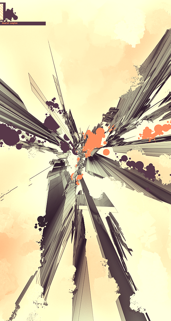
one of the pieces done for the latest release of depthcore .more technical grungy style.
tahnks for looking and go look at the release
 (Smile)")
Related content


Comments: 71


I'm still not sure how in the world you do these peices but - they sure are impressive!
👍: 0 ⏩: 0


I love this about your art, its so different. Like, this looks like abstract 3d, but its not ")
👍: 0 ⏩: 0

very nice work
The colourcombination is pretty cool
I like the infinity font alot
keep up the good work
👍: 0 ⏩: 0

i'm digging this. I really like the shapes and the composition of everything 
👍: 0 ⏩: 0

I totally agree with `jmulder here; this is the very essence of setting a trend. Well, on to the image.
The image is brilliant. Immediatly at the top the leafy tree-like shapes really catches your eye and invites you to the feast of colors in the center. Your eyes slide down drooling to look at the nicest finish I've ever seen. The image radiates infinity; harmony; infinity in harmony. Looks very natural, which is really the hardest thing in design to do - a natural design, looks like it's been here since the Big Bang. The image shows a continuous motion, which may also represent infinity. Very nice logo, by the way, I don't know who made it but it rocks
Very suggestive piece! Normally, the concept you make is more abstract and I have to take a little more time to find my association, but this was just BAM! - so inspirational. The use of overlap, moving shapes, real-life-like texturing in the shapes and suggestion of infinity just makes this one of the best pieces I have ever seen of you. What a theme!
God I am going to nail this to my wall and fuck it.

👍: 0 ⏩: 0

Reminds me of Autumn with the color scheme and kinda "leafy" (imo anyway) pattern. Another clean, crisp release. Good as always man.
👍: 0 ⏩: 0

the color choice is definately cool man. and for some reason....the shapes its taken and all almost remind me of a spider or something.....like the white on the left, and the red on the right kinda look like legs...but ah...thats just me. Do dig your techy/grungy style  (Wink)")

👍: 0 ⏩: 0

beautiful colors, man.
im lovin those colors, and i like the style. very cool.
where've ya been!?
👍: 0 ⏩: 0

an obsessive compulsive headache banging on the inside of the beetles brain as it crashes into my windshield... ayup, you got it right on radar baby.. bang-bang-bang... she's something right seksy...
....at least that's my first impression....
wicked-INCREDIBLE!!!!!
👍: 0 ⏩: 0

Super super stylish, the rainbow band just makes this piece somehow :}
👍: 0 ⏩: 0


Really digging the style. It's very different from the average stuff you see around here, which I really respect. In regard to ~sekt who said this is trendwhore--sorry man, you hardly know what trendwhore is. This is far from trendwhore, it's setting a trend.
👍: 0 ⏩: 0

sweet composition, colour and shapes...good sense of style, keep it up bro
👍: 0 ⏩: 0

Great piece! It would be perfect if it hadnt that colour gradient .. Anyway, congrats
👍: 0 ⏩: 0

dude, you have got to offer your stuff for prints.
this is beautiful man, i love it to death
👍: 0 ⏩: 0

Stop stuff. Excellent colours and really nicely layed out! Not rating the colour prism, kinda detracts from the minimal palette.
Highly trendwhore, but still cool.
👍: 0 ⏩: 0
<= Prev |