HOME | DD
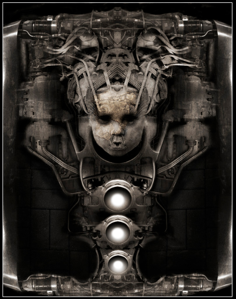
 ConstantToker — Reincarnation

Published: 2005-11-17 05:55:33 +0000 UTC; Views: 1573; Favourites: 43; Downloads: 168
Redirect to original
Description
This is my second attempt at photo manipulation. I did this manipulation in Photoshop CS. The wonderful stock was provided by the beautiful =lockstock .Related content


Comments: 87

Your second manip? Holy mother of christ, you sure got style
")
👍: 0 ⏩: 0

i am definately really jealous of what you can do.
and along with the first person to say it, have any pointers you can share with me as well?
👍: 0 ⏩: 0


this is amazing...it really caught my eye!i jsut love the effect you have done!!!!!
👍: 0 ⏩: 0

Nice photomanipulation skills being your second photomanipulation! But I'd suggest to make more light-dark contrast
 (Wink)")
👍: 0 ⏩: 0

very freaky (Smile)")
")
👍: 0 ⏩: 0

Makes me think of the borg (sp?) ...resistance is futile...
Great work ^_^!!
👍: 0 ⏩: 1

lol yea it makes me think of a cyborg as well, its probably more scifish than horror.
👍: 0 ⏩: 0

wow..very strong. I like the mix of mechanical thing...and this dark hurtfull mood. I like how the girl looks like a regular creature of terrible enviroment.
👍: 0 ⏩: 0


Really nice blending technique here. I like the colors and shading you used as well, they really complement each other. The texture of his face works well too.
👍: 0 ⏩: 0


second attempt at photo manipulation?
wow, that's awesome!
Im not really good at evaluating photos but I truly think you're an upcoming talent on DA ^^
👍: 0 ⏩: 0


This is an excellent manip. The wires and hoses are very well blended. Eyes can be pretty difficult and you've done a great job with them here.
👍: 0 ⏩: 1
thank you very muvh for the fav and watch I appreciate it
👍: 0 ⏩: 1
You are very welcome. This is really a great piece.
👍: 0 ⏩: 0


very, very nice! excellent concept. my only suggestion is that the banded markers on the pipes on the right side of the image look a bit too bright, but it's otherwise great!
👍: 0 ⏩: 1
Thanx, yea I wasnt very sure how to go about making them darker. I used the burn tool alot on them but for some reason it only made them brighter.
👍: 0 ⏩: 1
are you sure you used the burn tool and not the dodge tool? dodge would have the effect of making them brighter....i think....
excellent manipulation tho!
👍: 0 ⏩: 1
Yea, I'm positive. I for some reason the burn tool just kept making that part of the pic brighter. It only did it to that one part of the pic though for some reason.
👍: 0 ⏩: 1
huh. thats unusual. perhaps it had something to do with the layering...i honestly cant think why it would do that.
👍: 0 ⏩: 0


For a second attempt I think it was pretty successful. Those two metal highlights on the right side could be toned a bit more, but it's pretty clean and balanced everywhere else.
👍: 0 ⏩: 1

this is only your second manipulation? well then kid you certainly have plenty potential! keep it up
👍: 0 ⏩: 0
this is only your second manipulation? well then kid you certainly have plenty potential! keep it up
👍: 0 ⏩: 0

Wow, this is only your second manip? The details of this piece are perfect. A really awesome job!
👍: 0 ⏩: 1

Wow..It's really original..and kinda creepy.^_^; That's photomanips? You did a real good job with it!
👍: 0 ⏩: 1

Disturbing... as it should be I guess
good work here. the manipulation is well done, and the only thing that might make it better is more
color variation (try using color balance on the flattened image and see how that works out).
👍: 0 ⏩: 1
thanx for the suggestion, I'll keep that in mind the next time I try another manip like this
👍: 0 ⏩: 0

sweet nutters, now this is a impressive piece of work
👍: 0 ⏩: 1

Overwhelmed by technological in the post-apocalyptic/techie age. It looks very sinister yet organic.
👍: 0 ⏩: 1
Thank you very much
👍: 0 ⏩: 0


Wooh that's very nice, very unique and original! You have some great ideas keep up the good work!
👍: 0 ⏩: 0

Very dark - and really impressive! Love that uncertain feeling it gives me... Thanks for sharing!
👍: 0 ⏩: 1


Great choice in color. The expression says so much in this pic. Great editing
👍: 0 ⏩: 0

First impression: it's more sci-fi than macabre.
Colours: looks oxidated
Shapes: amazing!
Anything else?: wonderful manip!
👍: 0 ⏩: 1

I love how you put this together and the sepia works really well. I like the expression too, it adds to the surreal nature of the pic, very nice work.
👍: 0 ⏩: 1
| Next =>