HOME | DD
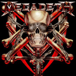
 ConstantToker — Vic Rattlehead Design

Published: 2006-02-03 07:12:23 +0000 UTC; Views: 5121; Favourites: 20; Downloads: 502
Redirect to original
Description
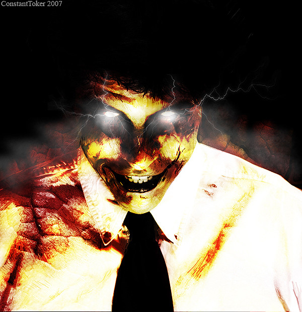
I've been working on this for a pretty good while now and I am pretty pleased right now. I may have to notion to change things later on though but I'm too sleepy to mess with it now.Related content


Comments: 34

thats brilliant...i lvoe what you have done!...kinda scary but it is very eye catching!
👍: 0 ⏩: 0


awesome entry! love the texture and dark look of this
👍: 0 ⏩: 0

Sorry for taking so long on my forum replies... Anyway, I really like this! In particular, the textures on the picture work really well, as well as the attention to detail on the blood and shades(?) Wonderful work! Thanks for sharing
👍: 0 ⏩: 0

Actually I meant only the top of the head from the "eyes" upwards.
👍: 0 ⏩: 0
Great work, very impressive. I think it could use some depth, it seems a little flat right now, I think you should add a little more volume to the skull to make it protrude out more.

👍: 0 ⏩: 0


This is the second one of Megadeth concert pieces that I have gotten in the forum post and this is the first I have faved.
👍: 0 ⏩: 0


Cool design. It really catches the eye, and the simple, depressing colours suit it perfectly.
👍: 0 ⏩: 0


Awsome work seriously, good luck for it, looks kickass
👍: 0 ⏩: 0

very cool, who's stock did you use or is it all your own? good luck in the contest ^^
👍: 0 ⏩: 1

thank you, I got all my stock pics from here [link]
👍: 0 ⏩: 1
cool, sxc is great for stocks ^^
👍: 0 ⏩: 0

I think this has to be the favorite of your manips  (Smile)")
I can't say i've ever really listened to Megadeth, but i think this would be good as a new mascot logo for them
I like how you have the mouth stitched closed.

👍: 0 ⏩: 0

Thanx man I appreciate it.
👍: 0 ⏩: 0

Yep. I'm beaten. My puny 16 year old skills with pencil cannot compete with this.
👍: 0 ⏩: 1
thanx for the comments and dont feel bad man. Theres alot of entrys out there that are way better than mine as well lol. Good luck to you in the contest
👍: 0 ⏩: 1
👍: 0 ⏩: 0


thats an excellant piece. But as an above poster mentioned the words megadeth should be bigger. Great job though
👍: 0 ⏩: 1
thanx for the comment, as for the Megadeth text I'm working on making it bigger with out lossing the quality of the resolution. I should probably start searching for a bigger pic of the logo or something lol.
👍: 0 ⏩: 0

Hell yeah, awesome. I like the texturization! I can't see anything that would stop me from favoriting this (or looking at more of your gallery).
")
👍: 0 ⏩: 1
thanx, I'm glad you liked it. I hope you enjoy my gallery
 (Wink)")
👍: 0 ⏩: 0


All I would say is make "Megadeth" a little big bigger and I'd say we have a winner here - It's is damn good and you should most definitely definitely win.
👍: 0 ⏩: 1
Thank you very much, I'll do that in a few minutes

👍: 0 ⏩: 0