HOME | DD
 deaddreamer — ddr - vic

Published: 2006-01-23 06:02:57 +0000 UTC; Views: 9116; Favourites: 68; Downloads: 1995
Redirect to original
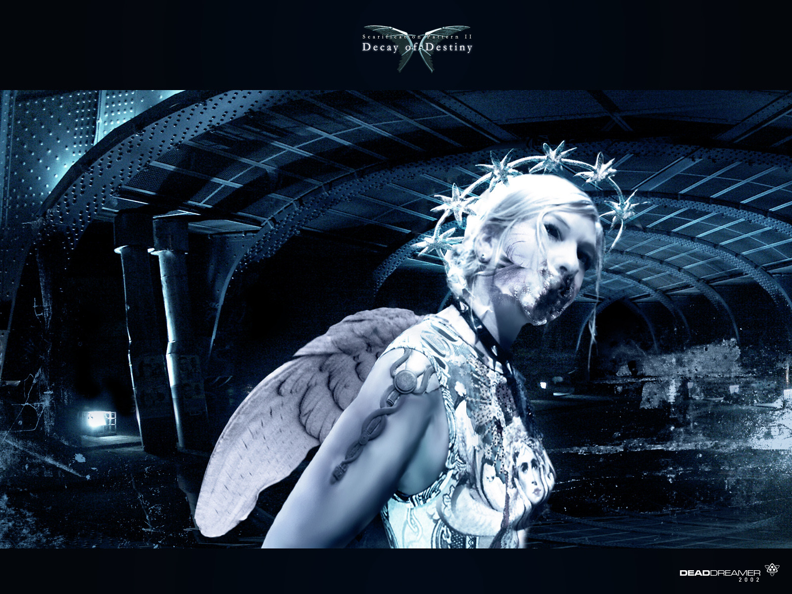
Description
well, also had to add my 50 cent for that contest.i'm not yet sure, i probably would want to make a cleaner, more logolike version later,
but who can say if i have the time for that.
megadeth were one of the bands that got me into metal at the first place, still remember
rust in peace vividly.
always loved the covers too.
Related content


Comments: 46


Megadeth was great metal band and now they sucks! Friedman is gone, Dave gone mad, i don`t know where the others gone but they sucks big time now! I will put this cover in my favs because i really loved megadeth and the Rutlehead looks great as all your work.
"Rust in peace" rules!
👍: 0 ⏩: 0

Dude this is truely amazing. Caught my eye first outta the rest of the Megadeth ones.  (Smile)")
👍: 0 ⏩: 0

")


always loved your dark disturbing style man this rocks keep it up
 (Wink)")
👍: 0 ⏩: 0

love the whole thing about it... except the Rabbit teeth
")
👍: 0 ⏩: 0

wow, this is just utterly impressive. It's desktop worthy.
-J
👍: 0 ⏩: 0


Wow... very nicely rendered.
The details and simply amazing.
The tones are perfect.
Awesome
I bet this wins ... it's true beauty!!

👍: 0 ⏩: 0

The perfect symmtry in some of the layers somewhat spoils it for me, even though I like the concept.
👍: 0 ⏩: 0

Fantastic. The best piece in this contest i've seen so far. WOW.
👍: 0 ⏩: 0


Great colors, and I like the text
Looks clean to me
")
👍: 0 ⏩: 0


amazing job, one of the best designs for the contest I've seen. Feels real, like I'm looking at a photo. awesome job.
👍: 0 ⏩: 0

This is great work, but, I think you better change the color of background, so the mascot logo can come forward and people can see how amazing your mascot is
👍: 0 ⏩: 0

Gotta say, this is probably the best one I've seen yet as far as an album cover looking image goes.
👍: 0 ⏩: 0

Great work, the only thing that makes me a bit weary is the top of his head, it looks to flat. maybe revise it for the logoversion?
👍: 0 ⏩: 0

hard to identify that with the mickymouse of metal, but that's his fault, not yours
👍: 0 ⏩: 0


This is my favorite so far ! Excellent work - very futuristic industrialization ( reminds me of the movie
"Metropolis" ). I agree with the previous comment about the skull....also I think the front teeth are a
little too prominent - kind of like rabbit buckteeth - maybe tone down the brightness a little ...? Fav !!
Laurie
👍: 0 ⏩: 0

after the 2nd look i found .. is that skull ends so sharp and it gives you feeling that it's flat .. why don't you try to add. alil. shadows on top to give her a round shape. like real skull. ... it's just my opinion so what do you think.
👍: 0 ⏩: 0

Ok, I'm not even gonna submit my entry now. You're gonna win
Good luck
👍: 0 ⏩: 0

hey man, great work here, and I wish u can get that guitar.
don't have time to do it but u have my support.
just an add: if the megadeth logo could has the same rusty texture of the skull or its iron piece, I think it will be perfect. something like letters breaking up and all that stuff.
good luck man!
👍: 0 ⏩: 0


You are definetely onto something here.
This makes more sense than the deviation with most favourites right now.
This has that extra development from the original... futurism.
👍: 0 ⏩: 0

You absolutely rock. It's always nothing but a pleasure viewing your art and this proves it once more. Good luck in the contest -- I hope you'll win it 
👍: 0 ⏩: 0

well done, dd. you've make an excellent work. as far as now i choose yours and bionic7's for the win.
good luck !
👍: 0 ⏩: 0


they're missing out if they don't pick this one...! echoes of previous covers.
👍: 0 ⏩: 0

So deeply disturbing... *shivers*
Good job on this. You've officially creeped me out.What did you use to make this? It's incredible! I especially love the chains. Drapey and lovely. And so shiny, too! ^^
*Ahem.* Anyway, good luck! You've got my vote, sir or madam. *thumbs up*
👍: 0 ⏩: 1

100% photocollage in photoshop
👍: 0 ⏩: 0