HOME | DD
 control — Controls Self-Portrait

Published: 2003-01-06 04:27:03 +0000 UTC; Views: 2277; Favourites: 24; Downloads: 306
Redirect to original
Description
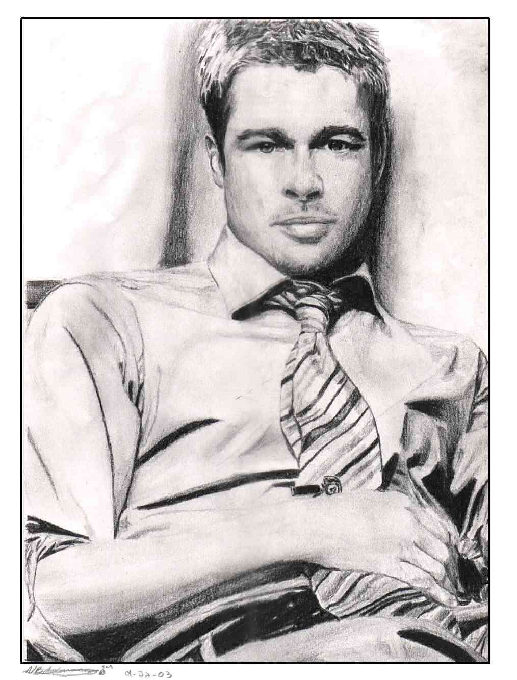
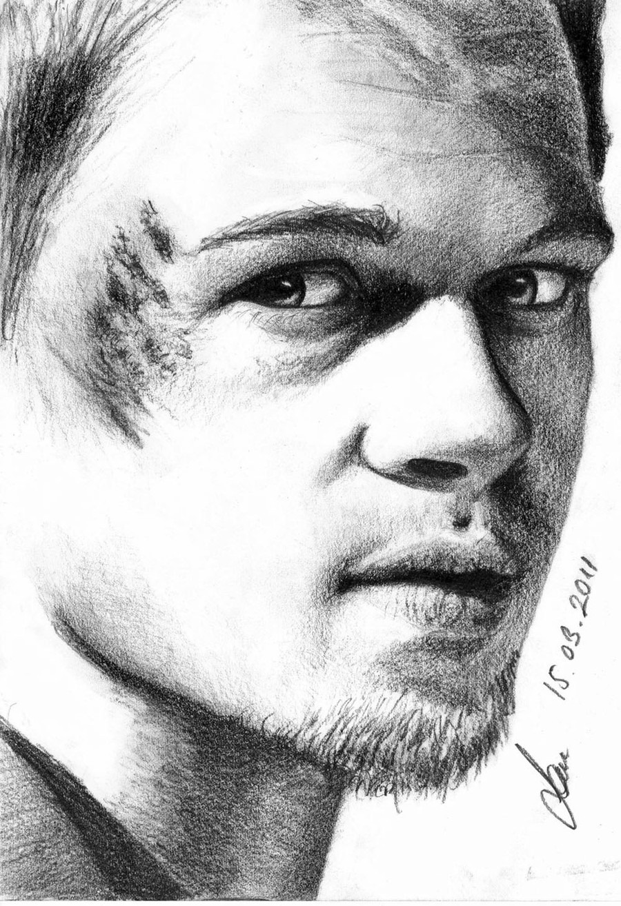
Yup, that's me alright.Hehe, I wish that was me. Maybe on a good day, a really good day, maybe. Anyways, it's Brad Pitt, photo reference used, in Ebony Jet Black extra smooth pencil, 8.5x11. There's something off in the picture, but I can't seem to find what it is specifically. The proportions are right, I checked it. The expression is pretty dead on, i think. Maybe its the rough texturing, or the hair, or the eyes, or the beard, or fingers, or the forehead, or maybe its just me and my need for unattainable perfection. Oh well, whatever then...
Related content


Comments: 54

^_^'
I saw the title 'self-portrait' and I was staring at the thumbnail and thinking
'maybe i should comment and say something like "has anyone told you you look like Brad Pitt!???"
V.nice lol
👍: 0 ⏩: 0


hei,
i really love the pic
i think it's amazing!!!
👍: 0 ⏩: 1

ye, you can see him in there, but the eyes and eyebrow leave much to be desired.

👍: 0 ⏩: 0

You think there's something off in the picture... cheek-bones seems too much ... bruise ... may be...
But I think is a very good pic = ) Is Brad Pit or are you?
bye...
👍: 0 ⏩: 0


i was gonna say DAMN you look like Brad Pitt...hehe great detail and shadowing..love it!
👍: 0 ⏩: 0

You took great photo and make such a briliant work here.. Wow.. Cant say a word.. Beautiful and speachless. Bravo!
👍: 0 ⏩: 0


very nicely done... the thing your talking about... the thing that's just a little of i think is the shading... specially near the right eye.. it sorta jumps from darker into brighter.. maybe you should fade it mare smoothly in and out.. but ignoring that you have some great work in your gallery.. and you must surely keep it up!!!
👍: 0 ⏩: 0


i think what may be off is the roughness of shading around the eyes, your paper may have been too textured to show this image properally, otherwise, pretty darn good
👍: 0 ⏩: 1

Thanks. Yeah, a lot of things wrong with this one.
👍: 0 ⏩: 0

ahhhhhhh...Braaaad......ok...had a moment
hmm...the "off something"...upper eyelids need more of a highlight, even if they are in shadow...lower lip line needs more definition, and it sorta looks like he's stabbing himself in the chin with his thumb...maybe add some depth & darken the tip of the thumb going under the chin.
still.........gorgeous.... =0)
👍: 0 ⏩: 1

Why would you want that to be you? You are so much hotter!!
👍: 0 ⏩: 1
only when I'm wearing a sweater and my leather coat and my long johns, even then its a stretch...
👍: 0 ⏩: 1

I am?
aaahhh! put me out, put me out, put out for me, put me out, put me out...
👍: 0 ⏩: 1
I see you missed the little subliminal message there...

👍: 0 ⏩: 1

*pushes eyebrow back down*
*licks face*
👍: 0 ⏩: 2
Ha, what are you going to do now?

👍: 0 ⏩: 0


I've seen the movie this comes from, and I think you captured it perfectly. This is the type of expression he has through the whole movie ^^
You inspire me to go do some pencil drawings... *sprints off*
👍: 0 ⏩: 0

/Unattainable/ Perfection? I don't see anything wrong with this @_@ A photographer couldn't capture him this well..
👍: 0 ⏩: 0

Wow...this looks really great. The eyes look awsome (I'm really big on eyes). Your work amazes me. Keep up the good work.
👍: 0 ⏩: 0

haha, don't kid yourself ... brad pitt isn't THAT hot (in my opinion) ... this really does look like him, however. i really don't see anything wrong with it. and the eye point is definitely the tone of his skin... you captured that perfectly.
👍: 0 ⏩: 0

looks like he (you) is holding a mask in front of his face.. the way the thumb goes behind the chin... gives me the impression of a flat face.. otherwise it's great!
👍: 0 ⏩: 0

it is definitely brad pitt
well it is definitely nce and good looking, but as you were wondering "what's wrong" or something, i's say it is the rough texturig. and the very dark under-eye areas + very dark shadows over eyes... i believe they might've been in the reference pic, but as the style of this shot is rather light, the sahdows are not "believable" if you know what i mean.
i like it anyhow :9
👍: 0 ⏩: 0


The middle finger runs off into space, and I think the neck should be shaded darker, to indicate depth, and to bring the face forward a bit. . ON his right eye (viewer's left) the inner corner is a bit too dark. . .or does not blend well with the rest of the white on the eye, making it look a bit odd and kind of flat. . .i'd expand the white inthere, and add just a hint of light gray shade instead. . . the eyes should look liquidy-glosssy kind of. . .
The shading on the forhead really really rocks. . I like the light patches. . .
I like the hair. . it looks scruffy, messy, rugged. . .and I like that. . .I also dig the beard, but it kind of does not match with the mustache. the mustache looks mellow and straight. . whereas the beard looks stronger and a bit more rugged. . .maybe add a few highlights to the mustache? and a few wavy strokes like you have on the beard?
That dark shadow under his right nostrill should spread out just a tiny bit towards the center, just to blend in a bit more. . .
I don't know why everyone else is whining about the lips, I think they look fine, except maybe just maybe you could add a bit more color ot the upper lip. . . just slightly more, to add a bit depth and contrast. . .just maybe because I think it is fine.
The bands on the fingers are a really nice touch, but I think you got tired of drawing when you got to detailing the hands. . .or were they just not as important as the rest. . . because it does seem like you are drifting away from smoothness and detail towards the outter edges of the piece.
Oh my god write me a novel! I am sorry, but I hope these observations help when it comes to "seeing" new things as you create more art. I think this is still incredible for a self-portrait. . .did you use a photo reference, or a mirror? or what?
I'm on my way to check out the rest of your work.
OH, and to add to everyone blabbing about Brad Pitt. . . this self-portrait kind of looks like him in Fight Club. . . (the finger bandages help ) But at the same time, this image has many many unique features to itself, that I feel bad comparing it to Brad Pitt. . . hm Ok I'll stop now.
👍: 0 ⏩: 0

From a heterosexual male perspective, Brad Pitt is fucking gorgeous.
Since you said you couldn't find the thing that was wrong, here's what I see: The beard doesn't look dimensional enough. It looks very flat, and almost combed. He's usually really scruffy. Second, his index and middle fingers have very hard lines on them that makes it look as if he's wearing band-aids. Third, his right eye is a little strange; the bit of flesh in the inside corner looks a little too big... I think that reducing its size would open up his eye a little more. Lastly is the hand and his jawline; there doesn't appear to be any weight on his hand... it's just floating in front of his face. If you could somehow add folds in the skin to indicate pressure, I think it might straighten things out. As far as his jaw goes, I remember Pitt's jaw tapering out a little bit more in the back.
Fantastic work, bro.
👍: 0 ⏩: 0

I really think it's the eyes that are your problem. they seem very dark compared to the rest of the picture.
👍: 0 ⏩: 0

Yes!! That is very well done. All of your portraits amaze me. I think that the thing you cant seem to place that is off in the picture isnt really off at all. You said you checked the proportions and theyre right, and i believe that. But sometimes, your eyes can tell you that something is wrong when its not, even though the actual photo is the same, like if you see a photo, your head tells you its right, but when its on paper, it seems off. I think its just the way that the hand disapears and you cant see that it actually comes foward. But thats just my opinion of what i see... you dont have to listen, but anyways, this is a great peice of work. Keep this up. Youll go far
👍: 0 ⏩: 0


perfect drawing . the wrinkles of the hands are pretty sketchy though.. comparing..
👍: 0 ⏩: 0

ow ow! very nice piece, i love it esp the bandaids on the fingers
👍: 0 ⏩: 0

Good job, I like how the soft lead came out. I think everybody had hit on what was a little off, but I still think its a good job, better than I could do
👍: 0 ⏩: 0

As I can see in Your ID Your speciality is drawing woman...so...this woman is very rough but i like it anyway...maybe [link] wrong with eyes,but it's only my impression
👍: 0 ⏩: 0


that is hella cool man ... like really.....
i just don't like one thing - his thumb kinda disappears 'into' him - my brain has a fairly easy time of coming up with explanation of how that can be "ok" but it still looks a bit odd .... just wanted to point that out ^_^
👍: 0 ⏩: 0

well, the good news is that i did think it was supposed to look like brad pit, & from the thumbnail... but there are a few things that are maybe a little 'off'.
the forehead, mouth and nose are perhaps slightly too large.. the nose not so much. (he has a little scar beneath his eye btw - not sure if u included that. just to be extra picky ).
anyways, perhaps a hint is when drawing him, is to think slightly feminine with the face... he's really quite beautiful.
yeah, mostly i guess it's really just the hair and forehead that need work.... the rest is pretty good (i'm just being v.picky on the other things probably). keep up the good work & ignore tired perfectionists/picky people like myself.
👍: 0 ⏩: 0

Hmm...I think it's the lower lid of the left eye or something. It doesn't look like it goes with the right eye. But that could be because his finger is pressing on his cheek, making his left eye look like it's squinting?
If that's the case, then add some more detail around that area. Add more shadowing under the index finger where he's pressing his cheek...
It's still a great drawing
You have great talent!
Keep it up
👍: 0 ⏩: 0
| Next =>