HOME | DD
 CoranKizerStone — The Bat show that almost was
by-nc-nd
CoranKizerStone — The Bat show that almost was
by-nc-nd
#batman #characters #coloring #concept #digital #digitalcoloring #illustration #kizer #kizer180 #modelsheets #futurebatman #coranstone #wbanimation #brucewaynecharacterart
Published: 2015-05-03 22:37:43 +0000 UTC; Views: 43129; Favourites: 1634; Downloads: 0
Redirect to original
Description
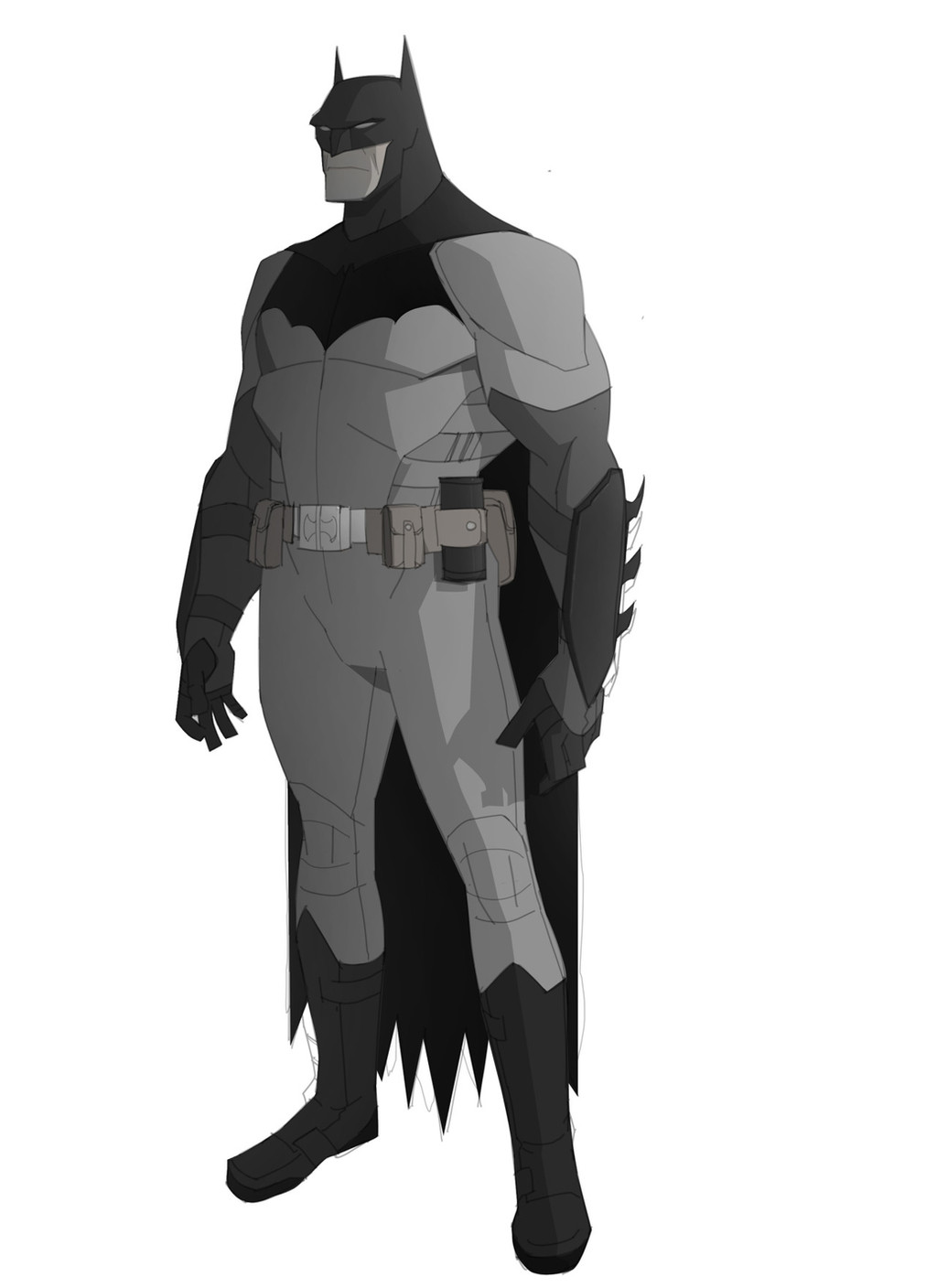
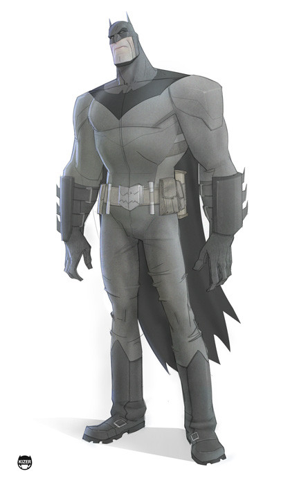
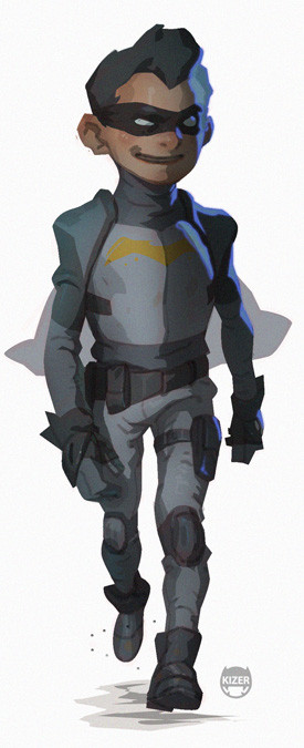
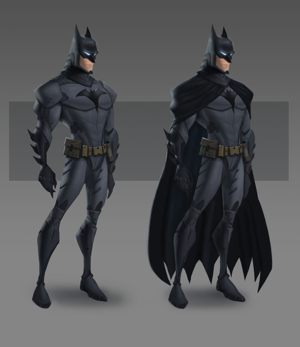
This was one of the first Designs that I did when I was helping to develop the now scrapped, Dark as hell, Batman series for WB animation. T'was fun though. James Tucker (the producer) was such a seriously talented dude to work with.Related content


Comments: 60


WOA!!! Awww man i would have loved to have seen this. As an animator would have been a dream to work on such a project if it went into production. Gawddddd. Those designs!!! 0_o
👍: 0 ⏩: 0

Batman will always be my favorite superhero. I love coming to you pages to see your next interpretation. Awesome work!
👍: 0 ⏩: 0

Disappointed!
We need more 'grown up' cartoons.


👍: 0 ⏩: 0


Kizer, I've been following your work for years and you never cease to make some cool shit. WB better snatch you up for something more permanent soon!
👍: 0 ⏩: 0

You have a thief on G+
plus.google.com/10574896624710…
Great art btw.
👍: 0 ⏩: 0


I would've watched it if the design aspect was based around this concept. Awesome character design.
👍: 0 ⏩: 0

whyyyyyyyyyyyyyyyyyyyyyyyyyy didnt it happennnnnnnnnnnnnnnnnnnnnnnnnnnnnnnnnnnnnnn
👍: 0 ⏩: 0


I prefer your style any day than the DC animation style they are putting out now. Yours at least stays true to the designs of Bruce Timm, yet more sophisticated than his. Keep up the great work!
👍: 0 ⏩: 0

love it. the larger symbol connecting to the collar/cowl and covering his entire chest makes the costume more fluid. really cool, man.
👍: 0 ⏩: 0

That is a hella cool design! Shame it was scrapped, between this and the description it sounds like it would have been pretty cool.
👍: 0 ⏩: 0


Would have loved to see how this would turn out.
👍: 0 ⏩: 0


It didn't even make it, and yet I miss it desperately.
👍: 0 ⏩: 0


Too bad the show was scrapped, dude! Looks awesome!
")
👍: 0 ⏩: 0


Would have loved to see this. I like the darker, more serious tone in the shows
👍: 0 ⏩: 0

Nice Mood and proportions! This series would have been fucking dope ( I can tell by the concept art direction) hehe.
👍: 0 ⏩: 0


Seriously. The over/underpants. They need to be on. They're there for a reason!
👍: 0 ⏩: 1

No-they're stupid. We're not in the 1940's anymore.
👍: 0 ⏩: 2
I shot a superhero movie once. When you're wearing leotards, you need the shorts. Or your bat-junk shows.
👍: 0 ⏩: 1
Aesthetically it makes no sense. It's called UNDER-wear. And no superhero today wears leotards (other than Plastic Man), most wear some sort of armor.
👍: 0 ⏩: 1
Gonna give you the eye-roll on armor. But that's not your fault, it's the stupid designers.
👍: 0 ⏩: 1
I think armor works for characters with trunks-Batman, Robin and fam need bulletproof armor, and Kryptonian armor is cool
👍: 0 ⏩: 0

your moms not in the 1940's anymore
#told
👍: 0 ⏩: 1

How dark would it have been compared to the movies/animated series/"beyond" sequel?
👍: 0 ⏩: 0


WHHHHHHHHYY?!
Why must all the good superhero cartoons never see he light of day? It's a shame, but hopefully you can use this design somewhere else. It's damn cool.
👍: 0 ⏩: 0

That's a damn shame. We need a new Batman show, but it seems nothing ever pans out. Nicely done though.
 (Smile)")
👍: 0 ⏩: 0

I suspect that this was meant to be a more aged Bruce Wayne/Batman, given the solid build of that torso.
👍: 0 ⏩: 0

Daaaaaaaaaaaaaaaaaaaaaaaaaaaaaaaaaaaaaaaaaaaaamnnnnnnn.....
👍: 0 ⏩: 0

| Next =>