HOME | DD
 coreylandis — Goldbug

Published: 2012-06-28 08:52:03 +0000 UTC; Views: 3684; Favourites: 115; Downloads: 0
Redirect to original
Description
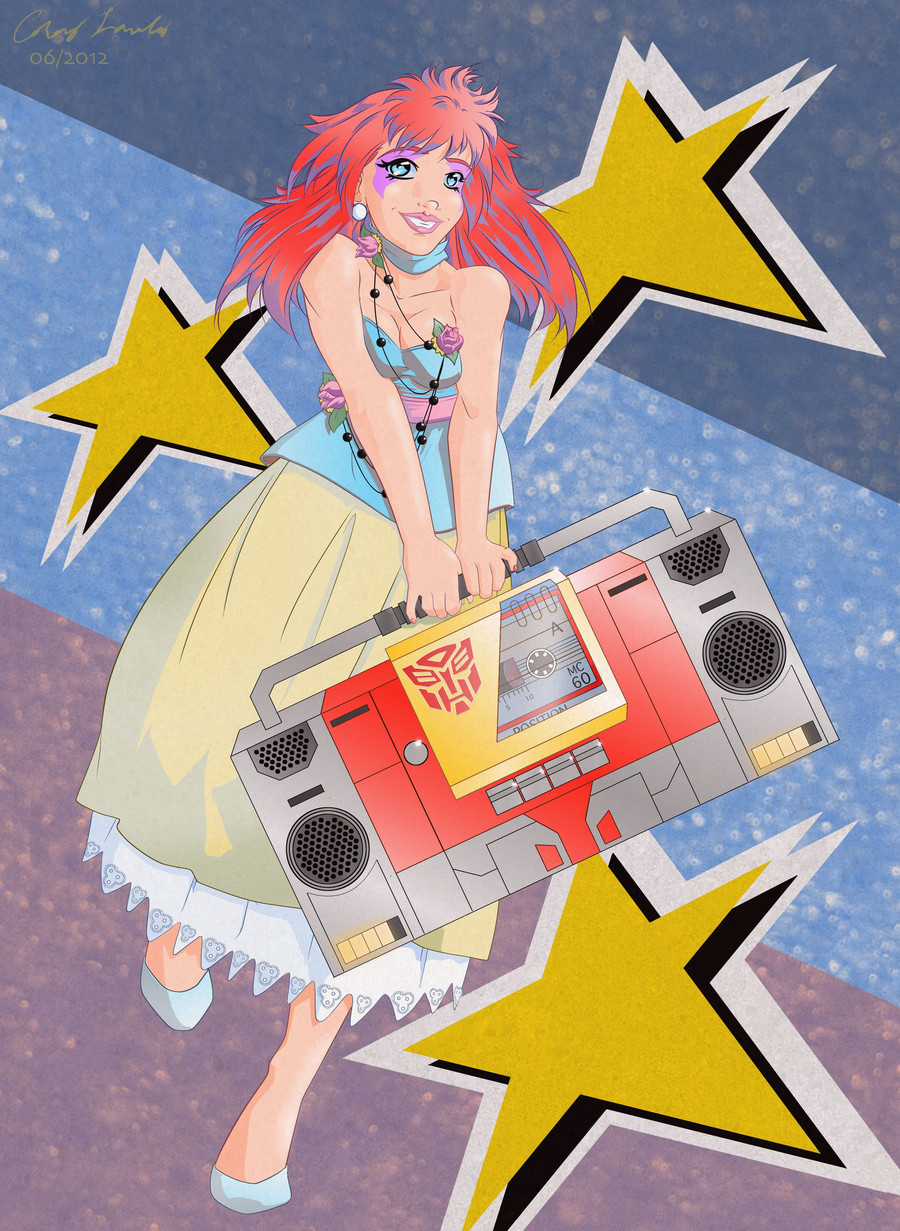
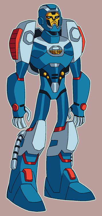
Edit: Made some small changes to some of the tone layers. Added a few shadows and highlights.My favorite Autobot, Goldbug (the evolved form of Bumblebee). This character belongs to Hasbro.
Done as a monthly challenge for We're supposed to revisit that which made us want to draw in the first place. For me that was the Transformers. If anybody cares to see my original sketch, you can find it here
This redesign has many areas inspired by 's redesign of Bumblebee for the IDW Infiltration series. As much as I like Goldbug as a character, the Throttlebot bodies are relatively boring. I attempted to go for a "gold" color similar to the toy. Pics of other properties from my youth :thumb309264341
Related content


Comments: 31

Wow, it's so close to the Knightverse resign of 'Bee. Very cool.
👍: 0 ⏩: 0

You're welcome. And you have a cute avatar, too.
👍: 0 ⏩: 1

Thanks again. The avatar is my OC, Cat. One of the characters from my Skitterpunk Hellsprite project, so there'll be lots more of her in the future.
👍: 0 ⏩: 1

He's got a fuel dump the size of Cybertron.
Did I say dump? I meant pump.
👍: 0 ⏩: 0

This is a nice redesign. Have you ever thought of recoloring him as Glyph?
It might fit pretty good. The stature seems a little effeminate. (")
")
👍: 0 ⏩: 1
I was waiting for someone to tell me he was standing like a chick. I kind of feel that way myself. I doubt I'll be doing any recolors, though.
👍: 0 ⏩: 1
Well, if you're up to it, you can draw "Her" in a different pose.
But alone this is a nice job, and personally this is one of the best concepts for a bumblebee-type robot, so either way I still congratulate you.

👍: 0 ⏩: 1
Thanks!
One of these days, when time provides, I'm going to do a series of some relatively obscure Transformers. I think I'll add Glyph to the list. Probably take a few ideas from this design, but I'll no doubt draw her more feminine (meaning less blocky) than my version of Goldbug.
👍: 0 ⏩: 1
Would you like it if I gave you the conceptual design for her Animated counterpart?  (Smile)")
👍: 0 ⏩: 1
[link] I've seen this picture on tfwiki. If you know of a different one, I'd be interested to see it.
👍: 0 ⏩: 1
So far, only her G1 and animated designs but there is another...
[link]
👍: 0 ⏩: 1
Yeah, that's a good reference for the face if nothing else.
👍: 0 ⏩: 1
Something unique, and it is quite feminine.
It goes for her G1 aesthetic, along with that lean body, and creates a unique balance between lean, curvy, and femmy but still has a classic ring to it like most G1 gals.
👍: 0 ⏩: 0

I never got to see this guy in action but he sure looks tight.
 (Cool)")
👍: 0 ⏩: 1
He was all over the old Marvel comic books, but got very little time in the show. I have to say, other than the shape of his head, Goldbug didn't look much like this in either of those versions. Heck, I even changed the shape of his horns to look more like Bumblebee.
👍: 0 ⏩: 0

Awesome job man. This turned out pretty epic.
Also do you use the gradient map for shading? Or do you blend your colors together with a brush? It looks smooth.
👍: 0 ⏩: 2
Oh, and I never should have teased you about your 80 layers, because by the time I got done with all the tone layers on this one, I was running about 87 layers without a background.
👍: 0 ⏩: 1

Glad you liked it.
I did all this in Manga Studio 3, which is geared more for black & white work than color, though you can find ways around it. You can apply tone layers (like you see in the black and white manga) and then change them to gradients. These particular tone layers are set to 100%, meaning there is almost no perceivable gap between the dots. With practice, I've found the tone layers to be highly manipulatable. You can also lay multiple tone layers in the same area for different effects. The upper legs have 2 tone layers, which is how I did that bright line on the edge, while also doing the up and down gradient (I actually don't like how that part turned out and will most likely change it at some point). Then I used the air brush tool at increasing opacities to put some highlights on the helmet, fingers, bumpers, shoulders and middle parts of the chest and feet, which I gaussian blurred. I might like to go back and redo the airbrush highlights. It was getting to be about 4:30 in the morning when I got to that part, so I'm sure I could do a little better, when I'm not tired as heck.
👍: 0 ⏩: 2
No problem man.
Ah, I've heard about Manga Studio. Is it extremely good?
👍: 0 ⏩: 1
I like it a lot for laying down tones on black and white images, so it's great if you want to do something in a manga style. You can manipulate the heck out of the tone layers. I generally ink with vector layers and you can get some really precise looking lines, but I can't seem to get them to look as organic I'd like on characters that are made of flesh (though it could just be the way I do things). For mecha, like in this picture, I've having a lot of fun with it. If you're looking for a coloring program that easily lends itself to a painterly style, I'm sure Photoshop or even Gimp are far more versatile. I like to color my own characters with cel-style shading, so Manga Studio is fine for that.
👍: 0 ⏩: 1
Yeah I tend to use Photoshop CS5 and Paint Tool Sai a lot since I can use them for painting purposes. I normally tend to stick with Photoshop since it's more suitable for me. However I'm using Sai more since I want to learn more about the program and how to improve my line art. For the most part, I am learning the program quite well and I seem to be getting the hang of things. But in the end, I prefer Photoshop better since I like the tools more.
👍: 0 ⏩: 0
")
Yeah. Is that surprising?
Everything I have on deviantART is Manga Studio version 3, excluding a couple of pencil sketches. I got it over 5 years ago when I had no interest in coloring. The intent was to use it's tones for my black and white comic book pages, which I was inking on pen and paper at the time. I've found Manga Studio does pretty well for inking, and I've since giving up inking on paper. I can't say as I have experience coloring in any other program, but some people think I'm crazy for using Manga Studio to color. If I wanted to do more pics in a painterly style, I suppose there are much better programs. I haven't been in any hurry to find out, as I've decided I'll be coloring my book with cel-style shading, which Manga Studio is more than adequate for.
👍: 0 ⏩: 1
I don't know. I'm not trying to talk the program up. I like the way you can manipulate the tone layers and the inking is good for precise lines (especially if you use vector layers), though I've never managed to ink anything that looks organic. I can't say if that's a limitation of the program or just me, though I've heard Robaato and others say Sketchbook Pro is better for natural looking lines. I'd like to try Sketchbook Pro and Sai, myself. If you're looking for a coloring program, I'm sure Photoshop or even Gimp is far more versatile. Having said that, I've yet to try Manga Studio 4.
👍: 0 ⏩: 1

Oh I've been using Sai for my inking and both Sai and PS for my coloring. I guess I tried MS4 a long time ago but it was before I got a tablet so it didn't work out for me lol. It may be very different for me now.
👍: 0 ⏩: 0