HOME | DD
 Corvarrow — Terror in the Depths of Fog

Published: 2010-08-19 07:49:30 +0000 UTC; Views: 1109; Favourites: 40; Downloads: 13
Redirect to original
Description
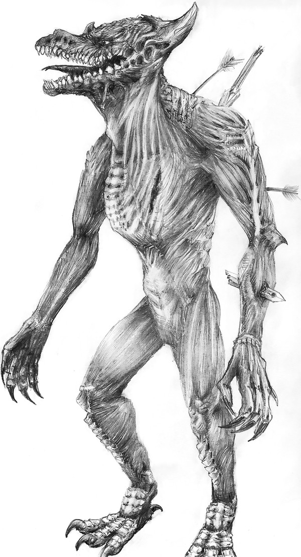
[Terror in the Depths of the Fog]I made myself a promise not to stay up so late, but here I am staying up and finishing art at nearly 2 in the morning. fff.
I realized that I haven't completed regular art of my characters since..the beginning of June. =Much= longer if you look at just the digital side of things. I'm still playing around with how I do digital art. This is definitely not the way I'm going to keep, but it was fun anyway. Threw a bunch of textures and sharpening at it! (The original lineart is REALLY MESSY and this is my way of hiding it. I also cheat and hide extra lines by making the 'background' SO BRIGHT) There are a couple things that are off, but. Aaand I spent a lot less time coloring this than I usually do. You can probably tell. Nehhhhh. I don't care. 8X
...THEM WINGS.

So...yeah, I haven't finished any art of The Nailangel in a couple years. It's a shame because he's actually super fun to draw. XDD;; In case you're wondering, his mask is around the back of his head.
Oh my god his ref needs to be updated, and so does Towers'. And so does Sy's. Would that be weird of I updated all three of them? XDD;;;; SEEING AS HOW Tower and The Nailangel both look like him!
...Does this need a mature filter?? Probably not. He's covered with blood and stuff, but it's harder to tell now.
BRB GOING TO BED NOW
Related content


Comments: 20

ksldfdf GHOST I saw this on LJ I think maybe, and the closeup of epic of his face. I really enjoy the scratchy sketchy look of his lines and all over. And I love them WINGS. dayamnnn. Ohhh and the one farthest away, you made it look really -GOOD- I have trouble when the wings are positioned like that but you OWNED IT.
I do get the silent hill feel with his coloring and stuff, THE MUSIC HELPED THAT. And I get the image that he's like 'OHGOD NO MORE LIGHT' or trying to escape from all the bright white, but the white bg also seems to fit well <333 /babble
👍: 0 ⏩: 1

Oh my god, I'm so sorry I took forever to reply to thiiiis 8| I got so many messages in my message center all at once I kind of hid from them. >_<
BUT THANK YOUUU
👍: 0 ⏩: 0

")
 (Smile)")
Loove the metal texture on the wings, great choice!
👍: 0 ⏩: 1

so fucking cool
And I love Nailangel anyway. >w< GOD YES
👍: 0 ⏩: 1
Thank youuu ;333; I AM GLAD YOU THINK SO.
👍: 0 ⏩: 0

I really, really like the... noise? I'm going to call it noise. Whatever the effect really is called, it's the first thing I noticed when I saw the colored version, that it has a kind of "rust" feel. (Not rust-y but rust, if that makes sense?)
Annnnd then I noticed that the wings, for the parts in the distance, start to smudge. The fact that the background IS so stark and bright really helps the effect, I think! The coloring, too - even if you didn't spend as much time as normal, what is there just seems so brutal/stark next to the white, and it suits him.
Also, asdjhfgdf, I still really, REALLY like how those wings came out! <3
...And now that I've started, let's see if I can get more commenting done. I feel really bad 'cause it's mostly your stuff from ages ago, augh! XD;;;
👍: 0 ⏩: 1
I'm not sure what it is, but I think noise would be a good way to describe it! 8D
Oh yeah. When I was doing all sorts of stuff, I ended up blurring the whole thing, and only sharpened the closest stuff so it would look like maybe he was moving everything really fast. ")
THANK YOOOUUU. ;333; <333
Awww! WELL, I APPRECIATE COMMENTS NO MATTER HOW LATE. ;33333;
👍: 0 ⏩: 0

Oh geez updating old characters' references. Recently I thought I'd update Ribbontail's sheet, then I did another, then another, and since then I haven't been able to stop. Updating old refs is a slippery slope, Ghost, I hope you don't end up wanting to update everybody's!
(OR DO I?!)
Ahem hem hurm.
Absolutely adore the picture though, for the quick sketch you say it is I must say it turned out fabulous. I'm most impressed by the texture and effects you gave the wings: they've got graininess, sheen, and depth with all their little ridges, and I really like that. And I like how his left wing is turned away from us, so that it's almost flat. Good use of perspective there.
Rest of the picture is also done well. Your use of motion is good too, and the pose is dynamic and exciting. I think that his upper right arm (the one facing us) is a bit too stiff, though this might be because of the angle. That's the only critique I can think of, the rest of it looks fabulous. Great job!
Might I ask what texture you used to get the grainy look of those outer "feathers"? It looks like you used something simple like "noise", but I'm not suuuure. It's... unique. :U
👍: 0 ⏩: 1
WELL the thing is that I already spent most of the end of last year updating refs! XDD The only refs I didn't update were Sy and his sions. BUT I guess my problem was that the sions by nature look like him, so I wasn't sure if it would weird people out if I did ref updates for characters that were all similar looking.
Thank you!
ACTUALLY I think what's wrong with the right arm is that I originally drew him with one of his spears out! 8U When they're out, a whole section of his arms become kind of stiff because they're basically like swords...coming out of his palms. But I ended up changing the pose and general composition a lot, and for some reason ended up keeping that arm the way it was! Whoops. XDDD;; But thank you for pointing it out. 8D
The feather coloring ended up really complicated! First I just had the flat colors, shading, and some extra red/redorange for blood/rust, but it wasn't looking so great. Then I added some metal texture I have saved on my computer to see if it would help anything. (It's kind of a weird looking texture. I'm not sure if it was from CGTextures, Mayang, or what). ALSO didn't help. That's when I ended up doing stuff like overlaying the picture on top of itself (which made it really dark), and then when I started sharpening it, the texture appeared!
...So...yep. 8'D It was pretty convoluted.
👍: 0 ⏩: 1
Haha I'd imagine that would weird some folks out too. But I say go for it, his ref right now looks fine enough as it is but there's nothing wrong with an update!
You're very welcome though, and thanks for explaining that texture thing to me. It sounds like you basically went on a tinkering spree and came up with something totally random. Haha! Looks great though, very interesting indeed.

👍: 0 ⏩: 0

I like that song.
I think my most fave SH songs to date tho are Letter, Rain of Brass Petals - 3 voices edit, and Hell Frozen Rain.
Love the wings on this, too. :3
👍: 0 ⏩: 1
I loooooove so much of the SH soundtracks that it's hard for me to even compile a top ten list, but I think my three absolute favorites are Theme of Laura, True, and Wounded Warsong (the louder the better). 8'DD
👍: 0 ⏩: 1
Oh hell yeah, when WW played during the movie I nearly screamed in delight.

👍: 0 ⏩: 0

O_O OH MAN THIS TURNED OUT SO COOL. This sketch was awesome when I first saw it on your LJ and now it is like a hundred times more awesome all finished.
The pose is fun and I really like the movement of the piece, especially on his hair and coat. ALSO THOSE WINGS ARE SO RAD they just look awesome. And the sharpening and extra textures really give this an ominous look.
Also, the wing facing away = awesome. That's a hard thing to draw and I like how it's blurred and out of focus, it makes me feel like The Nailangel is really moving!
👍: 0 ⏩: 1
THANK YOUUUU oh man I was so proud of the sketch. Mostly for the wingalings. I am also pleased that there is some sense of movement and not just like, hey guys I'm standing around doing a pose! The Nailangel actually is really fast, and if he's not going to stab someone with his hands, he'll probably try to cut with his wings. The effects I got with sharpening were so accidental, (I was just screwing around), but I'm glad I did it. ;33;
👍: 0 ⏩: 0

oh wow! thats so awesome!
I love his wings and pose! <3
that'd probably make an epic print if there was a bit more to the background maybe? I dunno but I think I'd buy one X]
👍: 0 ⏩: 1
Thank youuuu! <333
I did consider a lot of different things for the background. ;__; The problem was that this was so, so messy (I have taken precautions so my next sketchbook will not be so messy), and there were a lot of other things drawn on the page, between the wings, along the sides, etc. So instead of trying to clean up or hide all the extra lines, I got rid of them entirely by the fuzzy-white. I swear I'm going to try for more background...next time. XDDD;
👍: 0 ⏩: 0