HOME | DD
 cosmicbound — Apollyon Impact

Published: 2004-08-30 02:14:57 +0000 UTC; Views: 106500; Favourites: 1119; Downloads: 51171
Redirect to original
Description
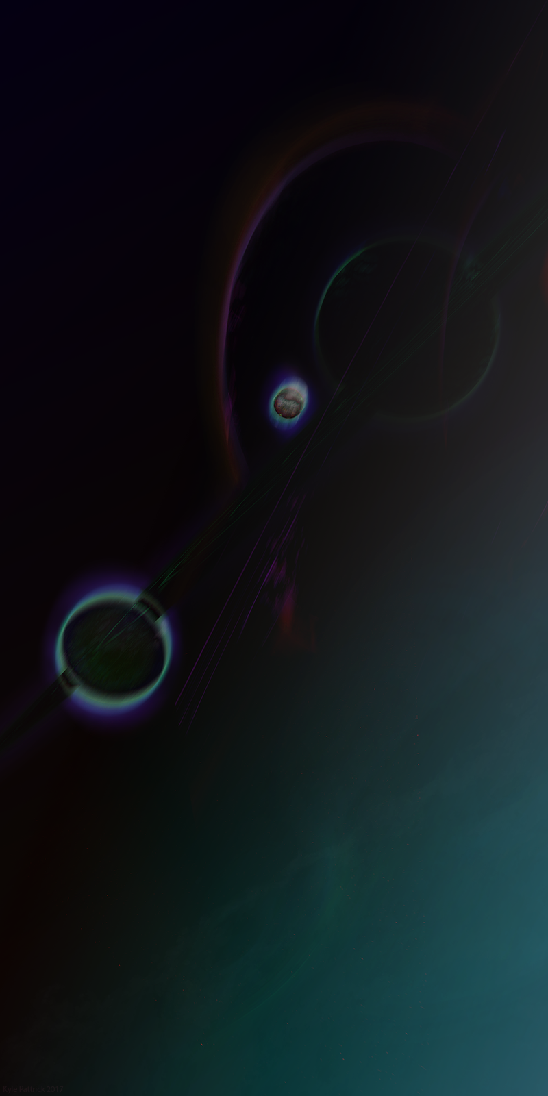
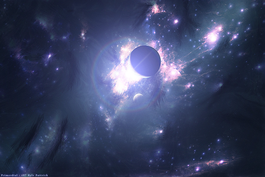
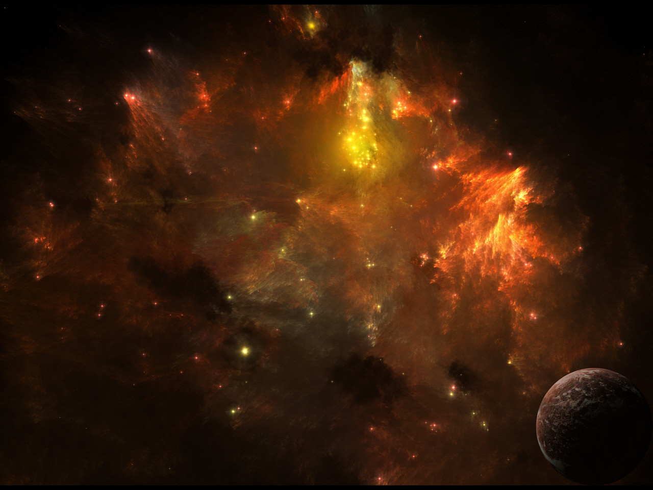
Wallpaper of the impact from Apollyon.Feedback is welcome!
24/4/07 - Added a higher quality version of the image.
Related content


Comments: 412


man this is just great, good work.
feel free to visit my gallery  (Wink)")

👍: 0 ⏩: 0

i have also noticed a warm impact on my room - i left my pc on all night...until it woke me up in the morning...
👍: 0 ⏩: 0

What 3d program did you use to make this? It is beautiful, and I gotta know what program(s) you used, as a fellow 3d modeler
👍: 0 ⏩: 0

holy shit now that looks awesome
excellent work thats a +fav
👍: 0 ⏩: 0

I like the texture and color here, and feel that you've done a good job of portraying the tension and energy involved. I like it for the most part, but should get straight to talking about some issues I see.
It's strange to me that the explosion is not tangent to your planet (star?). The "mushroom cloud" seems to be placed to work with your composition, and not to contribute to the realism of what you're trying to show here. If it were me, I'd add some to the canvas on the right side and rotate the explosion 15 degrees or so clockwise. As for what to do in the bottom right of the image, that would be your job to decide.
The sockwave looks cartoony, for lack of a better word. It isn't convincingly curved, and... ... well, I guess that's the only problem I have with it.
I don't especially care for what's going on in the upper right. As I think it happened, you finished the main event and couldn't decide what to do. It looks very much like a "space filler" made up of a few brush strokes with textured edges, drawing from the same oranges from your explosion and star. The texturing is good, but the technique is fairly transparent.
I'm temped to say it's monochrome, but it really isn't. You've got a variety of oranges, but I'd like to see you branch out and adopt the other two families of warm colors. Some reds and yellows could help you emphasize your shadows and highlights.
The star is the best part of the whole image. It's well done. I'd focus more on the good things, but everyone before me seems to have handeled that bit.  (Smile)")
Phew, I'm done.
👍: 0 ⏩: 0


whoah, a massive collision with a star
now that's original
well done technically too!
👍: 0 ⏩: 0

how did you made this fuckin' good lookin' piece?
AWESOME!
👍: 0 ⏩: 0


OMFG THAT IS AWSOME I LOVE IT!!!!!!!!!!!!!!!!!!!!!!!!!!!!!!!!!! THAT DESERVS (fav)
👍: 0 ⏩: 0


great work! I love it, i just gave it a +fav, i might use it as my wallpaper too. Really nice, you should try making wallpapers with a higher resolution though
👍: 0 ⏩: 0


OMG OMG OMG !!! THIS IS SO FUCKING GOOD ")
👍: 0 ⏩: 0

WOW....COOOOOL!
THE END OF THE GALAXY!!!!!!!!
I LOVE IT!
👍: 0 ⏩: 0


oh my gawd that is just plain ridiculous!!!!
i could stare at it for hours....
i know most people say its a planet, but seems to me more like a star that got struck by something very, well, big. yes?
👍: 0 ⏩: 0


Nice ejecta, nice shockwave and wow that looks hot, loving your stuff!
👍: 0 ⏩: 0

Really, really awesome.. except maybe one thing: the starfield. Other than that.. well, awesome!
👍: 0 ⏩: 0

Ooooooo! *watches in awe* that's the most amazing thing I've ever seen....*puts on sunglasses and sunscreen*
👍: 0 ⏩: 0

I thought it's time to have a look at your page again, and that's what I found
you love those powerful images, don't you? ^^ it is nice image, I guess the brushing was quite time consuming here. the explosition itself should be more angled, to make up one line with the radius, it looks a bit off at that angle. also I'd suggest reducing the amount of embossing on the sun, but I must say, those solar structures are nicely worked out, quite convincing.
a thing I miss in this piece is a background. you focused on the sun and the impact, but sort of forgot a background
anyway, good work
dan *waves*

👍: 0 ⏩: 0

WELL DONE! I feel the warm wind comes out from my monitor
👍: 0 ⏩: 0


Hey man, nice work
When I was looking through your gallery, I saw this pic and thought to myself I might put it on my favorites. However, when I got a closer look at the picture, the "physics" of the scene just didn't seem right. The presumed "impact point" of the asteroid/comet (what is causing the explosion?) does not seem to match the shockwave on the surface of the planet/star (what kind of celestial body is this?)
Also, I have another criticism. If this celestial body is really a star, then the other stars/planets in the backround should not be showing up as clearly. If this was a star like our sun, then one would probably only be able to see the extremely bright and/or close up stars in the upper left corner of the picture. This, however, was a more subtle "flaw" that I noticed only after I noticed *ice-phoenix-sb's comment, to which I would respond, "It could use a few less stars."
👍: 0 ⏩: 0

I just found my new wallpaper. Great job!
👍: 0 ⏩: 0

This is simply stunning man..dont know what else to say...wow!
👍: 0 ⏩: 0


I gotta say that that is amazing, gj, one snag for me though, the orange over powers it for me, i placeit on my desktop and i can't see the shortcuts because of the brightness of it. Try variang the brightness. apart from that it amazing, i wish i could do stuff like that...
👍: 0 ⏩: 0


👍: 0 ⏩: 0


when i say this i said "wow" out loud. Very nice piece, very well done and a 
👍: 0 ⏩: 0

my only beef is that it looks like a side impact.... but the explosion/cloud goes straight up... shouldn't they be in the same line?
👍: 0 ⏩: 0

Its so beautiful, people have said enough,
👍: 0 ⏩: 0

This picture is amazing. How did you do it?
👍: 0 ⏩: 0


l-l-l-l-love i-t-t-t-t-t-t-t!
My style, you're gonna be like my favorite artist!
👍: 0 ⏩: 0


This is like some of the best art ive ever seen!!! and your only 14 wow! mhm ::whistle whistle:: i am in awe! how do you do it? do you like the the art off line and fix it...or do you actually go to the sun? its so rad!!!
👍: 0 ⏩: 0

o fuck yeah, this is one of your best. I love how you color, you just so damn amazing with the detail! 
👍: 0 ⏩: 0

This is awsome, you should enter this into the Linspier Contest
👍: 0 ⏩: 0
<= Prev | | Next =>