HOME | DD
 cosmicbound — Instigate

Published: 2006-09-04 15:13:56 +0000 UTC; Views: 7082; Favourites: 176; Downloads: 128
Redirect to original
Description
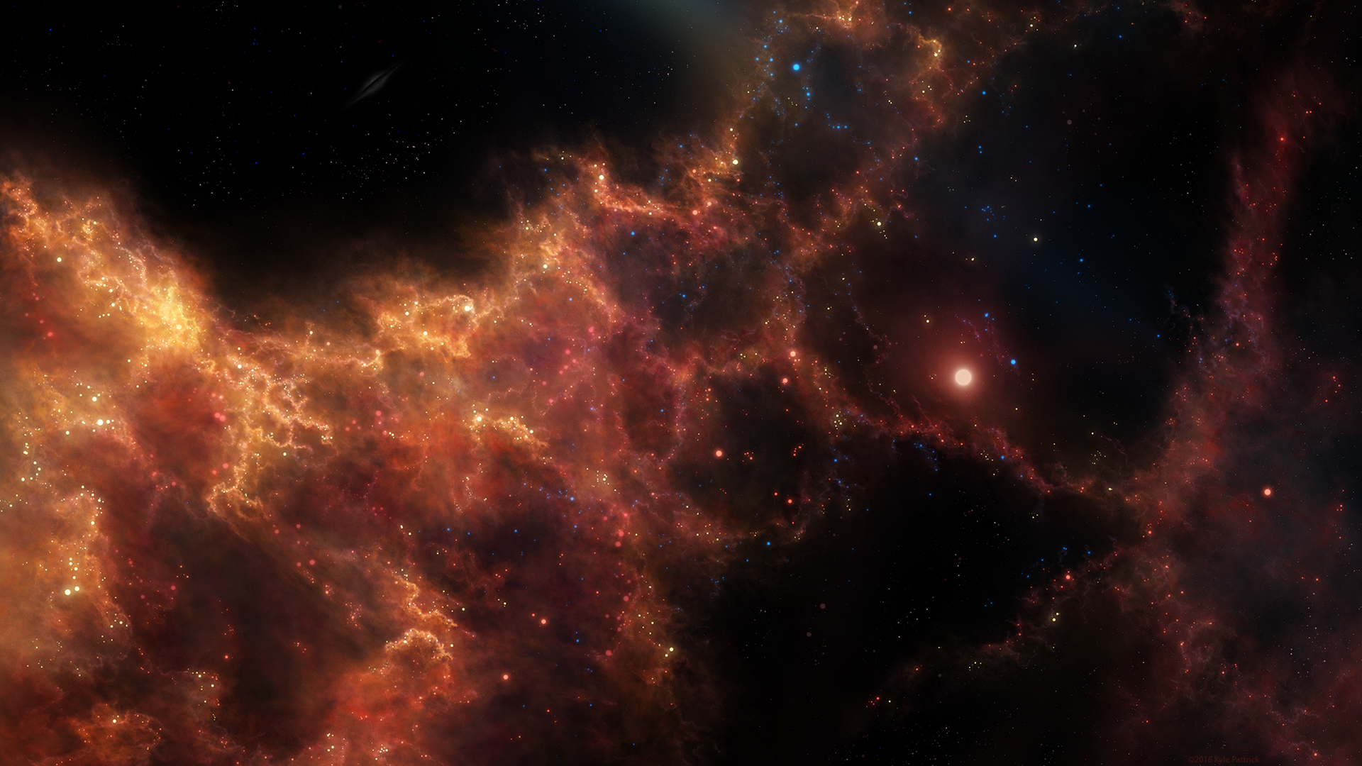
Almost in a realm of its own, this small solar system far from others; the most spectacular rarity existed, planets bathed in the light of the instigated light, this was no average sun, a very liquose object, its tentacles of light literally clinged amongst the clouds of swirling space dust to amplify its light in a vivid display of crimson light; the two planets rotating this sun have recieved an incredible boost of developement, strange chemicals, landscapes & rivers of resonant liquid drench their lands. An odd place, waiting to be found, newly awakened as the sun is.-
27/05/19: made a slight update (reduced glare and grain, enhanced colour).
Related content


Comments: 64

Hah, that actually wasn't too difficult -- all the main layer blending modes existed, as well as noise filters. But I kept trying to put in or create dense photorealistic starfields, which doesn't work best on a piece like this anyway.
👍: 0 ⏩: 1

Yeah, probably a bit more now that you mention it. Had the style change in mind from the time when PC became the dominant computer gaming platform, when Photoshop became a standard painting application after years in a niche. It feels strange in hindsight thinking PS and truecolor existed alongside Deluxe Paint and HAM - even in their shadow - for quite a while, and that the latter especially turned out to be largely a footnote.
If you figure out a way, please do tell. Generally find it relaxing, almost meditative painting each star separately, but it isn't exactly economic.
👍: 0 ⏩: 1
Can't say I tried any software in the 90s. Unless you count most versions of MS Paint! I am aware that stylistically people try to keep away from an 'artificial digital look'. It may be related, but I think I was making the beginning artist mistake of focusing on detailing/rendering, whereas the most important thing is idea and composition.
Unsure I understand your question.
👍: 0 ⏩: 1
The raster image workflow was very different, and unless you were working in publication - almost invarably on an Apple - you had to know a fair bit more about the digital colour models to make the most of it. There were also some peculiarities that seem to make no sense today but were necessary at the time: DP had a "fast pen" and a "slow pen" tool, with different update frequencies for sketching and committed painting respectively. Had to be economic with the RAM.
Oh yes... been there, as have we all. Work a lot with horror vacui as a matter of choice, but for the longest time was unaware composition existed. Found it a mystery how so many paintings could look so good when often they were, well, quite empty.
I don't know if it is a proper term, but sometimes heard industry artists mention the "texture monster", where aspiring artists are overwhelmed by the convenience of texture brushes, and fail to take into account how the different details scale and match. The trap of believing tools do the work, rather than make work more efficient and comfortable.
Conversely, am not much for how many artists shun special brushes completely either, giving a different kind of artificial look. But that is another story.
Ah! Was wondering about your methods for generating star fields on small scale.
👍: 0 ⏩: 1
That's a nice pixel art landscape! Conversely it is cool that things like the vector pen tool are essentially the same. An essential, mathematically precise tool. Raster brushes etc. seem more organic, slap-dash.
Detail enhances the focal points primarily, I think. Artwork is more about suggestion than description, being defined both by what it includes and leaves out.
There are several approaches to the starfield I've tried so far. One is to make a few by hand with round brushes of varying softness (hard centre soft outer) and layer modes (screen/linear), then define this as a brush. This can be set to scatter in different scales etc. You could add lens flares too. You can make noise starfields with the appropriate filters and selectively erase/duplicate for constellations either by hand or with textures for layer modes. Heaping these at different scales makes for intense graininess and some sense of scale. You can also duplicate and blur/layer mode to give some radiance. And so on... devise per your imagination, and see what works!
👍: 0 ⏩: 0


Great wars between "monsters inside the Universe" - could this become a sort of reality for humans to ponder or just think? Now again the dreamers from last centuries probably start already another war, or campaign, against some sort of forces, right? No, but dream still on!
👍: 0 ⏩: 0


Diggin it man  (Smile)")
👍: 0 ⏩: 0

Okie doke... I've been promising a critique for a while. *cracketh his knuckles* Let's spank this crack monkey
First... you capture the radiance powerfully. I feel blinded by it even when it's zoomed out and my laptop screen is on low-brightness. I like the color choices, though a bit exotic and saturated, you can't hate on the beauty this makes. The way that you bleed that color out really makes me feel awesome. The Planets are great and you hit them with the light in a way that you can almost hear. The positioning is just fine and you spread it out this time, which makes it a little hard to look at up close but from farther away it really looks hawt.
Let's get on with some cons. I'll hit the big ones first then go scrape up some tidbits that are more opinion than realistic.
So, first off... the patterns that you use and the texturing in the pinkish clouds: Wonderful effect... the highlights and colors are good, and I like a lot of how you make them build and slightly billow. But I have a couple things to say about it. For instance, at the top, the texturing seems to string a little much at the top. The larger planet of the two seems to also have a little overlap of the texture and it seems a little gritty and all. Perhaps it'd look neater if you tried to add a more depth... in the sense that closer bits are more blurred. It only makes sense that the clouds would look more detailed the further away... the features would naturally tend to scale up as the clouds get closer. So perhaps that'd help with the overlap there. As well, the textures tend to linger in the dark and so the outlines seem to go between looking too ghostly to looking like there's just jpeg compression fuzz in the background. The case in point is the distant bit of the nebula in the upper left. It's awesome looking! Really, it is. But as soon as the color fades into the inky black and you see the sharp edges of this ghostly texture, it feels more like the image had compression loss than anything else. One last thing is to especially consider more and more trying to get those cloud textures to follow the likely movement of those clouds... at many points you have it flowing very well, but at some places the clouds don't seem to be flowing in the direction that the details entail.
Now, the other points... this gets a little nit pickety, and it is likely more opinion... but I notice the two clouds (I'm assuming that's what they are) that blotch a bit of shadow around the upper middle don't have very well defined edges and so it's difficult to tell if they are holes in the nebula or just something obscuring the view. I guess if that really is a hole, then you should shape the textures more accordingly. If they are clouds, then perhaps highlight the edges and sharpen them more.
The last thing is about the two planets. So... I'm assuming they are on the same plane, and simply one is bigger than the other. This, of course, does sorta make it more plain. What would be more believable and would probably make for more depth would be to change the way the light falls on them. Recall how the moon changes from a crescent to whole. Perhaps make the bigger planet even more crescent and then make the smaller guy more whole. That's the way the light would naturally fall on them if they were at different distances. That seems a lot cooler to me just because the depth is very important, and you don't want to also make the nebula look small (which putting such a large planet at that position would normally do). By adding more expanse and making it look like the bigger planet is closer, it makes the nebula look way bigger and you can also start to move the nebular closer to the smaller planet to help that more (in my opinion, it's kind of odd how the nebula appears to just part and go around the smaller planet like it's avoiding it... it makes it look like the nebula is smaller... and nebulae are normally HUGE... so perhaps let the nebula get really close, if not wrap around the back of the planets. That'd be neato).
Finally... let me just say as I've looked back and forth from writing this to retaking the rendition, I'm blown away. You've done a really awesome painstaking job here and this is really an awesome piece of work. Really really awesome. I want to let you know that all these things are still really minor compared to how breathtaking it is... the way you wrap the subtle halo of clouds around the center of the star in the nebula just is amazing and a lot of how you put this together really speaks some great experience and forethought on your part. As well, I want to apologize in being so late in critiquing. Oh, and now that I take one more glance, I (hahaha... get a load of this) have one more thing to say. There is a layer of blurred cloud matter on the right side going down to the bottom middle, and then there's a layer of more detailed cloud on top of that and on the very outter lower right edge, right? Blur the outter right edge of the nebula so it more goes with the blur you already have there and I think that the structure of the nebula might get a lot more attraction... my eyes are a little distracted by the added edge details that are in front and close to the viewer (going back to my opinion that you should lessen the scale of detail as the clouds get closer to the foreground). Okay, I'm done.
PLEASE ask if you want any clarification. I hope that you realize all the stuff you did so well in this. Mainly, the textures are just AWESOME! They just need to really get tidy and you should use them more strategically.
Okay... I'm stopping. Seriously.... Must stop.... yapping.
thanks for sharing this inspirational work, d00d.


👍: 0 ⏩: 0


ah, beautifully done. Mum'll be proud of ya!
I really like this piece, the peaceful environment, the colors, the compostition... everything fits so well. Awesome job!
👍: 0 ⏩: 0


I think this could be a bit better if the shadow of the planet in the foreground didn't start that abruptly. But great work, as always.
👍: 0 ⏩: 0


there is an unusually genuine sense of depth in this piece the likes of which i dont see much in space art. nice stuff
👍: 0 ⏩: 0

I haven't seen any of your pieces most likely in a year & so it happens.. I decided to type in your name but I forgot how to spell it. (After rummaging through my watchers) I finally come upon this masterpiece..
kudos & see you in another year or so
👍: 0 ⏩: 0


A rays!
👍: 0 ⏩: 0

 (Cool)")

It amazes me how you do this. it seems like the star is going to gobble up the planets, since the arms appear like tentacles.
👍: 0 ⏩: 0

Absolutely beautiful - it really looks like the star is reaching out and nurturing the planets. A 
👍: 0 ⏩: 0

Very neat and impressive!!
Nice use of colors, and love how you did the nebula!!
Nice work

👍: 0 ⏩: 0

")


I just love how you do the light... I'm impresed again and again...

👍: 0 ⏩: 0

good job mr. bond
👍: 0 ⏩: 1
oh yeah love that light work ...and the sweet light reflecting on the front side of the other
planet
👍: 0 ⏩: 0


i think its my screen but the farleft planet the shadow looks like its cut in half with the black
anyway nice work
👍: 0 ⏩: 0

")


 (Wink)")


Beautifully done! Not many can use that pink and pull it off. you did nicely
👍: 0 ⏩: 0


wow sooo coool , looks so unreal, but real at the same time
")
👍: 0 ⏩: 0


pretty good, the depth could had been better though by making the transition from light to dark smoother. The rest is very good
👍: 0 ⏩: 0

O.o ::blink blink:: o.O
Breath taking...
wish our sun did that lol then maybe i wouldnt keep thinking of ways to blow it up lol
but really its a beautiful work my friend... you never stop amazing me with how you come up with this stuff ^_^
maybe here in a few weeks i can get something done with school that will be just a hair close to what you have ^_^
👍: 0 ⏩: 0
| Next =>