HOME | DD
 creativeguy59 — The Embrace

Published: 2010-08-29 01:04:33 +0000 UTC; Views: 1958; Favourites: 17; Downloads: 123
Redirect to original
Description
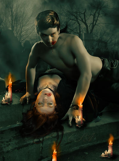
Late night strolls can have unexpected consequences.Originally I had this concept many months ago and I downloaded the images with the models. Since then the stock provider apparently deactivated their account sadly.
I think I have gotten a good handle on handling shadows out of this piece... not perfect but by a long shot my best attempt with handling light/shadow.
I am not quite happy with the vampire bite marks so I expect I'll be doing those over, but I need to figure out a better technique and practice a bit on that.
All and all I like how it turned out...
 (Smile)")
My thanks to the following stock providers:
- Background
Couple - Sadly this account is now deactivated, found that out when I went to do the credits as I had downloaded the image several months ago with an eye for this work.
Related content


Comments: 5


Thanks, I have plans do my work around this theme.
👍: 0 ⏩: 1

Hmm...not bad
You've dane a good job making it quite clear that the vampire is in fact a vampire, without actually showing his face.
And as usual I have some suggestions
-The first thing that caught my attention in this piece was the couple, however my attention was immediately drawn to the gate behind them. The lighting on the gate is a little off - it could use some darker shadows - but that was not what distracted me the most. The biggest thing is how blurry the gate is compared to the figures. Its seems a little too blurry for being so close behind them - see if you can make it clearer without ruining the contrast with the figures. Also, try adding some faint shadows on the edges of the wraught-iron bars of the gate - silhouetted objects are usually darkest around the edges.
-Second, the vampire looks fine as a vampire, but he doesn't really fit into the scene. I think this mainly has to do with his lighting. Try adding some darker shadows and brighter highlights. Right now he looks a little flat because of the lack of light-shadow-variation on his body. Also, try making his pant a little bit darker so they are easier to discern from the background - this is minor but it mgiht help
-Next, the woman looks pretty good but her highlights make her look set-apart from the scene a little. The highlights suggest a much lighter scene - try to darken the highlights a bit and make them blue-er. Also, try adding some darker shadows to her body and clothes to better match the shadows beneath her.
-Lastly, the blood... Without going into the details of what blood looks like and its consistency, I'd basically suggest making it darker and redder
One down, 2 to go...
Dan
 (Wink)")
")
👍: 0 ⏩: 1
Well the blurriness of the background was a something I did on purpose I did a light gaussian blur in an attempt to correct the background a little bit, it was bothering me until I did that but I could try it ht eother way fairly easily.
As for the lighting, the problem with some of that shadowing is the Background itself has this big old moon I could adjust shadows I expect I have to stew on that one.... I'll look at what we can do on that one in terms of the lights and shadow
👍: 0 ⏩: 0