HOME | DD
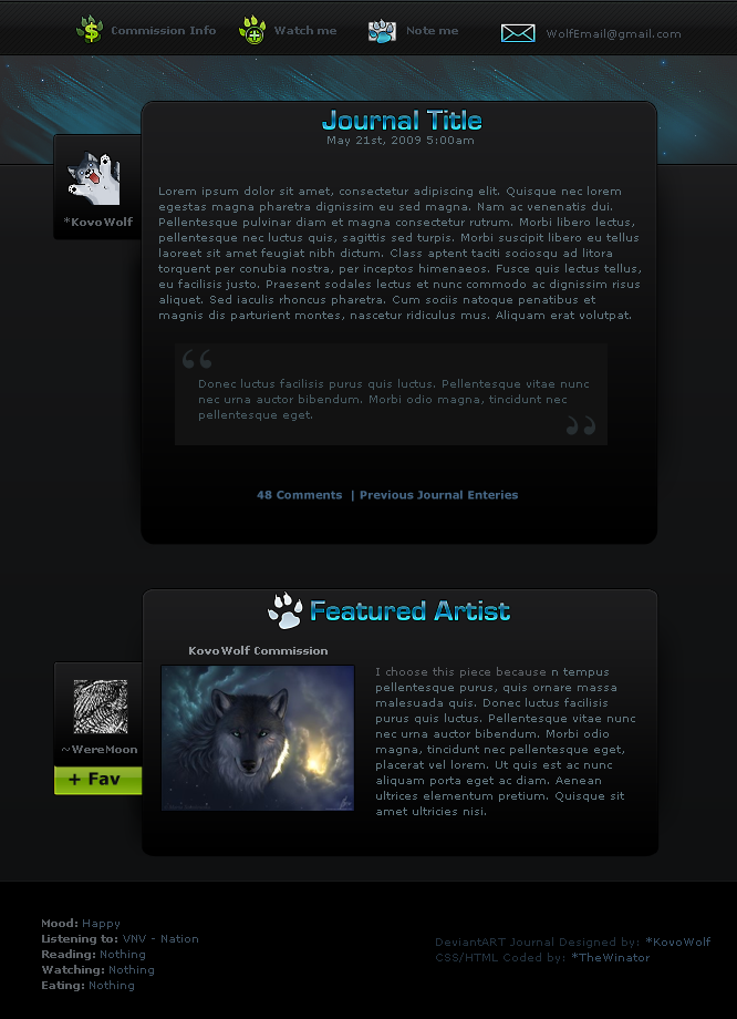
 Crelcreation — DeviantART Redesign

Published: 2014-07-08 13:13:16 +0000 UTC; Views: 6936; Favourites: 125; Downloads: 57
Redirect to original
Description
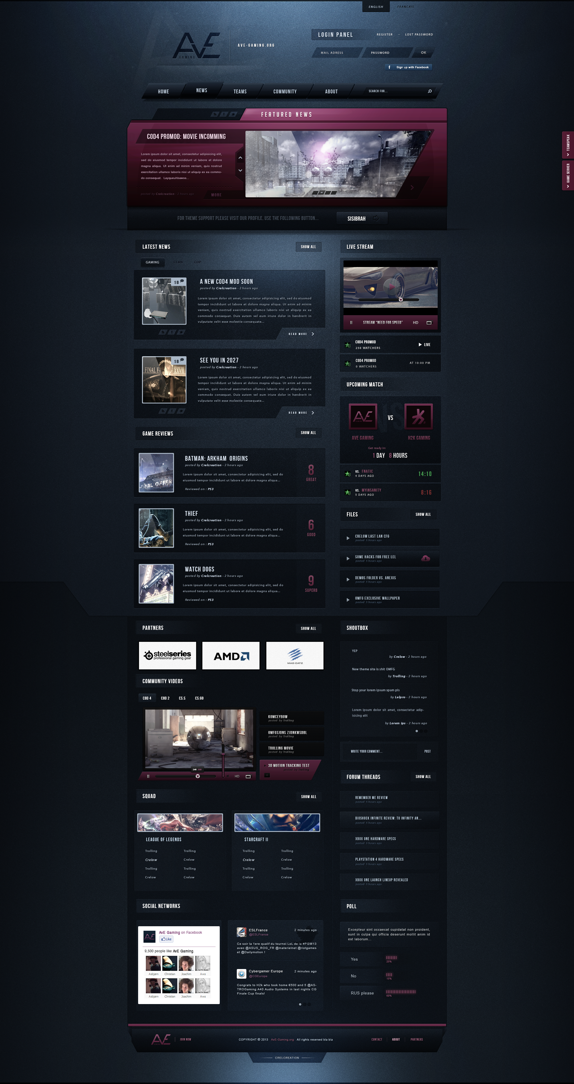
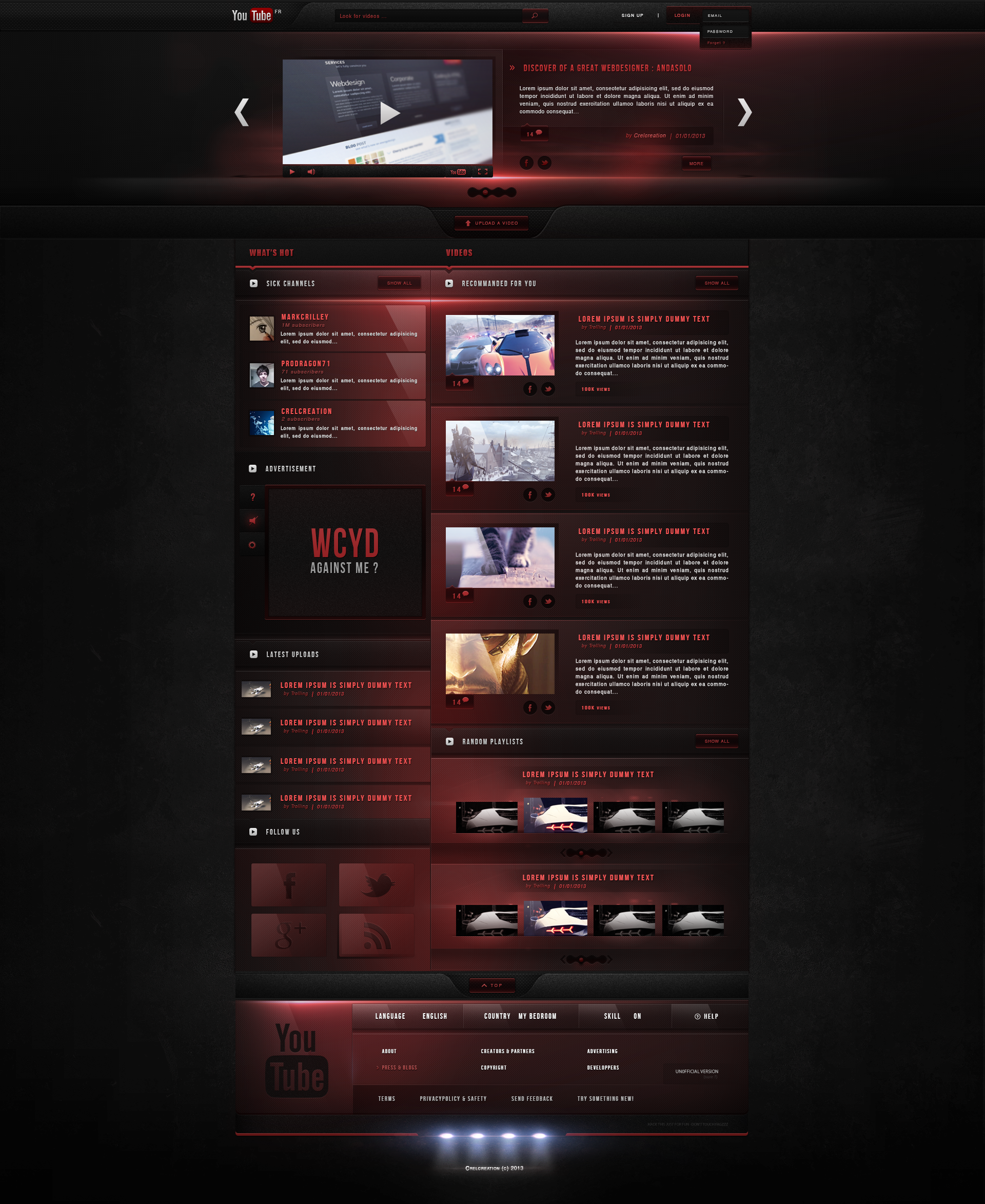
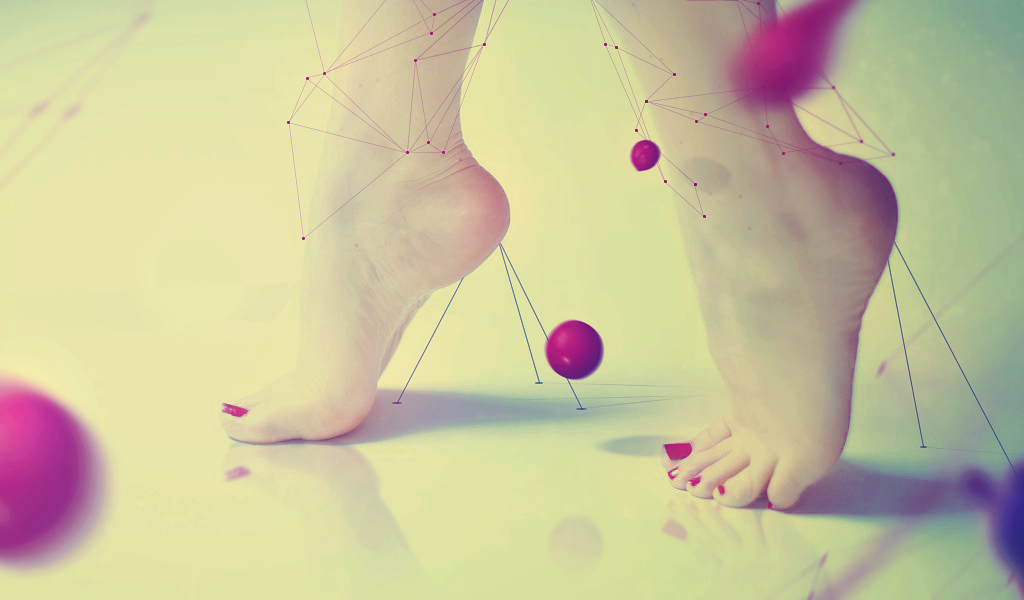
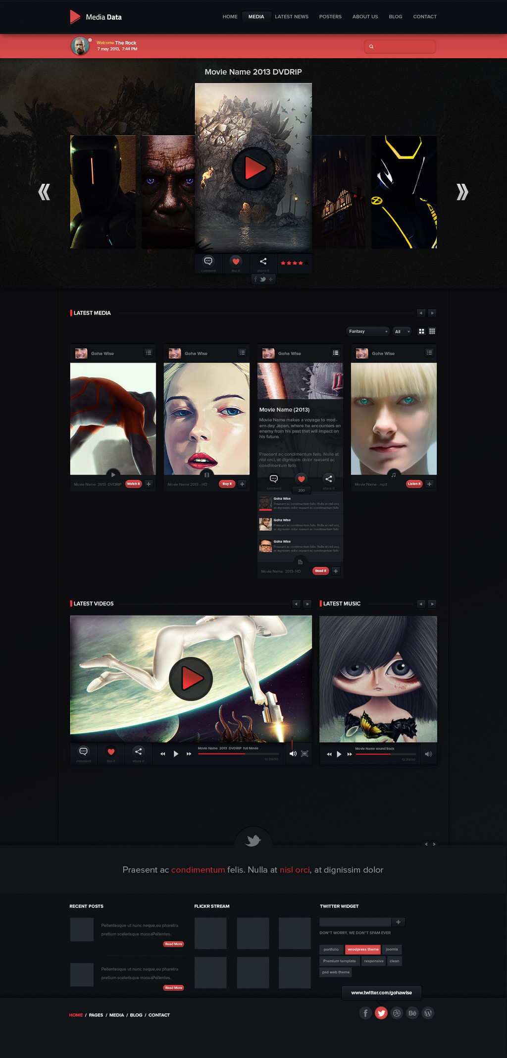
Hey there, finally I'm proud to present my DeviantArt redesign. This is just an example of a profil page (:I tried to make something new, a new UI, some new colours...
I used the 77chen artworks , her work is just mindblowing ! c: Be sure to check her gallery
The others pics come from:
and the master
Every fav'/comment and critique is appreciated ! c:
Related content


Comments: 98

Wow, you should post this on the site updates as a suggestion - its really brilliant.
👍: 0 ⏩: 1

Thanks ! I don't think they will put it, but I'm wondering where is this category ?
👍: 0 ⏩: 0

I feel like someone should mention that putting blue text on blue background is probably the worst thing for legibility there is.
Other than that it looks great and definitely an improvement.
PS: Also more contrast to highlight important parts of the interface wouldn't hurt. Everything looks very similar and it's hard to parse. It looks nice, don't get me wrong, but it has to be legible and understandable as well.
👍: 0 ⏩: 1
You mean on the head ? I think yeah but the contrast is good enough imo (dark on light)
I agree with you on the highlight, I just noticed atm that everything is on the same way coloured !
Thanks for your comment  (Smile)")
👍: 0 ⏩: 1
It may seem good enough for you, but there are people who don't see very well and they wouldn't be able to read most of the text in this design.
Here's a handy tool when judging legibility of text: www.paciellogroup.com/resource…
Or a web app: leaverou.github.io/contrast-ra…
And here's a handy checklist for accessibility on the web: a11yproject.com/checklist.html - most of this stuff is for coders and programmers, but there's a section about Color and Contrast, as well as a few handy links.
It may seem like a detail, but believe me, for some people it's the difference between being able to use the web and not being able to use it. And for everyone else it means their eyes won't get tired so fast.
I hope I didn't upset you in any way, I'm just trying to help.
PS: Maybe I am a bit biased on this subject because I create websites for municipalities and they are required by law to have accessible websites.
👍: 0 ⏩: 1
I know right for that, I thought if I contrasted much, it feels like fluorescent.
Thank you for your stuff, the second link looks very helpful !
You didn't upset me at all
Anyway you're right to emphasize on this subject, I've just noticed that the contrast is really important for the legibility !
Thank you for everything ! It's very kind
EDIT: What I said to Chibisuke: "Moreover I tried to see this on different monitors, sometimes the contrast looks perfect, on some other, it's clearly shit. Contrast and luminosity is different each time so..."
👍: 0 ⏩: 1


want
just
want so much
it's a perfect design i love it
👍: 0 ⏩: 1

lel I want too (:
👍: 0 ⏩: 0
pixelperf3ct In reply to ??? [2014-07-09 12:35:24 +0000 UTC]
Excellent design if you ask me!
👍: 0 ⏩: 1


Waaaah *.*
Ce serait tellement bien si deviantart ressemblait à ça
👍: 0 ⏩: 1
Oh merci !! (: Ce serait bien oui ^^
👍: 0 ⏩: 0

oh this is just way too cool! Awesome x1000 and great job!
👍: 0 ⏩: 1
Thanks x1000 as always guy !
👍: 0 ⏩: 0

Seems to use space much more effectively and display art in a much more eye-catching manner. Would definitely be a break from the ugly gray colorscheme (sorry da, I refuse to qualify #DAE5D6 as "green")
👍: 0 ⏩: 1
Well DA wants to stay on neutral colours to touch a larger public
👍: 0 ⏩: 0

can you like send it to DA and like get them to have a choice to have this or normal because this is amazing and i would so use it
👍: 0 ⏩: 1
I would but it's just a concept ^^ DA wouldn't use it cuz it's too different (colours)
👍: 0 ⏩: 1
SEND IT ANYWAY THEY MUST USE IT OR BURN
👍: 0 ⏩: 0


Would make an incredible userstyles theme
👍: 0 ⏩: 1

Thanks a lot !
👍: 0 ⏩: 0

It looks awesome!! Thanks for including my works, I'm honored ^^
👍: 0 ⏩: 1
Thank you C:
You're welcome ! Same for meh
👍: 0 ⏩: 0

Looks amazing, m8!
Your works are always so clean and well-structered!
Keep it up! (:
👍: 0 ⏩: 1
Thank you ! I really apreciate your comment
I'll for sure
👍: 0 ⏩: 0


<= Prev |