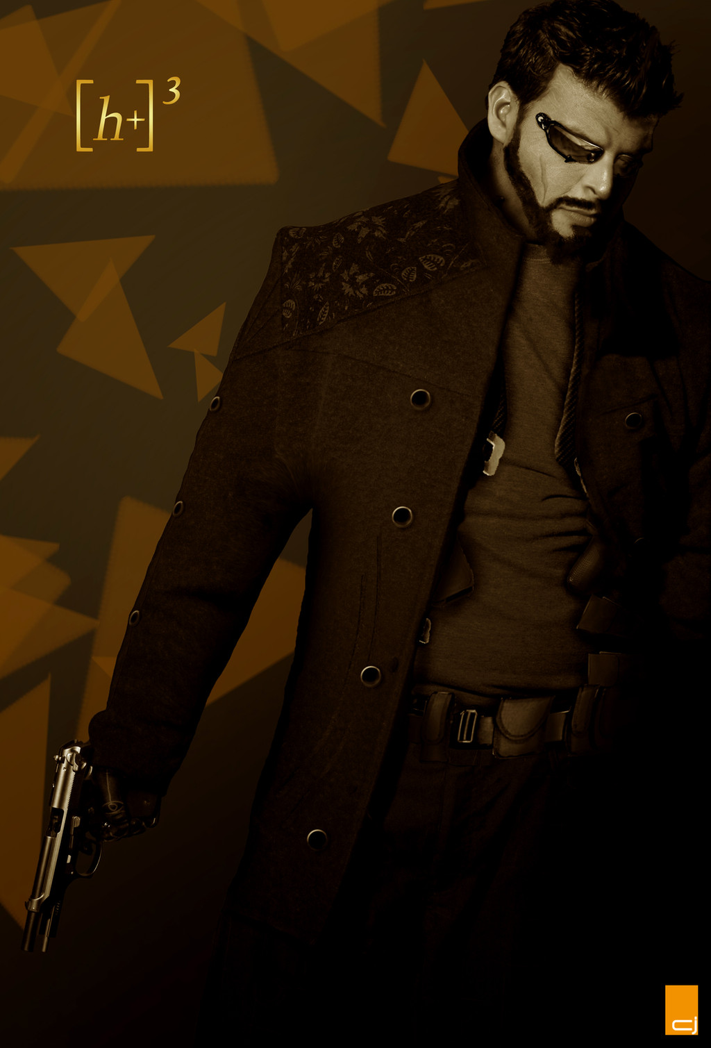
HOME | DD
 CyanideJack — The Keeper of Records

Published: 2010-01-18 20:48:03 +0000 UTC; Views: 2830; Favourites: 92; Downloads: 66
Redirect to original
Description
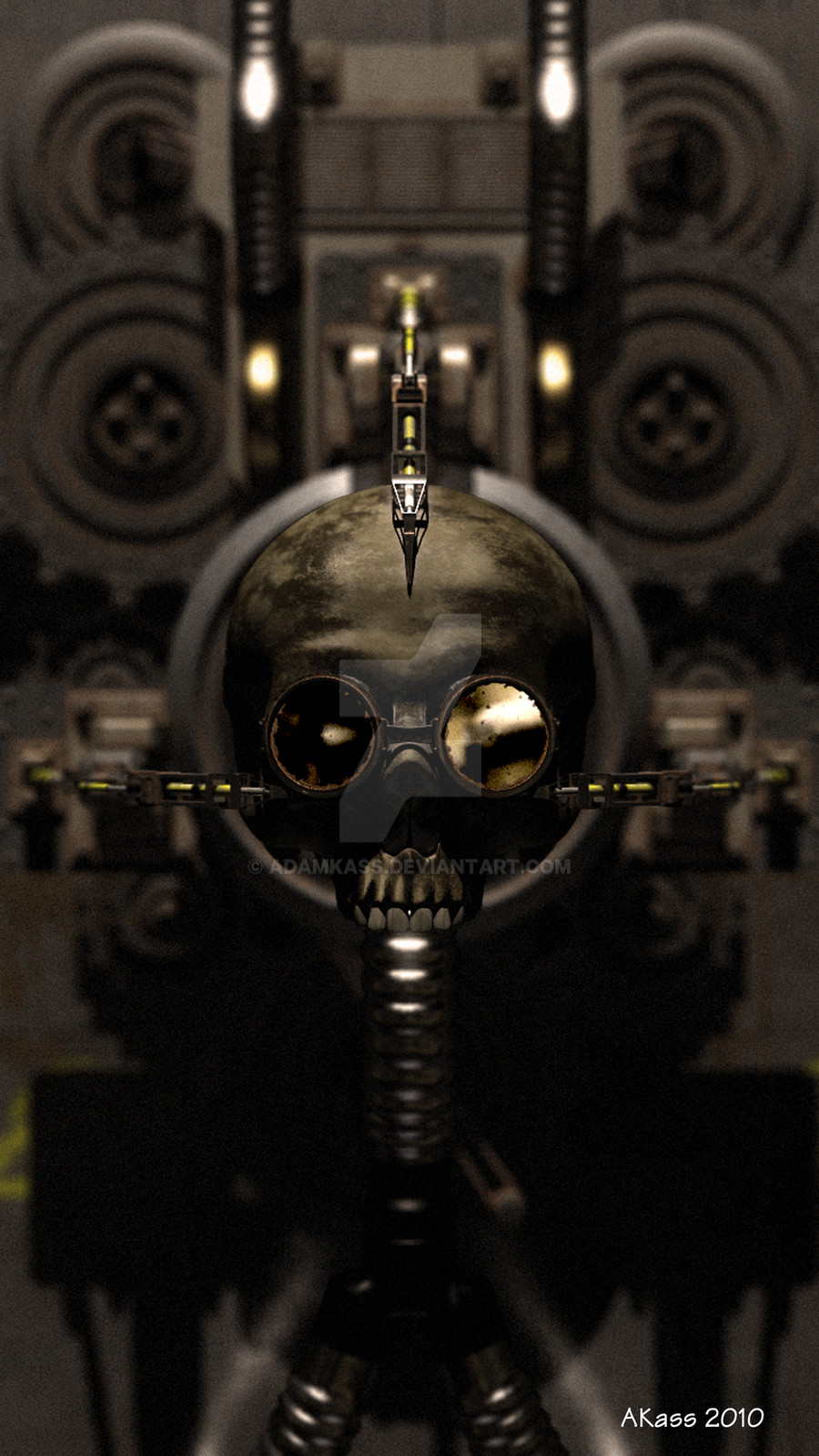
The "Scribe" pattern Servo-skull also supports advanced optical recording and replay facilities, which makes it popular for flying into the Adepta Sororitas changing rooms post-battle.
EDIT: Made the quill significantly lighter.
Skull: [link]
Quill: [link]
Book: [link]
+THE EMPEROR PROTECTS!+
Related content


Comments: 41

This is the coolest thing I have ever seen, and I have no idea why. D:
👍: 0 ⏩: 1

Servo skulls are one of my favorite bits of 40K lore. Such a unique idea, and wonderfully rendered by you in this piece.
👍: 0 ⏩: 1

Yeah, I enjoy doing them. They're all so unique. Thanks for the comment!
👍: 0 ⏩: 0

Nice to see some artwork on one of the more mundane aspects of the Warhammer 40k universe, as well as a piece much more simplistic in design than most 40k art.
👍: 0 ⏩: 1
Thanks!  (Smile)")
👍: 0 ⏩: 0

Really nice and detailed piece 

👍: 0 ⏩: 1
")

Good color used and technique
Please take a look at my Deviant T-shirt contest design, comment if you would, so I can improve it [link]
Thanks
-------------------
👍: 0 ⏩: 1
Thankyou. I'll take a look at your t-shirt
👍: 0 ⏩: 1


The emperor is proud brother and can’t wait to see more
👍: 0 ⏩: 1
Thank you brother! I shall serve his holiness well!
👍: 0 ⏩: 0

at first I couldn't see very well (Glasses don't help), then I enlarged it and i could see every detail, how do you make these?
👍: 0 ⏩: 1
Yeah, the full sized image is much bigger than what's on here.
They're composites of the stock imagery, processed in Photoshop. I used effects like Cutout, Curves, Levels etc to give them their distinctive Black & White comic look.
I was heavily inspired by Frank Miller's Sin City, but in the end I just think the dark, slightly grimy look suits the 40k mythos
👍: 0 ⏩: 1


Hard to see some of the detail but from what i can see it takes on the gothic feel of the 40k universe.
Brilliant work!
👍: 0 ⏩: 1
Thankyou! I've made the quill lighter due to the general consensus being it was too dark. Let me know what you think
👍: 0 ⏩: 1


sorry for double post... I meant "something like that".
👍: 0 ⏩: 1

Excellent. And I can see the quill just fine.
👍: 0 ⏩: 1

no offence, but the quill is too hard to see...
Malanok
P.S still great though
👍: 0 ⏩: 1
Interesting, thanks for the feedback. On my monitor, the quill is a uniform shade of black that is distinguishable from the background, outlined in a slight white line. Can you see it at all on yours? It's dark on mine, but I wonder if my monitor is calibrated brighter than yours...?
Oh, and thanks
👍: 0 ⏩: 1
Even on the brightest monitor settings it looks wrong, like a odd mask layer...
Sorry!

👍: 0 ⏩: 1
No problem, I appreciate the input. I've added a texture to the quill which might make it look a little better. Beyond that, I'm not sure what else to do 

👍: 0 ⏩: 2

just lighten the quile a slight bit. While I can see it, it would benifit from the change
👍: 0 ⏩: 1
Thanks for the feedback, I'll bear that in mind
👍: 0 ⏩: 0
uh...
it kinda looked better before... Sorry!
Malanok
P.S please don't hate me
👍: 0 ⏩: 1
Lol, no worries.
I think I like it better this way, but seriously thanks for the advice. It's useful to know what other people think of your stuff
👍: 0 ⏩: 0