HOME | DD
 CyprithTheCat — Painting with Light - Postwork

Published: 2008-06-20 10:17:06 +0000 UTC; Views: 3016; Favourites: 40; Downloads: 145
Redirect to original
Description
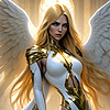
Another tutorial.")
Related content


Comments: 23


I would just put more interesting lighting in the render to begin with.
👍: 0 ⏩: 1

Yes, you are right. This is an old tutorial, I work with several light sources now but I find still occasions to use this.
👍: 0 ⏩: 0

Wow thank you so much for sharing and taking the time
 (Smile)")
👍: 0 ⏩: 0


Can't have enough lighting tutorials

👍: 0 ⏩: 0

You're tutorials are truly amazing. I am repeating myself over and over, but thank you so much for making them!
👍: 0 ⏩: 0

amazing - thx so much for sharing. many ppl act like what they do is a national secret! ugh
👍: 0 ⏩: 0

Thank you for this. It's really effective in showing just what you can do with layer-fiddling, and it makes me want to go set up a render so I can do some postworking. ^_^
👍: 0 ⏩: 0

This tutorial was suggested for and included in The Best in 3D Manipulations : Week of June 16th - June 23rd, 2008
You may read the article here [link]
Congratulations!
It is my hope that this feature opens up your amazing artwork to many new watchers!
👍: 0 ⏩: 0

Nice work! Always interesting to see how other people do postwork, and there are always top tips to pick up.
👍: 0 ⏩: 1
It doesn't look like a big deal but when I tried it the first time I was really surprised about the possibilities.
👍: 0 ⏩: 0

Cool tut, might come in handy one of these days
👍: 0 ⏩: 0
very nice tut - similar to what I do. Not everything is the same, but pretty basic stuff. I do a few other tricks.
👍: 0 ⏩: 1
Sorry Postwork is either a bore or a joy.
I do the render - yawn
Posework starts - oh joy.
I fix any poke throughs, and messes with the clone brush, and blur.
I use the burn tool set at 5% on the image with a large 500 or larger pix brush - I believe that is your under exposed process.
I use highlights set at 3% on the image with a 500 or larger pix brush - I believe that is you over exposed process.
I go over areas of the image the need more highlighting with a 5% process. This is usually a 30 pix brush or smaller from here out to just do smaller areas.
I do metals at 10-15%. I'll also do darker materials at this level if the highlights do not come out.
I sometimes use the violet layer to bring out depth in the image on a seperate layer. I set the layer to an underexposed setting- set at 18%-30%. It really depends on the work. I sometimes will also use a White layer and use that as an overexposed layer - set the layer to overlay at a very low level 7% or 9%. Again, it depends on the work. I than apply the postwork layers for clouds, and special effects. I also might apply a soft gausian blur to the image set at 0.5 just to take some edge off the image.
If I use a PNG file for the image, the process is slightly different. I'll use the gamma levels of the PNG. The blue, green, red, and BW.
After I do all that, i save the PSD as a compiled layer as a new image. I correct the levels, contrast, highlights, a gama correction if needed, and apply a photofilter to correct lighing issues if needed which is usually always.
I add signature, might add a frame to the image, and save it as a JPG.
Then I resave it as using a freebie program called photogadget that resizes the image and drops the res to 72 DPI. I NEVER post anything larger unless I am using the image for Prints here at DA. The image is always 300 DPI or better to start.
👍: 0 ⏩: 1
Yes, I gave up the burn tool since I know how to lighten with underexpose layers. It's way more flexible. I only use the burn tool when I need something to be darker. I think what you do with the violet layer is something similar with the patterns I use. Oh yes, and pokethroughs... always a case for the clone brush
 (Wink)")
👍: 0 ⏩: 1
I think we have the basics and how we modify them over time is the key. It's part of our unique styles. If we all did the same thing, we have a bunch of look a likes.
👍: 0 ⏩: 1


Very cool tutorial. I'll have to give it a try one day.
👍: 0 ⏩: 0
