HOME | DD
 dainix — Blog Design Training 2010
Published: 2010-03-30 13:18:50 +0000 UTC; Views: 10409; Favourites: 24; Downloads: 186
Redirect to original
Description
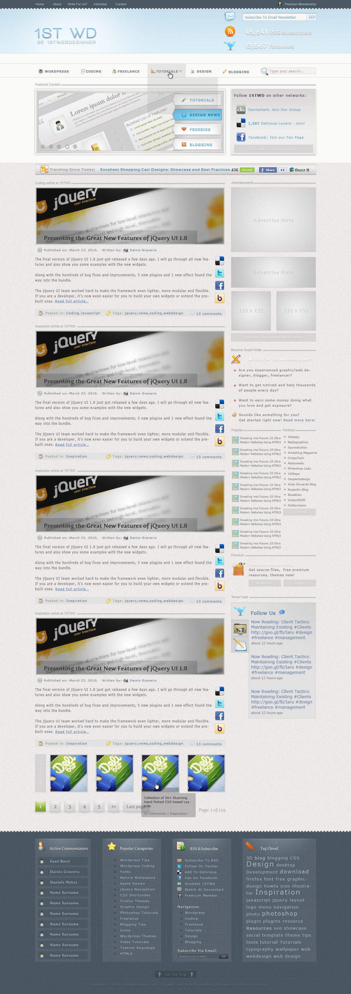
This is just a training for upcoming redesign for 1stwebdesigner.com website.I am planning to create Photoshop tutorial for this one and maybe in future even code it for free. Not sure yet - we'll see what future will show.
Design was sketched, but I did a lot of thinking and research so it took a lot longer than expected.
Creation Time: 20-25h
Free icons used: from FindIcons.com website
Hope you will like it, I invite you to critique this webdesign, for me - I am not sure about Featured slideshow and font used in main navigation, maybe I will change it in future.
Related content


Comments: 14

wow, i have no words to say you.
but i just only say you thank u very very much.
👍: 0 ⏩: 0

Nice design
Some video training about that : [link]
Have fun
")
👍: 0 ⏩: 0


Text on popular post and blogroll widget is too small. It's har to read the content. I dont know is it because font used or lack of contrast.
The font and background is blended together. Maybe you should make the text more black or background more white.
Get more popular is unreadable. No contrast at all.
Submit your email box is too small. It will be hard to fill it.
Page 1 of 129 should be bigger.
I think "category" article in 1stwd before every post is not needed. We can find it from category info below.
Every post need more extra space from the other post.
You must remove or rearrange the social network icon.
👍: 0 ⏩: 1

Thank you jeprie, great tips! I think I can agree with you on all points and I will modify those many points throughout holidays and then put tutorial out of it
Hugely appreciate you spending your time to share your point of view!
 (Smile)")
👍: 0 ⏩: 1

I think that there's so much text on the blog entries... and they're very close (that's a little confusing for unexperienced users).
If you use some white-space magic, everything is solved.
👍: 0 ⏩: 1
excellent tip, thanks - you may be right, I would also take off those social buttons in index page - looks too much!
Thank you for tip!
👍: 0 ⏩: 0


