HOME | DD
 dAKirby309 — V4 Windows 10 Explorer Concept - Re-Imagined
Published: 2015-08-03 05:02:53 +0000 UTC; Views: 28848; Favourites: 80; Downloads: 801
Redirect to original
Description
If you're interested, you can vote for this concept on Microsoft's UserVoice: windows.uservoice.com/forums/2…


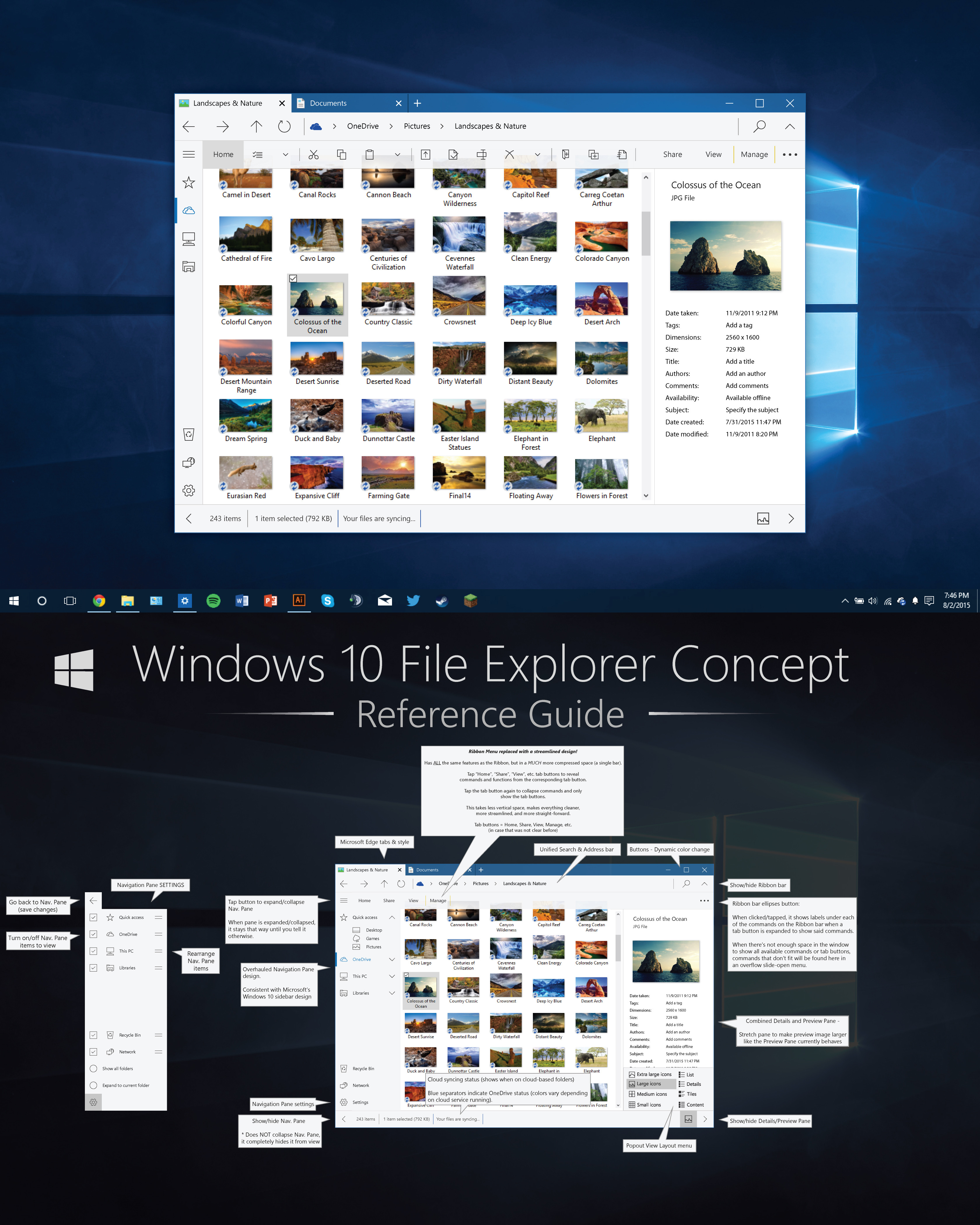
 I present a Windows Explorer concept that I made 100% for Windows 10 in mind!
The RIBBON you see on the topmost half of the concept is when the Home tab is EXPANDED, it would not show all those buttons all the time. If you'd tap the Home tab button, the commands would go away and you'd be left with a similar Ribbon bar to what the current Explorer currently looks like when the Ribbon isn't expanded. Plus you are able to easily hide nearly every part of the UI that you don't want to see, which cleans up the UI. Read the bottom half of the concept for the explanation.
I tried my best to stay consistent with the design that Microsoft has made for Windows 10 - a simple sidebar, bottom-bar/status bar, large spacing to accommodate mouse/keyboard and touch, etc.
After quite a bit of sketching, thinking, and inspiration, I came up with some ideas and decided to put the design to the test - how would it actually look rather than just drawings and notes on a piece of paper? I think it turned out pretty good.
Something I've noticed that is one of the toughest problem to solve is that placement and layout of the Ribbon menu. I've seen many AMAZINGLY CREATIVE concepts that have the bar placed on the bottom, the very top, on the sides, and other places... My concepts also struggle with this, it's just not that easy to figure out. So, after a bit of thinking, I came up with this - a streamlined Ribbon menu that takes up no extra vertical space but is still simple to use and not very busy looking! In this concept, you can even completely HIDE the Ribbon if you don't want to see it at all!
Be sure to read the bottom half of the concept image to see what I'm talking about.
Also, the Navigation Pane is highly customize-able compared to Microsoft's current File Explorer, which I feel is needed.
Tabs are included as well! Integrated into the title bar and closely modeled after Microsoft Edge's design.
I did my best to think of as much as I could, find problems with my design and try to figure them out. If there's anything I missed or should be changed, let me know if you'd like.


 Also, an older concept of mine that I used quite a few ideas from can be seen here: fav.me/d8i1txj
 Changelog:
8/4/2015 - Fixed alignment issue in Status Bar
8/6/2015 - Added drop-shadow to Details/Preview Pane image (forgot to add one)
8/8/2015 - Updated Navigation Pane style to fix indication/color inconsistency.
What do you think of it?
Related content
Comments: 48

This is AMAZING! I've already tried to create a new design for Explorer and it's far from reaching that level. You did a perfect job! It's disappointing that we're almost in 2019 and Microsoft can't make something like this. I'm shure this is one of the best designs I ever seen on Deviantart.
👍: 0 ⏩: 1

Thanks, I'm glad you like the concept! I certainly don't think it's one of the best things come up but I had fun making it. I know that Microsoft is working on a new File Explorer, but we don't know when it will be released. I just hope it will have some nice new features.
👍: 0 ⏩: 0

it's wonderful but file explorer has a part that called "file chooser" (dialog for open or save), do you design it too? i'll be waiting to see that
👍: 0 ⏩: 0

it would be cool if they merged File explorer and Internet explorer into one application
👍: 0 ⏩: 0

Either that's the wrong link or it's an advertisement/irrelevant website. Please edit your comment with the proper link or I'll hide the comment.
👍: 0 ⏩: 0

I just today started working on making a somewhat functional file browser that follows this concept. (My previous UI was more Windows 8 styled, and I don't like it any more).
So I decided to start essentially from scratch.
Here it is after a few hours of work I just did. : i.imgur.com/T7okJ8k.gifv
If you are interested, I would love to work with you on the design of the UI and the functionality.
And I really like the icons you have made for this, if you are interested in collaborating, I would be very happy to include them in the program.
I plan on working on getting the tabs like the style you have, then improve the navigation pane.
What do you think?
👍: 0 ⏩: 1

Wow, you're wanting to re-create this concept as a functioning explorer? That's awesome, 
Helping you work on this would be cool! I'm down.
👍: 0 ⏩: 1

Awesome! I probably won't be able to replicate all of Explorer's functionality (or even maybe most of it), but I can try to do as much as possible. pm me if you want to swap contact info.
👍: 0 ⏩: 1

Oh yeah, I totally get you. Explorer is the result of several professionals and decades of developments! I'll send you a Note.
👍: 0 ⏩: 0

It's been more than half a year
This concept reminds me of one of Kamal's concepts: twitter.com/Win10_UI , if you scroll down to the Metro File Explorer. It also uses the new metro sidebar and very similar structure as yours. Worth taking a look at
👍: 0 ⏩: 1

Ooh, his concept has some nice ideas! I like the nice and organized navigation pane. Thanks for showing it to me
And ikr, it's already been quite a while since this concept was made!
👍: 0 ⏩: 0

I don't mind the combined Preview/Details pane, however I would also like the details to be replicated down in the Statusbar/Details Pane on the bottom. In fact I'd like to be able to choose which info shows up there. Such as for a video file I would want the file size, file type, and the length of the file (a detail that was removed after Win7 I believe).
Not sure I understand the Ribbon Elipses button entirely, is there no way to pin the Ribbon as opened under this concept? As i understand the concept, neither the show/hide the expand the ribbon bar is just for the bar itself, and adding text under each icon on the expanded ribbon tab button doesn't do this either.
I see the Home tab ribbon buttons fill out rest of the ribbon bar, rather than "open" a drop-down tab like in real life. Nice use of space there, but I can't help but think they are easily missable without some sort of color, or using the win32 style icons?
A couple of requests for further development of this concept:
- Column Headers for sorting files (Name, Size, Type, Date Modified), as found under Details view settings. Ripped-out of all other view settings after Vista I think.
- "Show all folders" state of navigation pane.
- Personally I don't like how MS has ribbon tabs, and in real life also has the 'quick access' menu. I'd like them to let more advanced users define what buttons they wanted to have on the ribbon bar, instead of always switching between Home and View (in my case).
👍: 0 ⏩: 2

Reference: Commands/buttons are used in this comment synonymously - they refer to the buttons that are shown under each tab button such as "Home", "View", etc.
Oh, forgot to talk about the ellipses button. Yeah, so the ellipses button is used to house overflow buttons from the Ribbon if there isn't enough horizontal space to fit all the commands in the window. If the ribbon runs out of room, rather than squishing buttons together (making them harder to tap for touch users), the buttons that don't fit are put together in a collapsible menu so they are still accessible and so there is still plenty of padding to tap the buttons on the Ribbon itself quite easily (this is also the way it works in Windows 10 Universal Apps - the "..." button stores other commands).
But that's not all it does, when you tap the ellipses button, not only would overflowing commands show up in a little slide-open menu, but also the Ribbon menu would temporarily expand downward a few pixels to show the labels of each of the commands so users know what the buttons do (note: there would still be tooltips for commands when hovering over them). Even if there are no overflowing commands to show, the ellipses would still show the button labels under each button on the Ribbon. And when you click another part of the window to hide the slide-open menu (think of it as how context menus work: right click shows the menu and clicking elsewhere makes the menu go away), the labels would also go away when you click elsewhere as they are only shown until the user specifies otherwise. Again, this is how Win10 apps behave! Such as Alarms, Weather, and some others. ....Hopefully my explanation was clear enough.
👍: 0 ⏩: 0

You mean have the status pane info on the status bar as well? If so, wouldn't that be a big redundancy? And if so, the details could possibly show up in the status bar if the preview/details pane is hidden (but this sort of eliminates the need for the details pane altogether but also causes some info to be cut off on the status bar if the window isn't wide enough to fit all that info (unless of course, as you suggested, you can customize what info would show up there, this would potentially condense the space needed by a lot but I don't know how many users would find that useful). Sorry if I misunderstood your suggestion.
"is there no way to pin the Ribbon as opened under this concept?" The Ribbon menu would be visible by default (the buttons "Home", "View", etc. and not the expanded commands) and the user would be able to totally hide the Ribbon with the "^" button in the top right corner. If you want the commands to show under, say, "Home", then you would tap/click Home and the buttons will forever show until you specify otherwise (hide/collapse the commands by tapping/clicking the Home button once more, which is indicated by the darker grey color on the Home button when the commands are shown).
So, the ^ button totally hides the Ribbon and the buttons "Home", "View", etc. act as toggles to hide/show the commands that are under those specific buttons. Does this answer your question?
I thought about using color rather than dark grey outline-styled icons in the Ribbon and I wasn't loving the result. I understand the buttons are low-profile (which is somewhat intentional), so for a totally novice user, the icons may be overlooked at first. But they'd figure it out rather quickly I can imagine, upon clicking around a bit and exploring File Explorer. I chose dark grey (near black) because neutral colors work the best design-wise with nearly anything and simultaneously, they are NOT screaming "Hey, look at me! I'm distracting!" as they may with more colorful icons. But this is up for debate. ...This is the same principle applied on Win10 apps - neutral dark grey (or white on darker apps) colored buttons.
- You mean have a concept which shows "Name", "Size", "Type", etc.? I didn't think it was necessary to show as I don't think I'd change anything from the way they currently behave, so users don't need to see it as they would already know how it works.
- Also, you mean make a concept which shows the Navigation Pane in 'show all folders' view? If so, again, I didn't find that necessary as I don't think I would change anything there either aside from a slightly altered layout to match the layout I have for the Nav. Pane in this particular concept. I only added an option to show all folders in the bottom half of the concept so users know that this setting would still be there.
- "I'd like them to let more advanced users define what buttons they wanted to have on the ribbon bar..." I fully agree! Ever since the Ribbon first came out on Windows 8's File Explorer I always thought it was a cheap, more quickly coded, and less versatile knock-off of MS Office's Ribbon. The level of customization on Office is highly versatile. They didn't put this level of versatility into File Explorer one bit and I wish they would have. I dislike the way Ribbon behaves on Windows 8 and 10 for this reason mainly (aside from taking up a lot of space).
👍: 0 ⏩: 0

Your design is simply ahead of it's time <3 , windows maybe will be more like in future updates 
👍: 0 ⏩: 0

This looks absolutely AMAZING! I actually sent this to Microsoft as feedforward!
👍: 0 ⏩: 1

Glad you like the concept. 
👍: 0 ⏩: 1

Feedforward is basically ideas on what to do next time.
👍: 0 ⏩: 1

Not sure what you mean. Feedforward?
👍: 0 ⏩: 1

feedforward
/ˈfiːdfɔːwəd/
noun
the modification or control of a process using its anticipated results or effects.
"feedforward correction capabilities"
There we go.
👍: 0 ⏩: 0

Being a bit of a minimalist I think it would be nice to be able to see how your explorer concept would look when the Ribbon, Detail/Preview, and Nav panes are closed, which for the most part is how I would likely use it.
I like the tabs and the ability to hide that annoying Navigation bar. I never use that thing anyway and it just looks ugly IMHO.
One thing I'd love to see is a "smart" preview mode. Meaning, the preview/details pane is hidden until you select an image, video, text file or certain file type (customizable by the user). There should also be an option to only see the preview (helpful for previewing viewing text files) or the details part of the pane (helpful when you don't need to preview what your looking at).
Another thing I think would be awesome is a "full-window" browsing mode (similar to F11 in the current explorer, but not requiring you to be in full screen). In this mode the bottom bar and top bar(s) would be hidden until you hover over the top or bottom of the window. The detail/preview pane, ribbon, and nav pane could just function normally or optionally be set to show when you hover over the left, top (in addition to the rest of the top bars), or right of the window.
👍: 0 ⏩: 0

I suppose it looks alright, but at the moment I'll say there's no need to reinvent the wheel. You can always modify your explorer to include tabs, this things is very old and not hard to do if you know how to use google. Everything else - well, it works fine as is!
What bugs me the most is the details panel that is ON THE SIDE! It needs to be on the bottom, like in Win7, because the text info that goes there occupies way less space when it's at the bottom (likewise - you need a larger area if you want to distribute it as a column like Win8/10 do!). Again, there's a fix for that (at least I was using it with Win8.1, didn't get around that on Win10 yet) so that's that...
Overall, I suppose it looks alright and in style with Win10 and Edge, but I feel like this concept would literally need more clicks to work with than the current explorer, which defies the purpose...
👍: 0 ⏩: 1

Yes, you can use a 3rd party plugin to integrate tabs, but doing so doesn't work as well as native tab support would. If the tabs are native, for one, you'd have actual MS support if something doesn't go right and you can be sure that tabs would likely perform very well. 3rd party explorer extensions tend to have issues or cause productivity to slow simply because they would not be totally optimized. When using Explorer with Clover, a window can take up to several seconds to open and has a lot instability. QTTabbar works better and is quite functional but I have also encountered issues while running it. It can cause Explorer to take a long time to do tasks that would normally be relatively instant. Plus, you don't have to wait for an update to the plugins if tabs were native when a major update occurs - they would be supported out of the box 100% of the time, even after major updates.
Even though everything works fine in the current Explorer, it could be better, more consistent, and have a more modern style because the File Explorer has hardly changed since Windows Vista, which was almost 10 years ago.
Also, I've done research on UX of Explorer and why MS chose to put panes where they did. The reason the Details and Preview panes are on the side as of Windows 8+ is because the vast majority of screens are widescreen. If you put more content on the bottom or top taking up excess vertical space on a horizontal bar, you would have significantly less room to view content. Things are on the sides more often now is because of widespread widescreen support, which things on the side takes up a lot less room than on the top or bottom. What do most webpages still support? 1024x768. So this means that many webpages have a HUGE amount of space wasted on their sides. That can easily be taken up by content.
Also, my concept would likely take just as many, or less, clicks than the current Explorer. The ribbon works the same, just a more compressed space. However, what would take more clicks is clicking the "..." button which shows the labels on the Ribbon buttons to tell you what they do, like current Windows 10 apps behave. The current explorer doesn't have this issue but it also takes up a lot of vertical space, especially on my 1366x768 monitor. Also, hiding panes like the Preview/Details pane, Nav. Pane, etc. only take one click in my concept. The current takes anywhere from 1-3 clicks.
👍: 0 ⏩: 1

Valid points, I suppose. I've never had the pleasure or the need to use anything beyond explorer since forever ago (used to use PowerDesk, years and years ago, but eventually abandoned it when Win7 came out)
See, I personally don't need the tabbed explorer and I even think it would be a pain to use since I'm so used to quickly glancing at my taskbar or using positioning on screen to get where I need to be (say, copy a bulk of files from one drive to another, etc). Tabs would simply get in the way for me. Plus I have a bad habit of opening 20-50 tabs on Chrome (tons of RAM on all my systems, the absolute minimum I use is 8GB on a Surface Pro 3 tablet, but as laptops and desktops go - 24GB-32GB respectively) so I'm sure I'd translate the habit over to the explorer too
As far as vertical/horizontal detail panes go - if you were a photographer or a graphics artist (both of which I am) you would quickly see how much space is wasted by putting the info panel on the side and at the same time how little information it provides compared to the horizontal one. I simply won't agree with you on that one. Mind you - I work with 16:6 screens (which the exception for Surface Pro 3, which is 3:2).
👍: 0 ⏩: 0

Tab system like a browser. That was very cleaver and useful.
👍: 0 ⏩: 0

The design is great but.... I don't know it just looks like theres too much on the screen.
👍: 0 ⏩: 1

Mind explaining what you think is causing this issue so I may look into it further?
👍: 0 ⏩: 1

I am sorry but I can't really put my finger on it. It just feels like theres too much there.
👍: 0 ⏩: 1

I think it's because there are too many small icons with little very breathing room between them on the Home panel of the ribbon. I would also like to express a concern about that: Microsoft's explorer is meant to be used by a broad range of people, more so than Metro apps. These icons will probably have a mouseover tag displaying what they do, but I don't think it's enough. Take your average user that is not really used to PC UIs: they may not understand that this icon is copying and that icon is pasting. I must admit these pictographs are pretty simple to understand, but looking at the current ribbon, everything is explained perfectly. This may make it irreceivable as an Explorer concept.
👍: 0 ⏩: 2

As explained in the bottom half of the concept, the Ribbon icons get labels to show up under each of the commands telling what they are and do when clicking/tapping on the ellipses "..." button. The bar expands down a few pixels to make room for labels, just as native Windows 10 apps behave now. A simple bar with icons expand to show their function upon clicking the ...
You wouldn't want to see the labels at all times, the current Ribbon takes up far too much vertical space, and the buttons are generally self-explanatory (if you're familiar with the symbols), so tooltips would show up upon hovering over the commands and labels show up when clicking a the ... button. So I feel this streamlined design is a good solution to the Ribbon issue that would be presented upon the redesign of Explorer.
👍: 0 ⏩: 0

Also, I know that you imitated Edge, but the navigation icons on the Explorer don't need to be that big.
👍: 0 ⏩: 0

Incredible layout, all votes for this! I was merely checking whether or not W10 had implemented tabbed browsing yet and then I found this. Definitely takes it to the next level, although I wonder if Microsoft would implement what is effectively a redesign for the already released explorer.
Taking some ideas from Clover.exe, it would be great to see a bookmark bar running horizontally under the tabs.
👍: 0 ⏩: 1

Thanks, glad you like the concept! 
I think the bookmarks idea that Clover uses is nice, but I don't see a use for them... isn't that what Favorites/Quick access is for? I've only used Clover briefly so I didn't really find out a lot about it aside from learning that it's buggy.
👍: 0 ⏩: 0

This is by far the best concept for the File Explorer I've seen. I especially like the Recycle Bin being in the vertical menu. I kind of feel like the bottom bar is unnecessary. I would put the details button in the address bar to the left of the arrow button though. And I don't know if this is considered by anyone, but I really would like it if the file icon size was determined by how many files were in the folder. For example, if there were three files in a folder, then the icons for those three files would be automatically set to "Extra Large Icons." and "List View" for a folder with a large number of files. I think you are right, the appropriation of the Ribbon is the key to making the File Explorer look good and highly functional.
👍: 0 ⏩: 0

Feels a little too roomy, but overall looks to be a great improvement over what we have now. I like this.
👍: 0 ⏩: 1

Thanks 
👍: 0 ⏩: 0

Looks nice but I much prefer the navigation icons that are in place now.
👍: 0 ⏩: 0

Thanks 
👍: 0 ⏩: 0

Looks nice, just curious if you've ever used Directory Opus. Its a windows File Explorer replacement. I use it on every machine I have it kicks File Explorer's butt. You could literally customize it to look like this, mostly. I've used a handful of your icons to skin it.
👍: 0 ⏩: 1

Haven't tried Directory Opus but I'll check it out, thanks for the info
👍: 0 ⏩: 0

nicely done, it looks like a metro app, maybe best to send this to the windows feedback, wish windows add tabbing feature.
👍: 0 ⏩: 1

Thanks 
👍: 0 ⏩: 1

👍: 0 ⏩: 0
