HOME | DD
 damnengine — Molotov Solution CD Design
Published: 2008-03-27 17:08:54 +0000 UTC; Views: 15490; Favourites: 103; Downloads: 1332
Redirect to original
Description
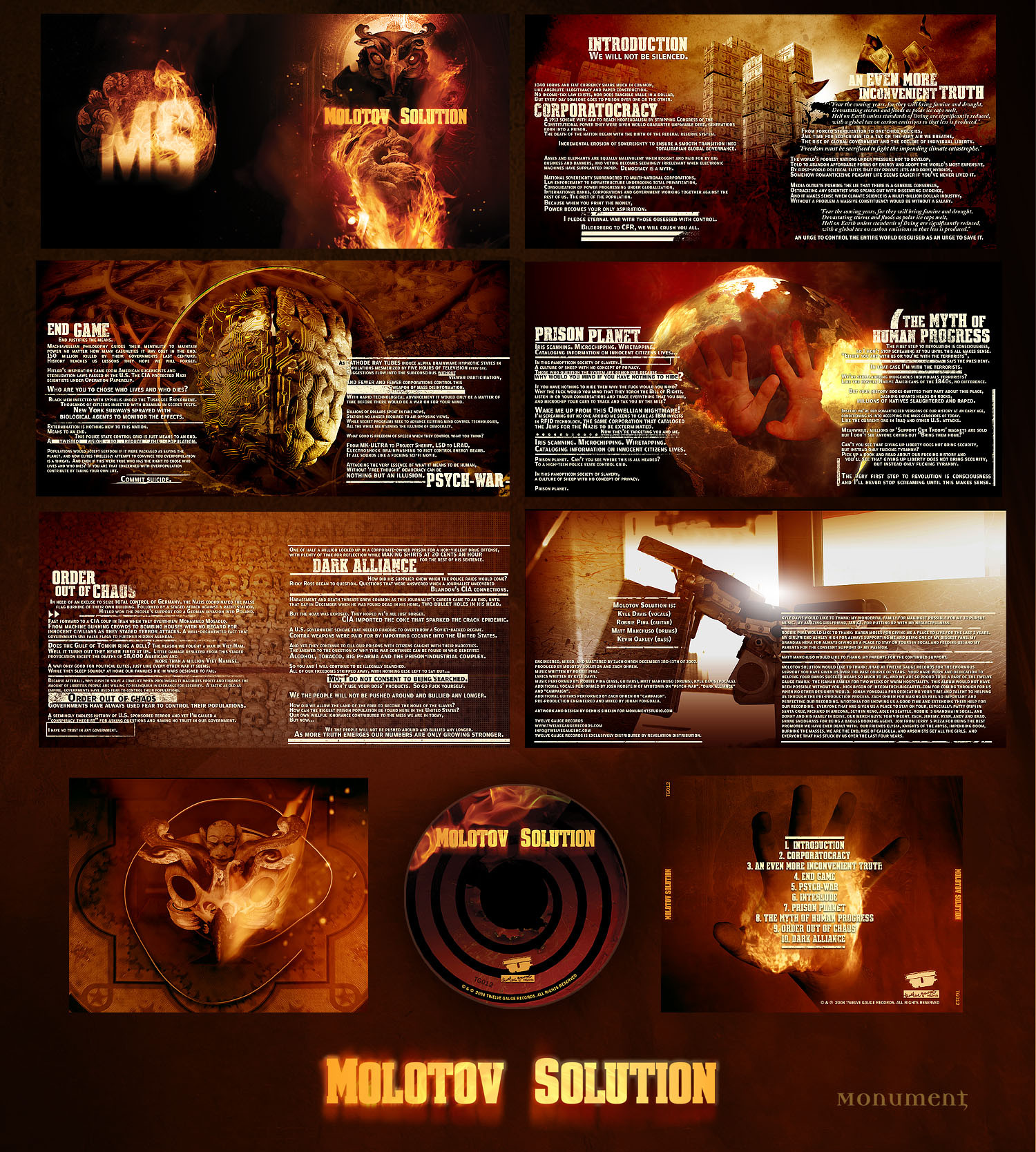
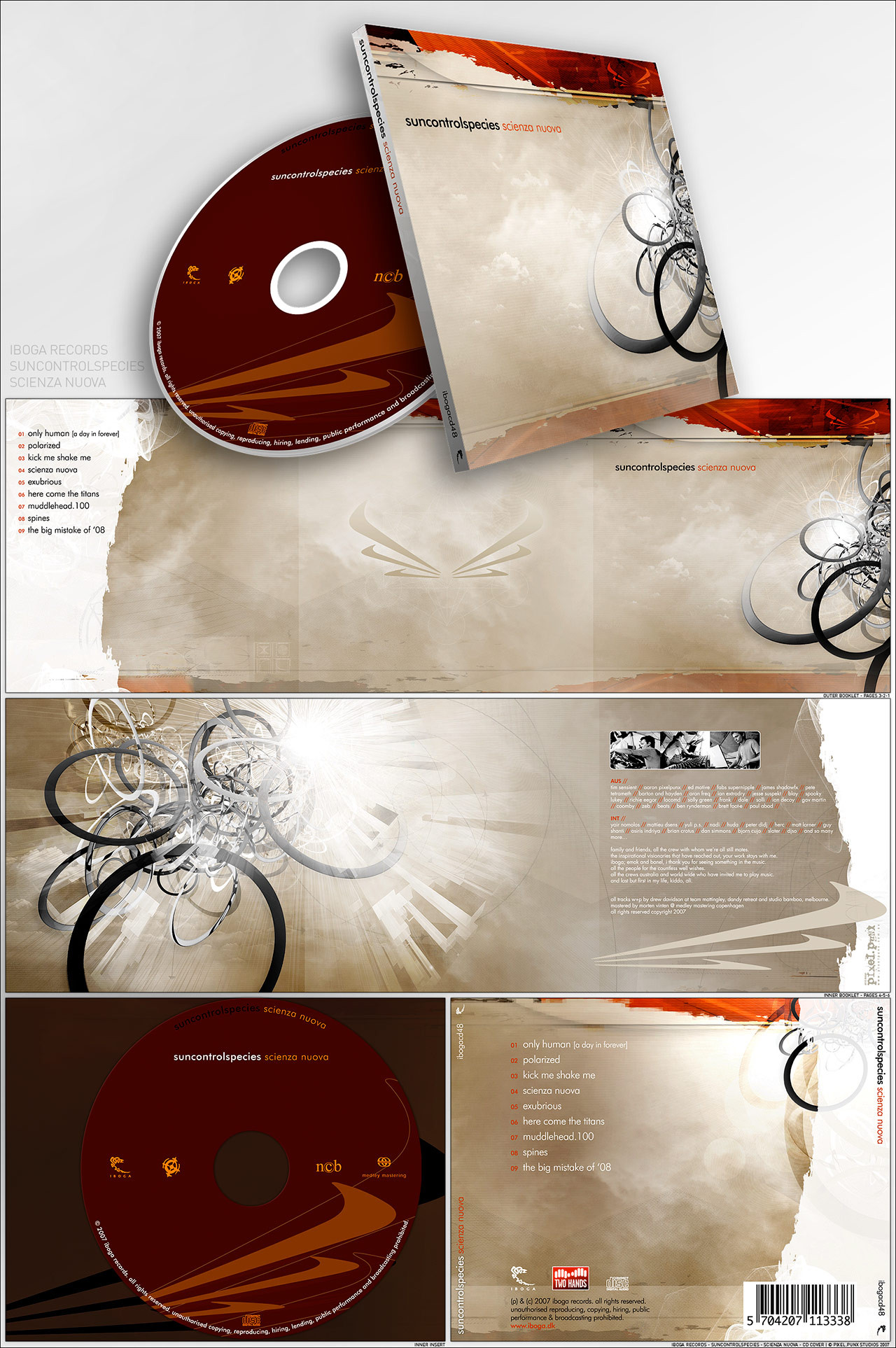
CD design for Molotov Solutions selftitled album. The album is about conspiracies and such so I tried to give the artwork that feel.All photography, textures by me.
Related content


Comments: 52

You have no idea how coincidental this is. I was just thinking earlier today "I wonder who does all of Molotov Solution's artwork" and I stumbled upon your gallery through a Job For A Cowboy t-shirt design.
You are amazing.
👍: 0 ⏩: 0

Man, I always love album art you do! Whenever my girlfriend asks what me and my band want for stuff (mostly typography) I usually refer her to you! XD
👍: 0 ⏩: 0


wow amazing! i've always enjoyed there cover art and to find the source is insane! what kind of techniques do you use, layer off sorts etc...?
👍: 0 ⏩: 0

this is amazing and I do like the "nazi like" (rofl) type.
amazing stuff
👍: 0 ⏩: 0

=T how can I be as great as you  (Smile)")
👍: 0 ⏩: 0


That's megakool! I might get the album just to see your work.
👍: 0 ⏩: 0

Exemplary cover-work 
👍: 0 ⏩: 0

awesome work mate, thats some kind of cover for which i would buy the cd!
👍: 0 ⏩: 0

That circuit-brain thing is pure genius. Maybe all of our brains will look like that one day....
👍: 0 ⏩: 0

You hurt my mind with your aesthetic brilliance, fucking superstar
👍: 0 ⏩: 0

So many questions. ABsolutely stunning work as always mate
👍: 0 ⏩: 0

")

I really like this.
The layout you use for the lyrics looks really good, and the artwork itself is pretty striking. I'm definetely gonna check these guys out.
👍: 0 ⏩: 0

Great album design!!! I did one myself so i know that it isnt that easy, great work!!!
Greetz
👍: 0 ⏩: 0


oh god i`m so hot for this record. Great work dude.
👍: 0 ⏩: 0


Nice one Dennis.... I really love the "dollars-bills buildings".
Have a nice day man.
Jonathan
👍: 0 ⏩: 0


hell I havent ever heard of Molotov Solution but that cd cover makes me wanna check them out (as well as thats a sweet name for a band).
👍: 0 ⏩: 0

Ja I dunno tha colors don't match for the theme D:, I don't feel the angry of the conspiracy on the cover but apart of that I like the art and Lyrics
👍: 0 ⏩: 1

there's no anger in conspiracies, conspiracies have a feeling of secrecy and some of those organizations have their own occult rites. This cover is based on the Bohemian Grove, who have a giant burning stone owl during their rites.
👍: 0 ⏩: 0

I couldn't think of anyone better to do MS's CD.
This looks fantastic, I love the colours.
Well done.
👍: 0 ⏩: 0

Wow I love this band, and this design is amazing. You are extremely talented.
How long do these take you to do on average?
👍: 0 ⏩: 0

hands down you're the best photo manipulator i've ever seen.
👍: 0 ⏩: 0

Great job! I'm wondering if genizah was thinking more like the font looks like it could be used on a poster depicting some sort of revolution. That's kinda what it looks like to me which I think is cool. Definately not Nazi!  (Wink)")
👍: 0 ⏩: 0


way cool. that circuit-brain is awesome and the readability is very good. 10/10
👍: 0 ⏩: 0

oh god, trhe frontal is amazing!!!! the total is amazing!!!!....is amazing!!!
I wanna learn!
👍: 0 ⏩: 0

Amazing work as always. I love all the imagery and typography.
👍: 0 ⏩: 0

Brilliant. I love the intensity. There is a sense of immediacy in the images. Great mood.
👍: 0 ⏩: 0

I think it's kind of ironic... my old bands first EP was entitled Molotov Solution.
Well regardless... your design is a lot better than ours was, haha.
Sick work man. Never dissapoint.
👍: 0 ⏩: 0

Whoa, could you possibly do one for my band?
I really like the style, can't find anything wrong with this piece!
👍: 0 ⏩: 0

really, really cool, man!
as usual!
and i like the typographic work!
great!
👍: 0 ⏩: 0


thanks, but it seems you don't know much about Nazi typography, they usually used blackletters fonts which are not even close to this type.
👍: 0 ⏩: 1

hi again,
i think you're missing a point in my comment, i didn't say "that's the typace which nazi's used", i just say its just nazi-like. surely i know the differences between your typeface and the other. my point is -let me tell- your artwork at background seems so clear, soft, fragile etc. etc. (i can say many keywords about it
cheers
/suleyman
👍: 0 ⏩: 1

evil owl with burning eyes is soft and fragile.
👍: 0 ⏩: 1
| Next =>