HOME | DD
 damnengine — motionstudy

Published: 2004-12-11 11:58:15 +0000 UTC; Views: 1929; Favourites: 31; Downloads: 327
Redirect to original
Description
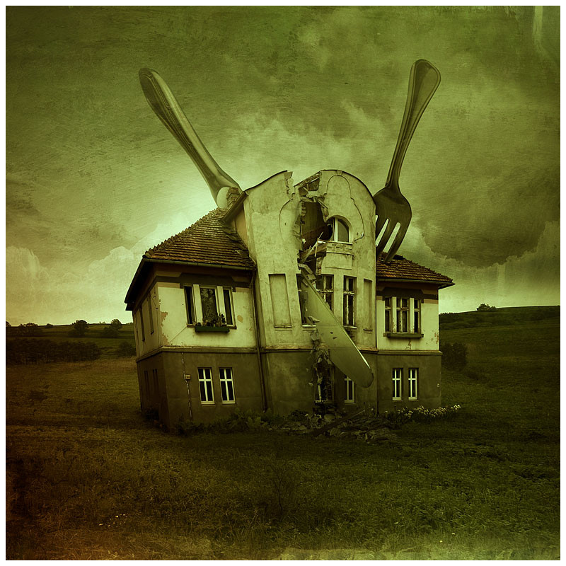
older pieceAll images/photography/scans by me - no stock used
Related content


Comments: 25

Awesome! i would remove the hand, but it stills being perfect as it is!

👍: 0 ⏩: 0

Excellent job, good color blending. well done.

👍: 0 ⏩: 0

hmm i really like it, however i can see how u hid the flaws in this piece, and i can't stop thinking of it hehe
 (Wink)")
👍: 0 ⏩: 1

I was young and innocent when I made this
")
👍: 0 ⏩: 1
haha i barely believe in innocence, especially professionalists' innocence, u sneaky u
👍: 0 ⏩: 1
I wasn't that professional back then =]
👍: 0 ⏩: 0

Jeez, I don't know ho you come up with stuff like this.
Great work.
👍: 0 ⏩: 1
this was inspired by the sketches of davinci. Thanks
👍: 0 ⏩: 1
That's exactly who I thought of after seeing it.
No problem.
 (Smile)")
👍: 0 ⏩: 0

your compositions always make me wonder how so much talent can be displayed in a work so small.
maybe a bit more contrast?
👍: 0 ⏩: 1
I wanted it to look like some faded old image, that's why the contrast is a bit lower than usual.
👍: 0 ⏩: 1


love the textures. intereting idea/composition. and i do like the implied concept of motion here, nice work...
👍: 0 ⏩: 0

mmmm... just my cup of tea.
what's the significance of numbers? one body? three limbs? I'm only guessing.
👍: 0 ⏩: 0

There is a lot here to think about. I think that viewing it on the whole cheats one out of the little details.. this is full of great stuff.
👍: 0 ⏩: 0

Hrm...to be honest: Compared to your other works the idea is a bit too much 'traditional' for my taste (maybe because its an older work). But it still is wonderful in a technical sense and it looks great.
👍: 0 ⏩: 0


God damn you.... You're like the most creative person ever -__________-. You're definitely one of the best manipulators ever. God... Blah you're to damned good. I hate life.
Faved.
👍: 0 ⏩: 0

Very very nice. One of my favourites from you.
I know you're busy but you didn't happen to get an email about prints of 'A Better Place', did you?
👍: 0 ⏩: 1
Thanks, I thought I replied that, I'll upload the print of a better place tomorrow.
👍: 0 ⏩: 0