HOME | DD
 damnengine — the reader and the critic

Published: 2004-01-26 22:07:06 +0000 UTC; Views: 2219; Favourites: 21; Downloads: 712
Redirect to original
Description
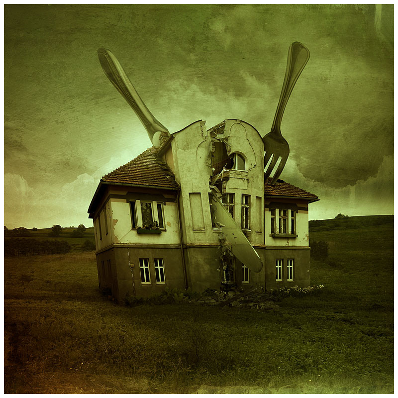
Finally a brand new pic, I've been just too busy lately.All images/photography/scans/3d by me - no stock used
Related content


Comments: 39

Amazing use of color and texture in a very errie/dark piece. I love the feeling I get from this. It's very dark and haunting but very light in a humorous way.
👍: 0 ⏩: 0

I...just love this.
- Short comment, yes. But there isn't much more to say. I definitely need to watch you. : )
👍: 0 ⏩: 0


its a very new view of things somehow  (Smile)")
👍: 0 ⏩: 0

Brilliant...
One of your best pieces ever...
I true showing of your creativity and style
I think that everyone can take something different away with this
<3
👍: 0 ⏩: 0

reminds me of dave mckean's work. and that's just great.
👍: 0 ⏩: 0

Take it from me when I tell you - that you have a very unique and original style. Your work is truly different than anything I have seen. I have seen similar, but you have set a path of your own, and that is what seperates good artists from awesome artists. This is just a very original idea manipulated very well. I love it. Damn good job
Jason
 (Wink)")
👍: 0 ⏩: 0


i love this, its symbolism, its colours, especially the thoughts swirling around.
very impressive.
you've been busy? i hear you.

👍: 0 ⏩: 0

wow, makes me think of how it gets when it's busy at work, just so much information flowing out of my head i can't take it anymore ... great concept!
👍: 0 ⏩: 0

Only just got around to commenting on this piece though I loved it as soon as I saw it.
The concept is very interesting and your style is really developing nicely, great composition and typography and I like your unusual use of photographs to build up a strange image instead of just throwing a few stocks together.
👍: 0 ⏩: 0


love the sureal look, its really bizzar en abstract, the colors are nice

👍: 0 ⏩: 0

mmm....always drool over your details! I sorta feel like this today-- chaotic with too much coming out of my head at one time-- marvelous work
👍: 0 ⏩: 0

This is great! I really love the stuff you do! Gawds! I want to be able to do the things you do!
")
👍: 0 ⏩: 0

I like the detail of machinery - I see it as an implication of reader-critic mechanism. consuming. digesting.
👍: 0 ⏩: 0


Very expressive.
I get the feeling the writer is really under allot of pressure from the critic(s) who can only critisize by comparing the piece to already written books and therefor the writer only gets blocked to express his/ her feelings.
Really nicely done (like allways)
👍: 0 ⏩: 0

very cool work! love the swirling text and the papers flying! good touches to the piece!
👍: 0 ⏩: 0


this is really hot.
i love the books...they really pull the title into play.
and the movement seen in the placement of the character is absolutely fantastic. [ie")
awesome work damnit!!
hehe
👍: 0 ⏩: 0


the books, the colors, the placement of the character, and the words flowing, just comes together soo nicely. I hope a print will be available. Great job dennis! I wish Sarah could of saw this, she would of absolutly loved it.
*adds to favs*
👍: 0 ⏩: 0


rad work. i really like this palette, and i think the composition and textures are great. i also dig how you handled the text. it's not oerdone, looks great. nice work...
👍: 0 ⏩: 1

Vague and a little difficult, but interesting work as always. The green and red combo works real well in those low contrast flat areas.
👍: 0 ⏩: 0

weird. don't like this 3-d look, but it's very attractive anyway.
👍: 0 ⏩: 0


well if you're a goat; yes indeed =]
👍: 0 ⏩: 0


I don't know what to say. The blending is awesome, the colours are awesome, the typo is awesome, overall feel is awesome.
definitive fav
👍: 0 ⏩: 0

very criativity mt friend!excelente manipulation!
rocks

👍: 0 ⏩: 0


wow.. its really trippy.. i like it.. its gota just an eerie yet light-hearted, comic feel to it..
👍: 0 ⏩: 1
thanks, I'm kinda trying to develop this style (making some new series).
👍: 0 ⏩: 0
