HOME | DD
 damphyr — PPG BlingBling

Published: 2005-03-23 06:46:22 +0000 UTC; Views: 2514; Favourites: 62; Downloads: 238
Redirect to original
Description
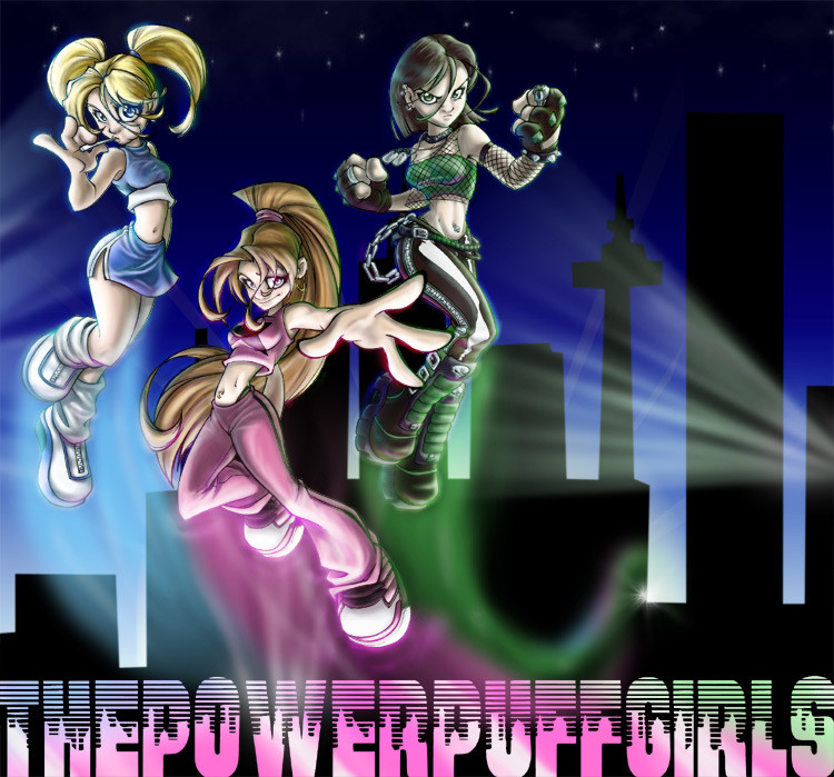
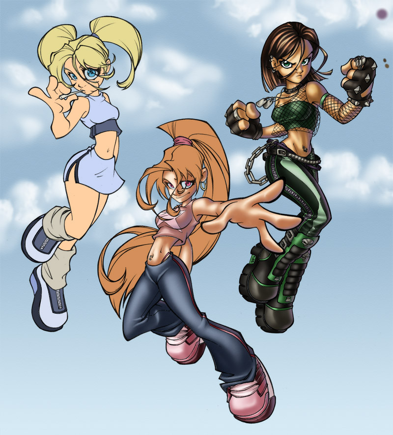
So, this is the more bling-blinged up version of my PPG Teen Coloring contest entry. I love the shinies on this one... but I think it distracts from the drawing itself more. So I'm posting both versions, because both have their strengths.Which do you like better?
")
Related content


Comments: 6


Hmmmm...
I enjoy this version better. I enjoy the mixture of colour of the letters, I really pay more attention to the other colours presented in the piece.
Also- like the linear has more of a knockout glow to it. The leather from the shoes, although subtle, really do stand out more. I am ALLLLL about the bling.

👍: 0 ⏩: 0

mmm i like this one better, there's subtle but important differences to the last, the colouring in the text looks so much better xxx 


👍: 0 ⏩: 0

SHINYBLING! *basks in the shiny*
I have a special fondness for shiny glowy effects, thus I adore this version. *goes to look at other version, too*
👍: 0 ⏩: 0

I like this one better. The extra shinies give it a bit more oomph than the other.
 (Smile)")
👍: 0 ⏩: 0