HOME | DD
 DanielHurd — RainForestSprite
Published: 2013-01-06 02:39:25 +0000 UTC; Views: 2092; Favourites: 48; Downloads: 0
Redirect to original
Description
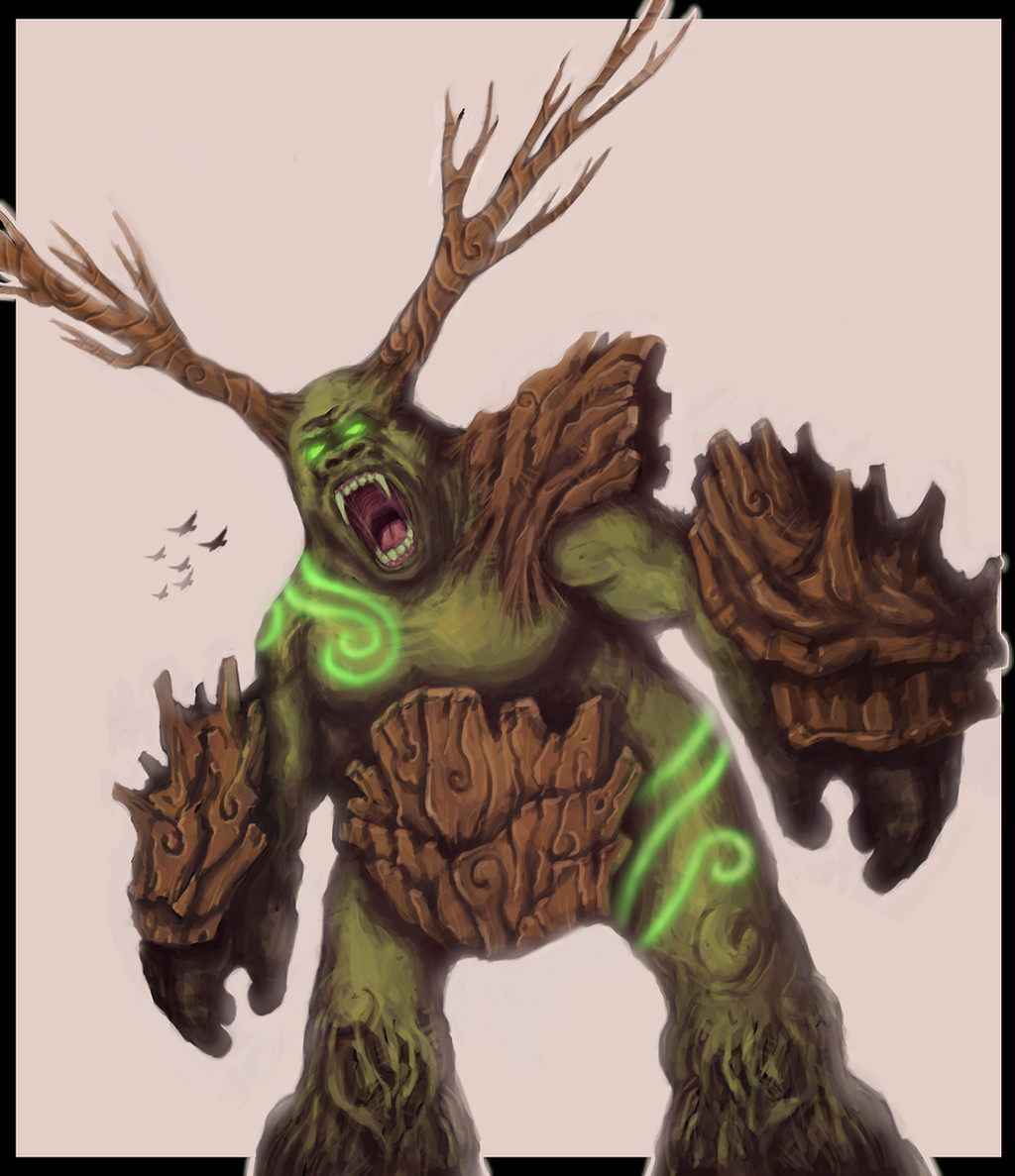
Finished version of my entry for Creature of the Week on ConceptArt.orgSadly conceptart.org is down due to a virus threat or hack. Hopefully it will be back up soon so I can enter.
Related content


Comments: 27

I really love it! I don't really understand the kneews, probably because of the perspective in it, but you did a really great job of design!
👍: 0 ⏩: 1

Yeah, I think I could have spent another 20 hours rendering this guy. He is definitely one of my personal faves.
Thanks!
👍: 0 ⏩: 1
No prob! I realy think is nice
👍: 0 ⏩: 0

an elemental with animal aspects? kind of disturbing
👍: 0 ⏩: 1
haha thanks, whatup Isaiah!
👍: 0 ⏩: 1

I've seen your art get better with time since I was 15, when I first started talking to you...all I got to say is...I'm jealous. It's gotten so good.
👍: 0 ⏩: 1
Lol same goes for you man! I have seen scetchy comics take shape into awesome looking panels.
👍: 0 ⏩: 1
cheers to you buddy. here's to another seven years of friendship and art. maybe we'll work together someday.
👍: 0 ⏩: 1

Thanks! I'm glad you like him. I really enjoyed painting him.
👍: 0 ⏩: 1


Really nice! I love the concept. My only quarry is that he looks a little flat around the edges and is lacking form. I do realy like it tho.
👍: 0 ⏩: 1
Thanks Matthew! Hmmm, do you have any thoughts to eliminate the flatness around the edges? I felt the same way as you, just had trouble really making the edges pop.
👍: 0 ⏩: 1
Yea! I love your attitude. Someone who really wants to improve always will improve! and keep in mind my advice or suggestion does not take away from how awesome this concept is, it would only improve it.
So, look at objects in real life and notice that almost nothing has a hard black edge around it. Cartoons look flat because of those thick cartoony black lines. In your case here, it's that black around the edge of your character design that is making it look flat. Contrast is important but black thick edges flatten your design.
When we look around we see a lot of reflected light. Light bounces off stuff and hits other stuff constantly.
[link]
Copy and paste that link. Notice how the ball has a core shadow - and just after that the edge is slightly lighter - that's light bouncing off the floor which is hitting the ball. So if you want something to pop out of your page and look more dimensional start drawing and thinking about light.
Also - Look at your hand right now. Notice how it's actually light around the very edge of it, then as you look more in toward your hand it gets darker then lighter again. Skin is cool because light penetrates the layers but the way light hits objects is universal.
So yea, apply that core shadow and reflected light. Try drawing that ball and stretching it into an oval then shading it. In this case don't put thick black lines around your object - unless it's a cartoon or technical illustration - or maybe you want a heavier line weight to draw your eye to an area on the image.
basically if you want 3 D - no black thick black lines.
also remember when things are super shiny, or glossy they have sharp highlights - look at anything shiny in your room - notice the hard white light reflecting off of it. So for example - if your character has wet toes, or his skin is smooth there, make a light sharp highlight on the lightest areas of his toes and it will look like the light is bouncing off a glossy or more reflective surface.
Play with light!
Hope that helps!
👍: 0 ⏩: 1
and see that highlight in his yes, that white spot you added is reflected light. Eyeballs are so glossy that you get a sharp white reflection, or little white circle on the eye. It's just light bouncing off the glossy surface of the eyeball. That's why your characters eyes look more real, and "life" like.
👍: 0 ⏩: 1
Super awesome man! I can't thank you enough for the advice. I am going to give it a go tonight and see what I come up with and really try to give this character a more 3d look. I will eliminate the thick black edges where light is hitting and keep the darker areas where light isn't. I have done the sphere/egg studies before but it always seemed so much more simple than dealing with a complex object or character. Eyes always seemed easier, I think because I understand more about how the light reflects off them. I will put your advice to good use!
Let me know what you think when I post the more refined version!
Thanks again!
👍: 0 ⏩: 0

Oo very nice! His eyes are so sweet!
Really like the line art at the top left too.
CA.org is back up again.
👍: 0 ⏩: 1
Thanks WitchHaze! I appreciate the compliments, glad you dig it.
👍: 0 ⏩: 0

Really epic drawing and idea! I imagine it to be giant and have tiny (in comparison) animals living on it.
👍: 0 ⏩: 1
That was kind of the idea! I imagined him being home to all sorts of critters. Frogs, lizards, birds, mice, etc.  (Smile)")
Thanks!
👍: 0 ⏩: 1
Awesome
👍: 0 ⏩: 0

 (Wink)")
Thanks! I appreciate the compliment!
👍: 0 ⏩: 0
OMG, I put the wrong year for the date! I keep forgetting it's 2013! :/
👍: 0 ⏩: 0