HOME | DD
 danieljoelnewman — Week 18 - Cryolophosaurus

Published: 2009-04-27 03:28:37 +0000 UTC; Views: 2765; Favourites: 78; Downloads: 795
Redirect to original
Description
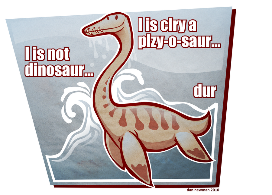
For Prehistoric Times. Not quite finished. Let me know what you think + what you think I should tweak...Related content


Comments: 9


You might want to add some more protofeathers considering were it lived. But obviously it is up to you. Great work!
")
👍: 0 ⏩: 0


If the crest was bit bigger and the snout was a bit shorter you'd have it nailed . . . like a nail . . . on a coffin.
👍: 0 ⏩: 0

Very cool, I agree with the "Inquisitor,"that there is something wonky about the focus. Neither the log nor the dino are in sharp focus. One thing I keep zeroing in on is the neck of the beast; it almost appears to be furry. Odd!
👍: 0 ⏩: 0

I agree that the log does dominate the image a little, perhaps if it were a little out of focus with the dino then being the true focus of the image.
The Skull seems a little odd, but I can't quite pin it down, perhaps it is that the crest is not as prominent as others' images - not quite as curved.
Reconstruction based on the small amount of material available, and for this specimen in particular, is always going to be an artistic challenge.
I do love the subtle colour and the hint of feathery integument you've included.
Look forward to seeing the finished product and seeing it in the PT.
Minmi
👍: 0 ⏩: 0

Love those subtle, "mottle-y" stripes; it strikes me as a very likely patterning for a large theropod, unlike some of the crazier and more flamboyant color schemes we often see in paleo-art.
👍: 0 ⏩: 0

Hey, very good job! The lower jaw looks too big imho but who knows... I think the log is too big in the composition, taking over the space of the first plan and disturbing the reading of the perspective.
👍: 0 ⏩: 0
