HOME | DD
 danimation2001 — He robot

Published: 2005-02-20 02:00:33 +0000 UTC; Views: 8372; Favourites: 177; Downloads: 318
Redirect to original
Description
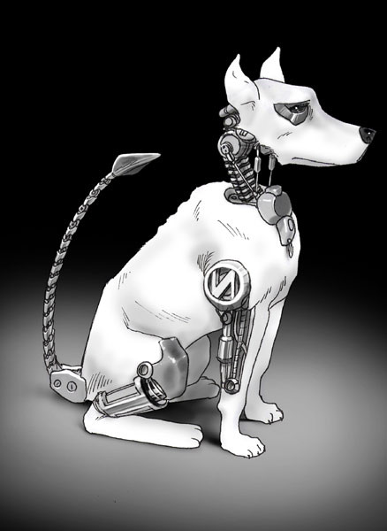
A robot sketch done with markers,gouache, and white pencil.shadows done with photoshop
Related content


Comments: 33


I enjoy the detail-negative-space ratio on this: elegant line work defining great forms over some very well done component parts. Excellent job!
👍: 0 ⏩: 0


i like it
that face saying nothing xD
and those arms are very cool
i would like to draw like u
")
👍: 0 ⏩: 0

It has a femininity in its simplicity and angles and longing eyes
👍: 0 ⏩: 0

really cool ... would work perfectly as a nemisis for my own Anon v2.0 hope you don't mind me asking

👍: 0 ⏩: 1
oh, and just to let you know, this would be the good guy, not the bad ... Anon would be the ... neutral? ... cuz Anon isn't good (fights cops) but he isn't bad (fights evil) ... this would be on the cop side. ... sort of ... more like a super hero ... super robot hero ... whatever.
👍: 0 ⏩: 0

GREAT! I love the concept, the line and the shadows..... everithing!...
👍: 0 ⏩: 0

Love this design
It reminds me of Shriek from Batman Beyond (the shape of the hands look like his sonic gauntlets.)
👍: 0 ⏩: 0

nice idea on the robot idea. Different that what most people have.
👍: 0 ⏩: 0

looks good
how many different markers did you use
like how many levels or whatever
👍: 0 ⏩: 1

for this it was only 10, 30 and 50%
👍: 0 ⏩: 1
if you dont mind me asking, what brand ?
i need to get some markers to start practicein'
👍: 0 ⏩: 1
prismacolor is the brand I think.
👍: 0 ⏩: 1
sweet
thanks for sharing
im glad you are submitting again after a semi away period
👍: 0 ⏩: 0

I really dig this one. Have you been reading Möebius recently?
 (Smile)")
👍: 0 ⏩: 0

Nice man! I love the idea on the "one piece" looking arms, really cool. The proportions are really cool as well ^^
As for crits, id say try using darker markers, it looks like its just 1 tone.. hmmm... and on personal opinion, theres somethin on the hips that look kinda wrong to me :/
Still, this looks great man, keep it up! XD
👍: 0 ⏩: 0

I just wanted to tell you that your recent batch of robot drawings look great.
👍: 0 ⏩: 0

Ha this is great man, shows me how much I have to improve my pencil-skills....damn
👍: 0 ⏩: 0
pixelquarry [2005-02-20 09:05:06 +0000 UTC]
Nice Robot, might be worth to become 3D  (Wink)")
Greetz
PRO
👍: 0 ⏩: 1
If your saying that you'd make a 3D robot out of this I would seriously kill to see that. :]
👍: 0 ⏩: 1
pixelquarry In reply to danimation2001 [2005-02-20 16:59:36 +0000 UTC]
I consider your robot worth a try...I'd make his head a bit longer though...well we'll see about that
👍: 0 ⏩: 1
do what ever you feel like changing, don't mind.
👍: 0 ⏩: 0


awesome design.
hmm.. what did you use the gouache for?
👍: 0 ⏩: 1

The tiny, simple-eyed head on the oversized body gives it a really interesting look, like he's a child with too much power and he doesn't know what to do with it. Really intriguing and lovely.
👍: 0 ⏩: 0

That is an awesome design. So simple, kicks butt.
👍: 0 ⏩: 0

awesome design.
hmm.. what did you use the gouache for?
👍: 0 ⏩: 1
I made that up. It\'s actaully the way I think of improving in art. The more you do the better you\'ll get at it. It happened with my colors same will happen with my pencils, just got to keep doing it every day, day after day. Sucks that it took me four years to really learn this lesson, but eh. Live an\' learn.
👍: 0 ⏩: 0
That\'s what i thought.
...dude... where\'d you get that quote in your sig from? That\'s the most awesome thing i\'ve ever heard...
👍: 0 ⏩: 0