HOME | DD
 Daniocity — ACEO: Like The Wind
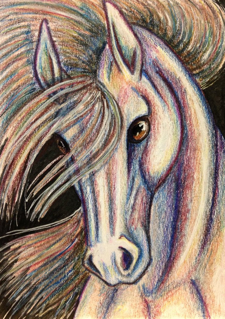
#aceo #artcard #equine #horse #artisttradingcard #coloredpencil #micronpen #prismacolor #prismacolorpencils #artcardseditionsandoriginals
Published: 2015-05-06 19:10:07 +0000 UTC; Views: 754; Favourites: 73; Downloads: 0
Redirect to original
Description
Edit: Dinked around with the shadows a bit, and tidied up the hair. I really have to work on light source...Done for a trade on iATC
 (Smile)")
Prismacolor pencils, micron pen, gel pen, paint pen, pencil
reference:
rocky mountain horse 2 by venomxbaby
Related content


Comments: 36


Originality
I simply adore this coloring and this beautiful mare. The shading and background is amazing in this picture, mostly the rainbow colored skin and hair you put in. The horse looks like its staring straight into my eyes, and saying "Hello". But, i think she's in a cave of some sort, or is it night time where she is? I cant really tell the difference, sorry. The style you have in this is a wonderful art style. I would love to see the other art you have created to feel like the same fuzzy feeling of this piece of beauty.
👍: 0 ⏩: 0

I think that this is a very beautiful work of art. I love all the colors used and the way you used them, though the shading is a little off. I'm not sure where exactly the light is coming from. Though the shading is off I do really like it over all. It's beautiful and almost mysterious. When I saw it I thought of a horse running in the wind and somehow a rainbow or different colors of chalk got on the white horse. (In a good way.) My favorite thing about this would probably have to be the way you made the main appear. The way it look to me is that the wind just blew and the light hit it perfectly to make all these other colors appear. Great job on it and I love this. e.deviantart.net/emoticons/s/s… " width="15" height="15" alt="
👍: 0 ⏩: 1

Thank you so much for your critique! Defining a light source is definitely my biggest weakness as an artist. I should probably do more still-lifes....
👍: 0 ⏩: 1
That would be best. I have trouble with lighting as well so no worries!
👍: 0 ⏩: 0

Overall
Vision
Originality
Impact
I would like to say that I find this art sort of unique and such, because frankly, I find the shading so interesting. It isn't there, but it is. Problem is, there's not enough for me to determine where the light is being projected. And the glass eyes are telling me that the shading is somewhere in front, but then there isn't any shadows near the edges of the horse to confirm this.
Another problem with the shading is in the nostrils (it feels so awkward saying that). I see what you're trying to project, but where the holes should be it seems to actually pop out if you look at it overall. This also confuses the looker, because the sense of where the light is located is messed up.
I just want to say, before I forget to write it, is that I see this as an amazing piece of Fauvism-like work. Heck, Matisse would be jealous. The use of only colors and not any dark colors such as grey and black to offer the looks of shading and an outline really gets me. It seems more professional than if you had done it with a dark outline.
Speaking of the colors, I want to empathize on that. I see that you used many complementary colors (a part of Fauvism, no doubt) and it seems great. Problem is, you almost every single color on the wheel...except for blue-green, green, and more IMPORTANTLY, yellow, which is a PRIMARY. You have plenty of tan, peach, and orange, but without yellow itself the picture seems a tad bit duller. Add yellow next time to add contrast, it'll seem much more lively.
I think the last thing I'd like to address is the mane. Now the hairs on top of the head seem marvelous being done in this style, but what about that bit flowing in the unseen wind at the bottom left of the picture? It seems very much rushed to get done and although it looks like the hair above, the 'shading' trying to be added makes it seem very disorganized.
I hope this critique helped you. And remember, Fauvism is a wonderful kind of art. Look it up; you'll be amazed. Compare your skill here to artists like Derain and you'll see how skilled you are.
👍: 0 ⏩: 1
Thank you for your critique! I had gotten to the point where I was kind of stuck on it, so your suggestions are very helpful. I haven't sealed it yet, so I may go back and take some of your advice  (Wink)")
👍: 0 ⏩: 1
Shading can kick your butt, I know.
👍: 0 ⏩: 0

I'm glad you like him <3
👍: 0 ⏩: 0

I like the composition a lot. The black background is like a line that counterbalance the diagonal of the horse.
")
👍: 0 ⏩: 1


This is amazing.
Beautiful colors, I like the style you use and all lines appear to be do with slowness, it makes us see that you wanted to have this result.
Pretty artwork, good job !
👍: 0 ⏩: 1
Thank you!
It was fun playing around with colors and layers
👍: 0 ⏩: 0


Umm... probably about 2.5 hours between fighting with the initial sketch, and adding some suggested edits after posting it the first time. The actual coloring part went by really fast, because I wasn't really blending the colors, just laying them down on top of each other (which is what gave it that chalky feel). Mostly it was getting the head to look right...
👍: 0 ⏩: 1


Wonderful drawing Danielle.........movement and colour exceptional.
👍: 0 ⏩: 1


Thank you so much!
👍: 0 ⏩: 1

