HOME | DD
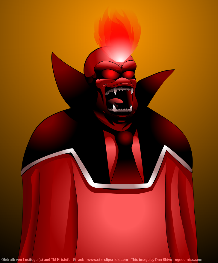
 DanShive — Obdrath von Lucifuge Color
Published: 2006-10-27 18:28:57 +0000 UTC; Views: 9131; Favourites: 24; Downloads: 94
Redirect to original
Description
I'm normally my own worst critic, but HOLY CRAP O_OOk, now that that's out of the way, I'm interested in honest and constructive criticism. This is my first time going all out like this with shading in Flash, and I'm looking to improve. If anybody knows of any good tutorials, I'd be interested in those as well. I pretty much just winged the process on this based on artwork I've seen by Lepas .
Obdrath von Lucifuge (c) and TM Kristofer Straub - www.starslipcrisis.com
Related content


Comments: 27

Well, the flame looked better in the original, but overall, not too bad.
Ahh, good ol' Obdrath. Immediately filed under "Names To Run Away From Really, Really Fast"
👍: 0 ⏩: 0

I'm not much of a critic with this sort of thing, but I liked it. It was cool.
👍: 0 ⏩: 0

There's way better critique than I can provide already. Therefore: JAWSOME.
👍: 0 ⏩: 0

"Avatar!"
"Know that Britannia has entered into a new age of enlightenment!"
"Know that the time has finally come for the one true Lord of Britannia to take His place at the head of His people!"
"Under my guidance, Britannia will flourish, and all the people will rejoice! And pay homage to their new... Guardian!"
"Know that you, too, shall kneel before me, Avatar."
"You, too, shall soon acknowledge my authority - for I shall be
your companion...
your provider...
and your master!"
Seriously that's what that face brings to my mind. I think it's a sign I've been playing computer games for too large a portion of my life.
👍: 0 ⏩: 0

Only thing I can see is that the...nectie? looks a little flat.
Other than that, is perfect!
👍: 0 ⏩: 0

Brilliant work, but a few small points. Normally I hate gradient shading, but you seem to have made it work far better than I'd ever seen before, except that the eyes still look cheesy. Point two: The fire on top of his head dosen't seem to 'match'. It just seems like it has a different quality or sense of realism from the rest of the image. I'd like to restate, though, that I've never seen shading with gradients that well done outside of comedity.
👍: 0 ⏩: 0

Holy crap! Flash!? Are you serious? O.o That is amazing...
👍: 0 ⏩: 0

SO FRIGGIN BADASS! I like the shading muchly. And the red. Beyond that i can't critique this well because i have no skills with CG or anything.
~sara
👍: 0 ⏩: 0

I've gotta say, this rocks. Apart from the fire. It seems in a different style to the rest, and too clean looking to be fire, if you get what I mean. But then again, I am terrible with Flash, so I don't know how to get around that, sorry. It may the be the colour, actually. Seeing as you've stuck to a colour scheme on the foreground otherwise, and this shade of red is a bit off from the colour scheme used...
Anyway, hope that helps a little :S But yes, this picture looks great otherwise!
👍: 0 ⏩: 0

I agree with your initial 'holy crap!' diagnosis. o.O
As for critiques, I don't got Flash, but . . . first off, face, amazing. ")
However, there's something about the clothing that's off. I think the shading needs more gradation sorta thing.
I dunno, try doing a greyscale on Flash, with as many shades as possible and really try blending them together well.
Seriously, though. Holy crap on this. o.o
👍: 0 ⏩: 1

true dat. good depiction tho.
👍: 0 ⏩: 0

Well, I'm terrible myself, so to me this is...
o.O WOWSER!
👍: 0 ⏩: 0

Hmm, I hate to give criticism w/o offering suggestions, so here goes:
As someone at Keenspot said, it looks a little "flat." I think you need some shading and texture (folds?), especially in the lower part of his robe to bring out some depth to his figure.
The comment from above regarding the light source(s) seems correct, too. While there may be another multiple light sources (looks like there's one in front, above and to the sides), in this instance they do more to flatten the image than anything else. Not being familiar with the character, I don't know if the thing above his head is flames. If so, then I would base all lighting and shadows on that source of light, which will provide some real depth to his figure when you adjust the shadows below. In particular his collar would be illuminated on the inside, with perhaps a little shadow at the bottom from his head, and his shoulders would not only be illuminated from that direction, but would also have shadows cast across them by his collar-thingies.
One other note on the thing coming out of his head. If it is flames, then the top looks fine, but the white point below makes it appear that he has a mini projector in his head emitting an image , which may not be the effect you're looking for. Perhaps it would work better if you used other hues of red or similar colors to indicate the source.
The highlight on the background also seems to indicate another light source; if there is none, perhaps you would want to change the hues to reflect the color of flame above his head, and cast a shadow, which would reflect his head and collar, on the wall.
I think you did a great job with his face, regarding shadows, features, and whatnot. In fact, I would say that's the best part of this image, because you did put so much effort into the details. Since his eyes are glowing, I think that might effect the highlights on this face, but that's getting really complicated.
I've never worked with Flash, so unfortunately I can't offer any advice with that. ")
Personally, I think the background doesn't do your composition any favors, given the colors used in the character, and the muddy hues used as background. Perhaps something closer in the spectrum to his outfit, or a gradient running from black up to a red/orange hue? Just ideas to give you something to think about.
As a final comment, going by your work in EGS, I would say that your strong suit is facial expressions, particularly the eyes. Perhaps you might want to give more thought to that here? Just because he has flames or glowing spots for eyes doesn't mean you can't show more expression, especially with his brows. Of course, his mouth doesn't leave a lot of room in that area.
I hope these comments are helpful, not just negative. I'm personally going through a learning process right now with a tablet, and just drawing in general, I'm impressed that you're working with so many different media and software apps.
 (Smile)")
👍: 0 ⏩: 0

well done, Dan! seriously, very well done! but if I must critique...
my thoughts are based entirely around that piece that seems to make up his shoulders and upturned collar...thing. It seems as if it has no depth. Perhaps, as suggested before, you could add texture to it, that could work, but it seems to be just sitting back from the rest of his 3D body. The white part and the tie help with the depth on the shoulders, so it's the collar thing that needs more tweaking, but they both could use some sort of a facelift, so to speak.
heh - and remember, you asked for critique, and this is only my opinion.
👍: 0 ⏩: 0

are there two light sources? there seems to be light coming from the fire, but then it gets darker around the 'tie', and then bam another highlight. that one seems to be coming from straight on, or, where we are sitting looking at it. And the highlight on the torso is really..round. most lighting won't be like that, i think. it's a bit more diffused.
Also I'd suggest some shading along the sides of the robe, between the chest and arms. it looks really flat. the face is very well drawn though, and you're off to a good start!
(sorry if i was too harsh!)
👍: 0 ⏩: 1

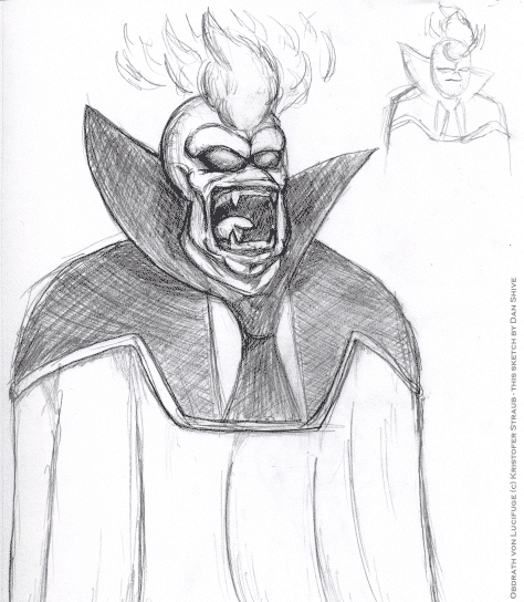
There are two light sources; I don't think I INTENDED for there to be two when I began, but I originally planned to crop out the robes and just attempt to color the head.
As for the arms... to be honest, I have no idea what his anatomy is like under that garment. Straub has yet to show this character in any pose that gives any indication as to what's under there (though he did say Obdrath's species have fanged venom-dripping forearms...). That would apply to most characters (and, as far as I know, this one) so definitely valid criticism.
And harsh criticisms are welcome; I want to get better with coloring, so I need to know what I'm doing wrong so I can do it right later.
"I'm wrong all the time; it's how I eventually get to right." - Grissom, CSI
👍: 0 ⏩: 0


Very nice work Dan! For advanced criticism, you need to work on your edges. There's allwasy just a little change in color and shading as something curves away from the viewpoint, on both sides. Adding a little gradient along the inner edges of something gives it a much more "Popped" 3-D feel to it, like it's a real object and not just a painting. It takes a bit of experimentation to get it right, but you're well on the way allready to epicly awesome stuffs!
👍: 0 ⏩: 0

Whoa... Nice work.
If there's anything that seems off to me, it'd be the front-middle of the robes seems oddly flat. Kinda like he stuck a piece of cardboard under the robes.
I'm not sure how you'd fix it (if it even needs fixing), as I'm not great with shading/coloring myself.
Other than that, very nicely done!
👍: 0 ⏩: 0

caption: "my god someone get thing out of my butt!!!"
no seriously, it looks like the guy got something lodged somewhere... wrong
👍: 0 ⏩: 0
Tutorials need not be flash-based; I have PhotoShop as well. I'm just more used to working with Flash for coloring. I'd probably be better off working with Photoshop for print-level things anyway.
👍: 0 ⏩: 0

Damn that all and good. there is little to criticize. But I can think of a couple. The shading and lighting is awesome, especially on the face. The anatomy is awesome for all that I know.
One of two things can come to mind right away.
I'm sorry for(even though I'm not reqiured to) not finding any flash tutorials. But dA has a whole catagory for it[link] . I took a peek at it and it has the good with the bad.
Finally, this is better then what I can do. ^__^
NLT: R.E.M-Hope
👍: 0 ⏩: 0

Great job, dan, especially on the Face!
I can't really crit in terms of flash technique, as I don't have the program, but overall;
My only real crit would be that, the black "Shoulders plus collarey thing" feels like it's not lit the same way the rest of the scene is. While most of the picture has a consistent front-and-above light source, the red edge-circle-gradients on that "shouldrs and collar" area are a bit confusing and seem to be more stylistic than actual shading. In terms of what to actually do.. well, I'd have a hard time giving concrete advice without actually playing around with it myself, but I'd vote for moving the highlights more towards the front, to give it dimension, and maybe a brighter part along the front of the collar that's in direct light.
👍: 0 ⏩: 1
I think you're right about those highlights... I did a little tinkering, and it looks a lot more natural. Thanks!
Once I get enough critiques and make all the changes I feel should be made, I'll likely post an improved version and move this one to scraps
👍: 0 ⏩: 1
Glad to know I helped!
Can't wait to see your "new and improved" version ^^
👍: 0 ⏩: 0


"Honest and constructive criticism"? This is comprised solely of win and god! How could anyone criticize it? I'm gonna need like, a Super-Favourites list to add this one to.
👍: 0 ⏩: 0