HOME | DD
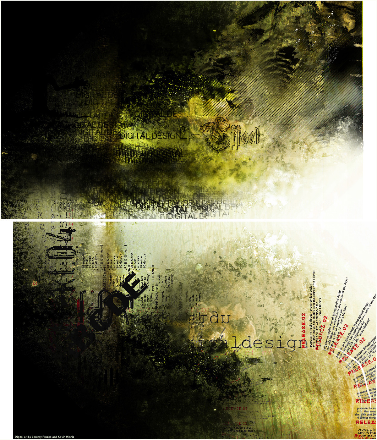
 darkicefx — 4-Effect
Published: 2004-10-20 20:37:15 +0000 UTC; Views: 460; Favourites: 8; Downloads: 182
Redirect to original
Description
Can you feel it?Related content


Comments: 33


Wow i really like this kind of style you have created, i have never seen anything like it. I never though i would see a peice that can envolve text and make it so nice like you have done here. Very nice job man and keep it up, i think ill give you a dev watch so i can see some more of this!
👍: 0 ⏩: 1
 (Smile)")

Really dig this piece, great colours. The choice of colours is spot on, interesting textural work too
👍: 0 ⏩: 1


Wow, super weird style here man! Its clean and refined yet grungy, what an oddly interesting combination
👍: 0 ⏩: 1

haha thats a lot of things... thanks alot man

👍: 0 ⏩: 0

This is indeed lovely. Reaks of style and a good sense of composition. I can't help but feel tempted to try something like this some time. The use of text here is orgasmic as well. You have done a bloody awesome job mates. Cheers for a well earned fav.
👍: 0 ⏩: 1
typography props goes to Kev... he did an outstaninding job on it...kudos to him
👍: 0 ⏩: 0

Incredible design. The textures, the lighting, the text...Top Notch!
Well done.
👍: 0 ⏩: 0


woot! slick, I love the text... how do u do that diagnol black line effect?
👍: 0 ⏩: 1
its a pattern i created myself....quite easy to make in fact
👍: 0 ⏩: 1
yes does look simple, but its a very nice effect. cool
👍: 0 ⏩: 0

")

 (Wink)")


F'ing A! Absolutely stunning. You and Kev did a great job on this piece mate.
👍: 0 ⏩: 1

Likeing it, thats a great comment since I normally dislike this stuff XD
👍: 0 ⏩: 1


not really feeling the typo at bottom..but its still overall a sweet piece!!
👍: 0 ⏩: 0

cool the right upper corner brushing looks like a dragon's head lol
")
👍: 0 ⏩: 0

Like some sort of decomposition image... I love the two sections and the way they're split up.
👍: 0 ⏩: 1
