HOME | DD
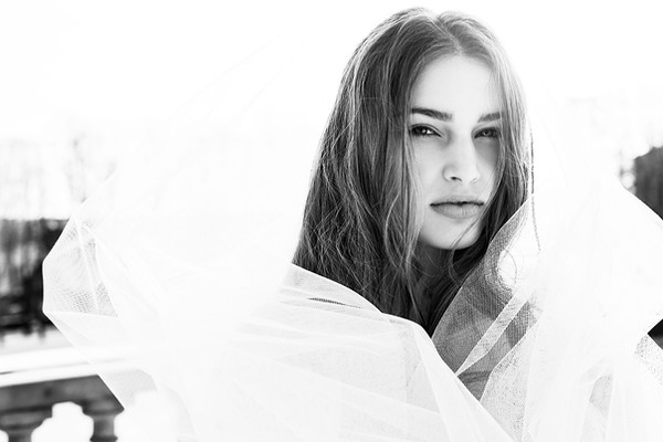
 DarkMyth — Vanity II

Published: 2007-04-25 08:58:14 +0000 UTC; Views: 5780; Favourites: 197; Downloads: 96
Redirect to original
Description
So, after many moons of inactivity I decided to give one of the oldies another go.Give me advice, verbal bashings, whatever you like. I love critiques, so go as harsh as you like!
Related content


Comments: 75


texture is perfect  (Smile)")
👍: 0 ⏩: 1

Thanks, I'm glad you like it
👍: 0 ⏩: 1

hey wow been a while since i was here! I like the contrast of this one but prefer the grace of the other
👍: 0 ⏩: 0

did you mean to have the measuring tape tangled for effect? i like it.
👍: 0 ⏩: 0


You look absolutely smexy Anna. <3 Marry me now. ^~
👍: 0 ⏩: 0

This is a great pic. I especially love how the bones are sticking out as an emphasis on the unnecessity of paranoia regarding weight, measurements, and so on.
👍: 0 ⏩: 0


gorgeous textures. Nice curve. Perfect lighting.
the knot is possible a little too complex, slight distraction. I would have tried to capture a little more hip aswell. If you added sharpening, perhaps a little too much for the measuring tape. More focus on the skin would have been better.
But seriously, good work

👍: 0 ⏩: 0


brilliant work hun, i really like it.
the black and white makes it that much more dramatic.
and i think the vanity aspect really comes through strong.
well done.

👍: 0 ⏩: 0

this is really great...
here's something on much the same thought that i produced as my thesis during my undergraduate: [link]
i hope you enjoy.
👍: 0 ⏩: 0

Hiya Anna
I definitely like this one vs Vanity I - much stronger composition, better contrast, more interesting shapes with the loops and curves of the tape
nice work
👍: 0 ⏩: 0

I totally prefer this to your older take on the same idea but I still think it hard for this approach (the implied obsession with measurements) to really nail the idea of vanity. I think of vanity as sort of walking a line between pride and disgust, the underlying latter always seething below the overarching former -- so it's a very public trait despite being a really personal one in how it's dealt with. You've covered perfectly how isolating it can be; the model is clearly stuck in excessively proving herself for at least her own sake, trying to fight irrationality with numbers -- why, though, is she doing it? That isn't really covered. Vanity has an assumed goal, as bizarre as it is (one that can't be achieved, of course)...I'd try to work that into the concept you've established.
Visually, though, you've totally got this one down. I can't at all fault its appearance. Lighting, contrast, how both emphasize the presence of the tape...it's fantastic. Contrast especially twists the model's figure into something that's more of an object -- so how you composed it is great, too, because she lacks a strong human element (ie. a face) (I think I said the same thing about your last attempt with this idea).
My opinion clearly ain't the majority, here, so I realize it's probably not entirely fair, but I'm used to goin' way too deep in how I look at your submissions.
👍: 0 ⏩: 1
Oh, and I love that the tapes are almost randomly knotted...connotes frustration on the part of the model.
👍: 0 ⏩: 0


This is a very nice photograph, and the tones create great depth, I also like the DOP.
No one has mentioned this yet, as far as I can see anyway, but there seems to be two tapes.. I wouldn'ty find this a problem except fo rthe fact that the same number (37) is clearly identifiable twice, right near each other.
Something that alot of people have mentioned is the knots of tape, they seem a little out of place where they are, but I think that they would work much better if it were moved up a little bit. It would even out the composition a little, because they would be oposite the inward caving stomach.
I actually like the pants, they make it more about the message rather than the body so much.
Well done.
👍: 0 ⏩: 0

wow, really well done...
great concept and even better execution!
👍: 0 ⏩: 0

The concept hits home for me.
I'm an anorexic.
I have been for 10+ years.
I don't know anything.
But anorexia.
I'm glad that you can perceive what life is like.
For an anorexic.
But at the same time.
I'm sad that you can perceive what life is like.
For an anorexic.
The disease is being common place.
I'm upset about that.
I'm just...
fully upset about life.
Thank you for the image.
-secretphotographer
👍: 0 ⏩: 0


Love the shading on the body, the contrast looks very good.
👍: 0 ⏩: 0

Wow. Love the concept, and it's a sad reality that all womens are undergoing. You couldn't imagine how mad I feel when, a girl asks me if she's fat when she's thin enough to me.

👍: 0 ⏩: 0

I was waiting for updates on the seven sins concept. Excellent contrast and composition as usual. Kudos.
👍: 0 ⏩: 0

it just really catched my eye. I think that the BW volume is a big BIG plus. Also the contrast - I just love it.
btw pretty tammy

👍: 0 ⏩: 1

")

I love the composition and the concept. Good work!
👍: 0 ⏩: 0


It's a wonderful display of the concept, however, the knot in the tape makes it seem a bit too busy in that area of the image. Though, the B&W seems to add a wonderful effect.
Very nice composition, concept, and translation.

👍: 0 ⏩: 1
Yeah, someone else mentioned that too, and good point. Thanks very much!
👍: 0 ⏩: 0

Great tones and lovely execution. I'm so glad you chose to keep the tape loose around the figure. It adds interest.
👍: 0 ⏩: 1
Thanks
👍: 0 ⏩: 0


beautiful tones and nice texture. This is a very nice concept piece, congrats!
👍: 0 ⏩: 1


Good work.
I love art-work that actually deals with visual communication.
A very important message conveyed aesthetically. Just don’t watch that "Size 0" show please!
👍: 0 ⏩: 1
I've never even heard of "Size 0," what is it?
👍: 0 ⏩: 1
Its a new TV show ( probably by a different name ) of an English celebrity ( I think she's married to a famous football { meaning soccer} player) and she is showing how ridiculous the lolly-pop / size 0 is by losing that much weight in a matter of weeks ( I think its ten).
It's like the reverse of Supersize Me. In a way its good as she is showing the health risks involved and ultimately the shallowness of it all ( i.e.- fashion models are that thin because the main focus is to make the clothes look good, not the other way around ) but really, a woman losing that much weight in so little time would have horrible, long lasting consequences.
Love your new work. Getting a little sarcastic now that you are a uni student?
 (Wink)")
👍: 0 ⏩: 0

You know, I was seriously considering harshly critiqueing (critiquing?) you, but I couldn't think of anything to say, other than that I don't like the pants. Love the lighting, though.
👍: 0 ⏩: 1
Hehe, thanks. The pants were unintentional, weren't meant to be part of the shot...but I was too unco to make it better. Thanks
👍: 0 ⏩: 0


Great view on a major issue,
something i was actually fighting a while ago =/....
im so glad you did one with this message
👍: 0 ⏩: 1
I'm glad you like it. I have several friends experiencing this, and one who passed away from it, so it was pretty close to home for me as well.
👍: 0 ⏩: 0


| Next =>