HOME | DD
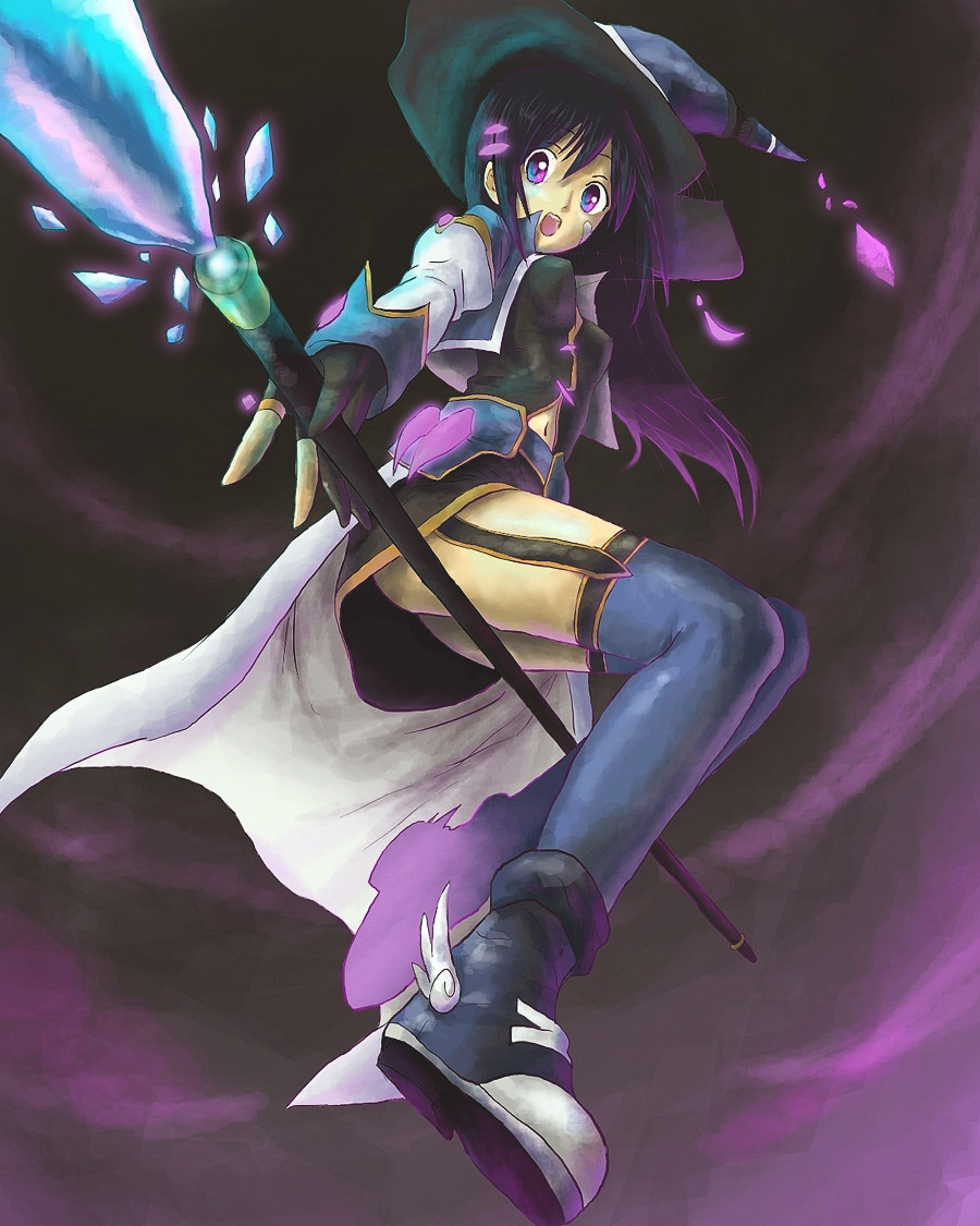
 darksen — Violet Sorcerer-FEZ Contest
Published: 2010-05-24 01:38:04 +0000 UTC; Views: 9797; Favourites: 203; Downloads: 3
Redirect to original
Description
EDIT: and there seem to be some problem with the small preview, you have to open full view to see the image clearly.or azure sorcerer...
i like glowing crystals and sexy sorcerers.
If you like it, please fav, comment, and watch me!
Need assistance in getting smoother and cleaner lines, if you have good advice please comment or note me
 (Wink)")
EDIT2: oh and i use tablet, i do not scan.
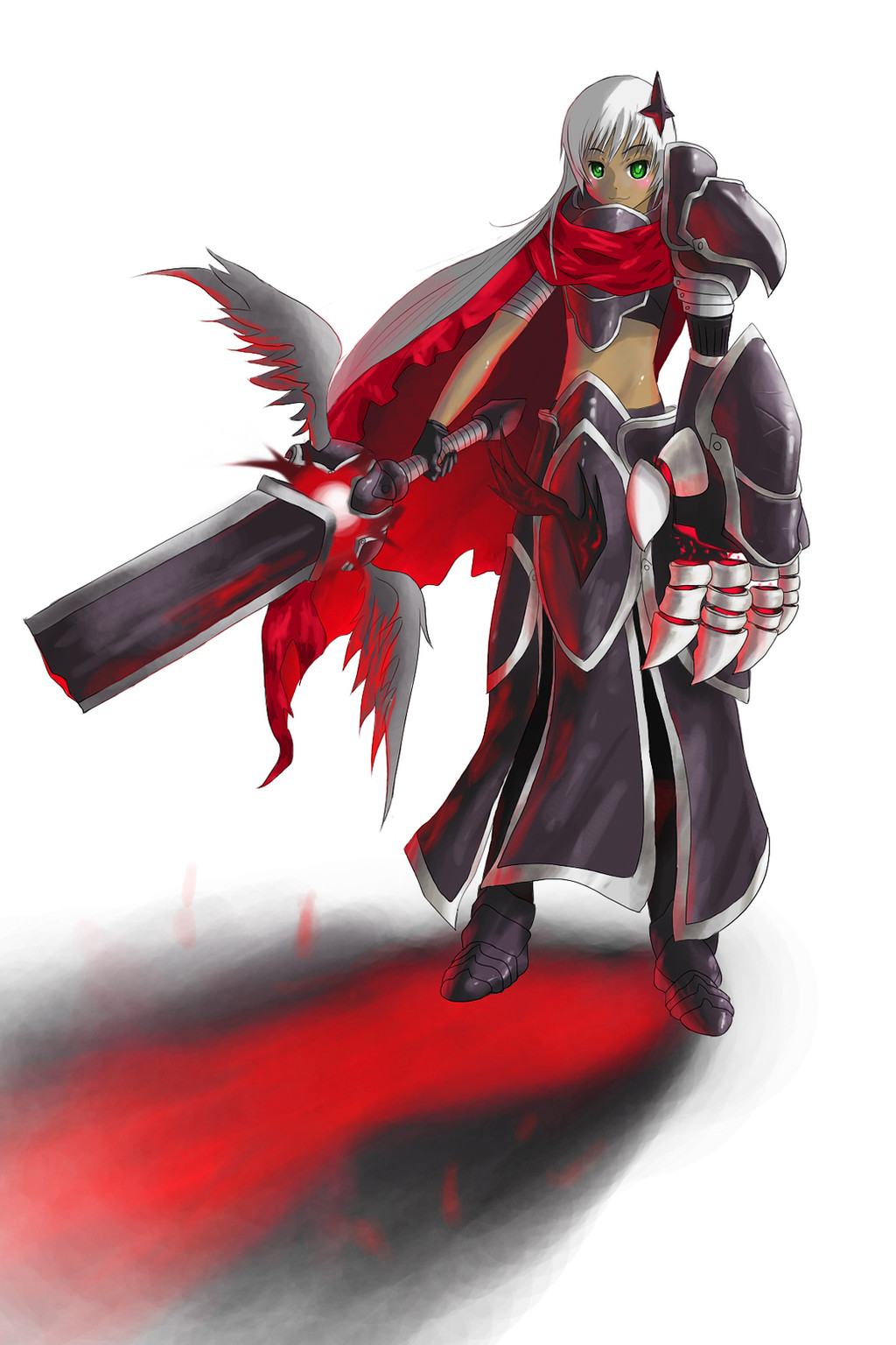
Scarlet Knight: [link]
Roaming Scout: [link]
Related content


Comments: 51

If you want smoother and cleaner lines: git gud.
-Advice101
👍: 0 ⏩: 0

it's so good people are stealing it, [link] you should be proud : )
👍: 0 ⏩: 0

Hi there.  (Smile)")
First of all great job, it's nice to see the use of a daring perspective, that will really help to set you apart from others. I think you have captured the feel of a FEZ sorceress quite well - you have an obvious talent for this style of anime.
In regards to getting smoother and cleaner lines I have some suggestions; it's all about finding what programs work well to suit your needs. I personally, am a Adobe Photoshop girl. But many other people work better with programs like Paint-toolSAI and Illustrator, which allow for 'auto-correction' of lines. Though I find this annoying, because I want my tablet to draw exactly like it would if it were a pencil on paper. I highly recommend playing around with different settings in some of these programs to find which, or which combination of programs suits you best, as most digital artists use more than one.
Furthermore, smoother lines tend to come naturally the longer you use a tablet, if you are relatively new to using a tablet, it can be a bitch.
The problem could also be how sensitive to pressure you tablet is, a highly sensitive tablet will pick up on every little shake your hand makes. I remember mine doing this the first time i drew with it, I didn't know what the hell was happening
When I'm teaching people how to use a tablet, one thing that always stands out as a problem is how afraid people are of breaking their tablet by drawing on it. Yes, it is fragile but it is designed to be drawn on with that pen, I'm sure the developers designed it so it could withstand people pressing hard on it. Be confident with how you use it and it will reflect in you line-work; I can see here that there are some obvious parts where you breakaway then resume lining, and it leaves uneven chunks (for example, halfway up the staff). Try doing a long, controlled line without pausing. It makes a difference.
Size and zooming is also crucial to getting a smooth finish. Always, always, always work on a bbbiiiiiiigggg. The beauty of digital art is that it isn't restricted to a specific size. Go crazy, I normally start out on a 20000pxl x 20000pxl canvas, but that's just me. You do whatever you are comfortable with. Now, to get smooth lines on a big canvas, what I do is have a 'sketch' layer, and then on top of that a 'clean' layer. I draw what I want on the sketch layer while zoomed out, so I can see the whole canvas and proportions etc. When I'm done sketching, I set the opacity of the 'sketch' layer to about 50. Then I take the clean layer, zoom right till the point that a single toe would fill my screen, and slowly and carefully paint over what I've done on my 'clean' layer, adding detail and fixing bits. When I'm done (it can take hours) I delete the 'sketch' layer from underneath, and what I'm left with is the beautiful, smooth lines from my 'clean' layer.
The same rules apply with the coloring, zoom in a carefully blend the colors together and much smoother and well-finished. Rather than painting it all zoomed out.
Heh, I've gone and rambled. I hope you found that somewhat helpful. Nevertheless good luck with the contest, this piece is definitely a favorite of mine - with all that purple. I love purple.
x a m y x
👍: 0 ⏩: 1

wow, this is totally unexpected. I would love to have more people like you who are so helpful and thoughtful on replies.
Thanks for the wishes and i have been trying to use sai lately and i really do like the auto smooth option. Then i change it to photoshop to color it in. I"m starting to get used to the tablet and i see the tip is already thinning due to long uses of the pen. I see what you mean with the staff, i'll try to use more steady hand when drawing.
as for canvas size, do you not lag? I thought i have a very decent gaming computer (since i built it for gaming, specs are actually quite high.) but working with anything more than 3000x3000px and 300dpi will cause everything to lag. Do you have any problems with that or is there some settings i don't know about?
Again, i really appreciate you taking the time to write these for me. Hope I can learn more from you in the future!
👍: 0 ⏩: 1
Thankyou, it's no trouble at all. 
I actually teach students in art and such, so feel free to note me at anytime if you have a question about something.
As for lagging, I only tend to get that when I use ridiculously big canvas sizes, even for me. But, I may not have issues because my computer was custom built by a friend of mine who's very handy with technology too - god only knows what he put in there but it runs everything like a charm. I honestly don't know that much about the technical side of computers so I can't say that it's because of better specs or anything. But I do know a large number of digital artists who follow similar procedures to me, and all use large canvas sizes and they don't seem to have any lagging problems. Hm. I'll look into it more for you
Maybe for now, don't go larger than what your computer can handle - the large size really only makes things easier for YOU, the actual people viewing the art can't tell the difference. The same amount of smoothness and detail can be achieved on a smaller canvas, you will just have to be a bit more patient.
Also with you pen tip, I didn't even think of that earlier
It's good that you're using Sai for lines and photoshop for coloring, most people do that and it gets great results. Especially when you're drawing manga/anime. I personally find that Sai is excellent for lines but crap for everything else. But to be fair that's only because I've been using Photoshop for alot of years and I'm used to its interface.
But still, this sorceress piece you did is excellent, it's one of the most popular artworks in the FEZ gallery. I was nowhere near this good when I started out with a tablet. That just shows how quickly you pick up on stuff, you'll have smooth lines in no time.
x a m y x
👍: 0 ⏩: 0


I love the perspective and the idea of her being a witch :3 I also love the feeling of your colors! You did a great job drawing this! Good luck with the contest
👍: 0 ⏩: 1


aaaaaaaaaaaaaa I love her and thumbss up for the crystals very awesome job
👍: 0 ⏩: 0


What program you use? It should be easy to make clear and smooth lines if you use tablet o_o
I always have clear and smooth lines and i use PaintTool SAI and a tablet. There's some option in SAI, which can make your drawn lines smoother by correcting it automatically.
👍: 0 ⏩: 1
yea, that's what i'm using now. thanks! 8D
👍: 0 ⏩: 1

good luck at the contest and I loved your style, it's amazing

👍: 0 ⏩: 0

if you have access to illustrator, i would use the pen tool to get your lines. It's a little frustrating to use at first, but it creates smooth vector lines that can be easily re sized without pixelation and imported into photoshop. photoshop also has a pen tool, but it's not nearly as sophisticated as the one used in illustrator.

👍: 0 ⏩: 1
ah ok, i have never used pen tool before..the triple lines just confuses me. When i have time i will sit down and read some tutorials! Thanks for the comment!.
👍: 0 ⏩: 0

love the perspective and the colors are very beautiful.
👍: 0 ⏩: 1


really cool and cute
for smother lines if you use a blend or blur tool in Photoshop or any other art software, softly over the outlines of the char. it should smooth then making it a little more 3d too
aftre that you can al ways add a darker like around the char too iff you want it to stand out.
:thumb165214958: heres my entry. guess you can kinda see wt i mean by blending.
really hope that helps
👍: 0 ⏩: 1
[link]
entry, thumb no work..... :S
👍: 0 ⏩: 1
Ohhhhh! i see, i never wuld thought about using blur on the lines. That is really cool. how much do you normally blur? 1px?
👍: 0 ⏩: 1
depending on the size of the area, i normally go for 3-6px
👍: 0 ⏩: 0


Really awesome one..
Thanks to people like you I can continue drawing. Cause if I see your pictures I realize that there is still much much more to work till I get as good as you or other artists :'D Thanks much <3
👍: 0 ⏩: 1
Oh thanks. I 'm still learning to do stuff and try to improve my drawings! and good luck to you too!
👍: 0 ⏩: 1
Thanks I will work hard. Certainly.
I will start stalkin you +watches you+
👍: 0 ⏩: 0


to get smoother lines, try working bigger it allows for more small mistakes, also try being fluid with the pen stroke, another alternative it using the pen tool, guaranteed to be smooth but it just takes patience, other than that just practice drawing smooth strokes in one motion over and over, i like the colours in this btw and good luck in the contest^^
👍: 0 ⏩: 1
thanks, i already use 1500px+ resolutions, i will just try to steady and smooth my hands better. Thanks for the wish
👍: 0 ⏩: 1

Liked.
You have good poses, perspectives.
Also a very good carachter. I like sexy sorceress too. Had to fav.
I hope you don´t get me wrong, but you have some sort of 3 stripes of white on the blue crystal
that felt weird. Maybe it´s just me, but I´m sure you are very talented.
Hopes a lot of sucess for you.

👍: 0 ⏩: 1
thanks, the three stroke was meant to be a reflective thing. I totally got what you mean thought, didn't work out the way i planned, maybe i should blend it more :S. I"ll test it and reupload if its better! thanks again for the comments.
👍: 0 ⏩: 1
Sure!!! I didn´t felt like you were really going to reply!
I´m really happy though.
I hope the change is for the better. And I´m going to watch you from here on. Anyway, congratulations on the awesome work.
👍: 0 ⏩: 2
and my main purpose is to learn to draw better. I take comments seriously! 8D
👍: 0 ⏩: 1
It´s so nice to find ppw who understand the way you think.
Waaaay cool.
I feel motivated. And I really want to get better and better on. Although our styles may differ, we both like manga and priorize the learning. I hope I can learn a lot from you from now on.
I´m really delighted.
P.S.: Yeah! It is tottally better. If keep going on like this you´r going to be snobe soon. 
👍: 0 ⏩: 0
Yup, you are right! alot better now! hahaha. thanks for watch and advice
👍: 0 ⏩: 0

Wow, impressive that you don't use scan.
I am planning to use scan, because I am not that great with my Tablet. Did you already started with tablet before... or did you used the scanner also before you became more experienced with the tablet?
Great work ")
Only... her breasts are too pointy XD
Cool boots and weapon btw.
👍: 0 ⏩: 1
thanks, yea i used scans before. sigh, iono. Scans dont work with 64bit windows 7 because of twain setting or w/e
")
👍: 0 ⏩: 0


this is awesome, i never scan either. and oddly enough i did a sorcerer too for the contest lol
👍: 0 ⏩: 0

its good but if i were u i would do one with the style of the earth zero art
👍: 0 ⏩: 0
