HOME | DD
 darulian — TOWARD

Published: 2004-07-04 00:51:16 +0000 UTC; Views: 2266; Favourites: 24; Downloads: 941
Redirect to original
Description
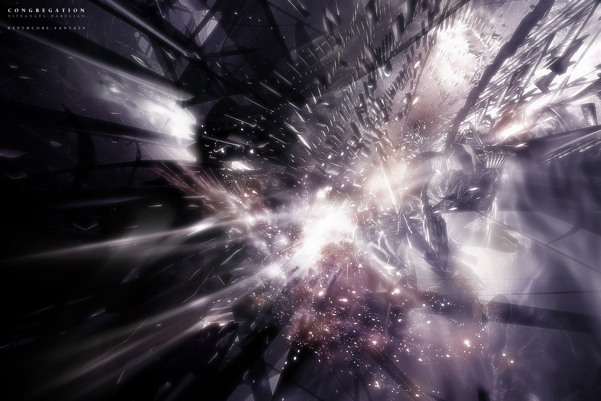
NEVER, EVER LOOK BACKwww.avensys.org
Jort Braam, 2004
Programs used:
Illustrator
Related content


Comments: 48


I cant look at this without seeing a couple making love. What that tels about me?
Awsome
👍: 0 ⏩: 0

hmm I like the overall look but it loooks definatly too randomly made for my taste  (Smile)")
👍: 0 ⏩: 0

loved theese lines!
reminds of picasso's light drawings...
👍: 0 ⏩: 0

")


Zit een erg goede beweging in. Het is een bepaalde stijl "focus" en "centrum"-loze kunst, maar het is wel erg mooi. Ik denk dat het erg leuk zou zijn als je er één zou maken met geen tekstthema, maar een gewoon beeldend thema en daarna misschien in photoshop wat tekst adden, maar dan zou ik het misschien distorten of er iets creatiefs mee doen ... you get the point, doe er in ieder geval iets nieuws mee... doorbreek het patroon niet alleen qua vorm en beeld maar ook qua layout en gevoel, wat expirimenteren kan nooit kwaad
En alweer een goede keuze van lettertype
👍: 0 ⏩: 1

Is inderdaad een goed idee, ik ga er nog wel even mee klooien als ik tijd heb

👍: 0 ⏩: 0

ziet er cool uit. vooral de dikke 'grungy' buitenlijn ziet er cool uit. het laat me denken aan een paar schilderijen die me ouders hebben gekocht  (Wink)")
👍: 0 ⏩: 0

really nice piece of work here. you have some mad skills
👍: 0 ⏩: 0


Some aspects I like but others I dont. I can tell you used the paintbrush and distorted. Im curious if this was pure abstraction or if you had made something then distorted it. I wouldnt have made the stroke as strong. Overall it is cool though. Good to see you starting some vector abstraction. I think more people will start after seeing this.
👍: 0 ⏩: 1
Thanks for you comment :] It started of as an abstract, actually it just came out as i wanted. i just got illustrator CS, i used to use illustrator 8 wich is old and has a sucky GUI. I just like to experiment and this is my first full illustrator output.
👍: 0 ⏩: 0


yeah I also see the body of the woman
👍: 0 ⏩: 0

ya all the niceties people have said before
flows nice n the colours rox.
👍: 0 ⏩: 0


Wicked stuff man, i keep seeing shapes of womens bodys in this illustration hehe. gj
👍: 0 ⏩: 0


sweet work, im liking these styles of yours ")

👍: 0 ⏩: 0

nice flow, its something that looks relativly simple to do but I think the layout just makes it much more complex. I like it +fav
👍: 0 ⏩: 0


Dunno what the fuck to say really. But I like the shapes and gradient.
👍: 0 ⏩: 0

damn... wat een heerlijke stijl man. The 2d in de bg heb je mooi rustig gehouden, en dat komt mooi uit met de drukke 2d op de voorgrond (of ist vector, weet nooit wat et verschil is
👍: 0 ⏩: 0


I like this one much more than that last one you submitted. Beautiful flow and color, great job
👍: 0 ⏩: 0


youre a sexy man jort braam hot shizz this is. +fav sucka
👍: 0 ⏩: 0


The flow of everything is just truly magnificent.
i love the colors and the gradients. +fav
👍: 0 ⏩: 0

nice, simple yet effective
👍: 0 ⏩: 0

not too shaby hu?!? i guess the re-size didnt affekt this now
👍: 0 ⏩: 1
thanks for the fav, i just wanted to make it as vibrant and plain as possible. I think more 2d would slow it down. No inverts there. Outline tweaks.
👍: 0 ⏩: 1
hmmm 
the outline tweak is good idea. maybe ill start messing around in Illustrator too... i've just got to get it anyhow 


👍: 0 ⏩: 1
yeh all illustrator.
Silly, you see those white drops the bottom.....? Now think what happend before with that nice smooth body of that woman.
👍: 0 ⏩: 1


i've got to get me Illustrator.
cya l8r Daru.. got to get in bed or else my babe s going to kick my balls out into space tomorrow... (if i dont wake up in time im screwed.. im driving)
👍: 0 ⏩: 0

I absolutely love the colors; one would think they're never blend, but this is perfect. Awesome detail on the lines, great great.
👍: 0 ⏩: 0