HOME | DD
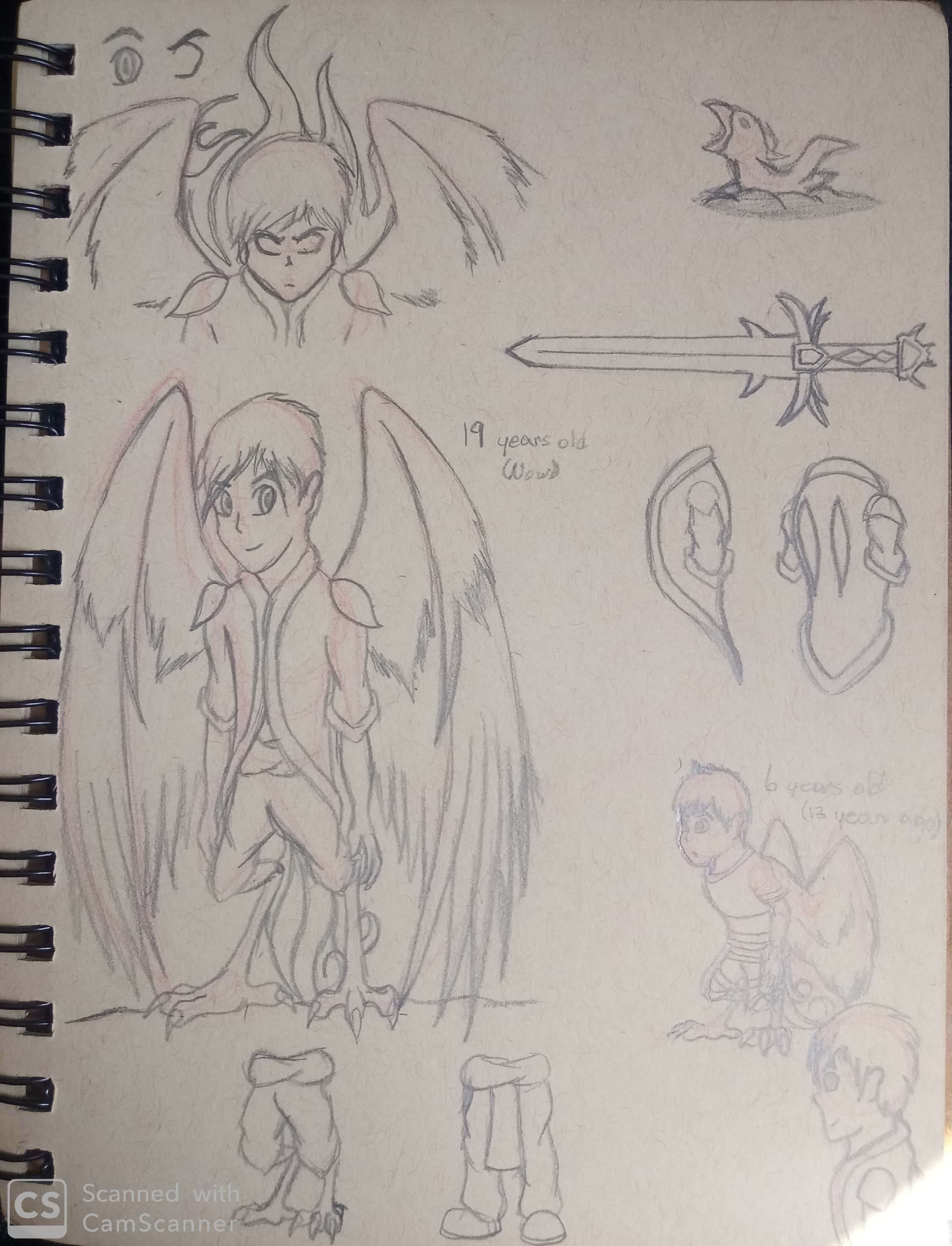
 Dashyburd — Shading Experiments

#bird #burd #sword #tweet #birb #windwakerrito #birdboy #experimental #thelegendofzelda #shadinglighting
Published: 2019-03-18 02:24:55 +0000 UTC; Views: 606; Favourites: 14; Downloads: 2
Redirect to original
Description
Did this a while ago in February and thought I'd post this here since I haven't uploaded in a while. Which do you like more? Being totally honest, I'm not satisfied with either. But I do like the left one more. I'll keep experimenting.
Also, kinda tweaked Locar's colors a little bit so I guess this works as a reference.
Locar belongs to me.
Related content


Comments: 9

Since the character is super cartoony in this picture I think cell shaded fits it better but you can always try doing a little bit of both. You can try applying values with a soft brush for a base then go in and create more cell shaded types of shapes over the values. But if you're gonna go for straight value shading, at the very least the line art should be colored. That or you can paint over the line art all together. Just remember the key is always in the hue shifts and highlights. Membah dat!
👍: 0 ⏩: 0

Funnily enough, the right one fits better with your cartoonish drawings while the left ones fit better with the more detailed ones.
👍: 0 ⏩: 1

And yet for some reason I refuse to do straight up cel shading for my main style. :I I wanna see if I can get a good mixture of both.
👍: 0 ⏩: 1
Meanwhile i stay as far away from cel shading as possible cuz doing that shit with a mouse kills me. :I
👍: 0 ⏩: 0

I'd go with the left. Smoother shadows, better quality. But if you go for a more cartoony look, the one on the right.
👍: 0 ⏩: 1
That's what I'm thinking... I definitely won't stop with cel shading altogether, but I don't want it to be part of my main style.
👍: 0 ⏩: 0

supongo que depende de lo que quieres hacer en el momento y del material: el de la izquierda es más suave y sirve mucho para ropa y piel, que son materiales poco reflectivos. El de la derecha es más sólido y sirve para metales, cristal y otros materiales reflectivos (por lo menos si están pulidos). El de la derecha es un cel-shading más clásico, el izquierdo es más realista .3.
PD: dem legs
👍: 0 ⏩: 1
Tienes razón, voy a averiguar si puedo mezclar los dos estilos y así conseguir un efecto más o menos realista. Tienes algún en cuanto a elegir colores para sombrear?
These legs were made for walkin'
👍: 0 ⏩: 1
Eeeeh yo a veces me paso de cochina y solamente hago unas sombras todas chanchas con negro y luego pongo la capa en multiply (juego con la opacidad para que no se vea tan cerdo). PERO cuando me da por ser una mujer civilizada, utilizo una de dos: si el objeto tiene colores fríos, contamino la sombra con azul y si tiene colores cálidos uso marrón. Si eso no basta, uso el color análogo o complementario para contaminar más la sombra. Básicamente esto , me sirve tanto en digital como en medio tradicional.
👍: 0 ⏩: 0